Month: May 2012

 Kips Bay Decoratio's Show House belle vivir

I was able to walk the Kips Bay Decorator’s Show house for a few hours and took a lot of it mentally and in photos.  There is always something new to see for the first time and tones of inspiration to get from show houses.  This year there was a lot of interesting details
too good to not share them.  When I looked at Thom Filicia‘s space the first thought I had was that he had set up his shop in the middle of Kips Bay Show house, although none the less beautiful. His space (above) called “The Gallery” was a walkway between the dining room, living room, entrance and hallway and every piece of furniture in it belongs to one of Thom’s many furniture lines.  The space had only two small walls of about 3 to 5 feet and
two other even smaller ones.  Magically Thom made it feel like a room.  My conclusions of how he nailed it!

Read More…

Some people prefer closets where everything is on display, maybe for better and faster access, where as others prefer to have their clothes neatly behind doors and drawers.  I think I prefer a combination of both or maybe doors that can easily open up the space.  I like to see everything I have because I always think I’m forgetting something.  I love the top closet via Elle Decor, everything about it speaks to me but mostly the lighting.  The three closets below are via Architectural Digest, first belongs to Alberto Pinto in his Brazilian home and third to Alfredo Paredes and Brad Goldfarb, are more masculine and austere, but both have great lighting as well.  Lighting is an element we all want when getting dressed.

This closet, above, has a well lived feeling via Architectural Digest. 

Whenever I have one simple appointment to keep in the day and don’t feel like dressing up, I spruce up a pair of simple pants and an understated top with a Zara blazer.   Just add a few cuffs or a statement necklace and I’m good to go.  I have been buying Zara blazer for a while now because I love their clean and classic lines and the price is unbeatable.

This kitchen I came across with is from a newly constructed farm house in Spain that Isabel Lopez Quesada created together with architect Pablo Carvajal.  It’s hard to guess that this kitchen with that old and graciously run down feel is newly constructed.  There are many obvious elements that help create the ambiance of old, from the reclaimed wood-plank floor, the classic bin cabinet pulls to the curved over sized range hood.  I love the details of the rivets on the stainless steel backsplash.  The range is Lacanche.  Enjoy

Image via Pinterest
There
are many stunning rooms, if not all, in this year’s Kips Bay show house
but I have three favorite rooms that I can literally live in.  In last
year’s show house in the Hamptons, one of my favorite rooms also
belonged to Rija Radhakrishnan, a designer who not many bloggers knew about and this
year she again stunned me with a room she designed with a special client
in mind.  Another one of my favorite rooms this year is also designed
by a designer I had never heard of before.  
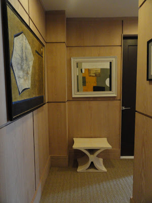
Alexander Doherty‘s room “A Collector’s Bedroom” was paneled
in washed oak and the private collection of art display in the room is to die for.  I was
completely smitten with the entire decor of the room that went from the
pop of red in the Robsjohn Gibbings sideboard to the touches of brass and the
spectacular selection of custom made furniture.  If you are not new to this blog, or
if you are, you should know of my eternal love affair with sculptural
furniture.  There is no easier way to go chic with your decor.   (personal note:  get some oak paneling even if they’re fake)

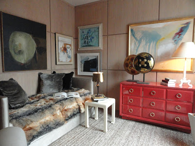
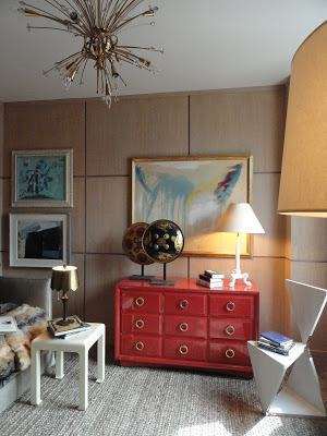
1940’s sunburst chandelier.

The Gentleman’s Study designed by David Scott was breathtaking.
 David played with contrast at its best.  The space was masculine but it
could fit a lady’s taste as well.  David told me he was inspired by his
new book and also that he wanted to design a space like he would design
it for himself.  And for me, I would say if you ask.  David’s space
also has oak paneling on one wall and Seagrass wallpaper on the other
where the amazing Paul Evans bookcase is.  The bookcase is from Todd Merrill.
Custom made omnibus chaise lounge by Vladimir Kagan Couture, the floor lamp is by Jacques Adnet.
George III writing desk
Kubrick console by Mauro Fabbro, moon wall sconces by Stephen Downes, the sculpture is by Paul Evans from Todd Merrill. The blue chair is by Jean Royer and is from Maison Gerard. 


David’s book Outside The Box is one book I can’t
wait to buy.  The images are great and if you didn’t know, David
is a curator interior designer so I’m sure there is a lot he can teach
to those who want to learn.
Stunning!
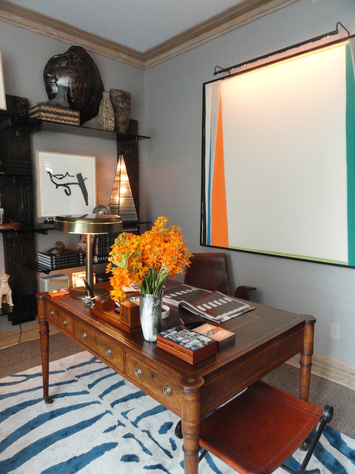
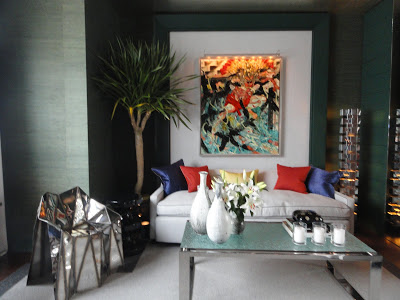
“Le Bureau Prive” was a home office designed by Raji Radhakrishnan for
her imaginary client who was none other than the chief curator of Metropolitan Museum of Art.  Raji blew up a painting she took from the Metropolitan Museum and used it in the
back wall of the sofa.  A very traditional image but used in a very
modern way exactly like a museum curator would want to live, I suppose.
 The walls were treated with a Venetian plaster technique,
remember what I said 
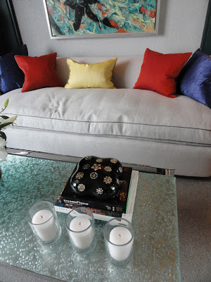
here?  Adore how the throw on the sofa makes it look as if it were upholstered in two
different tones.  The desk chair is by Jules Leleu from Maison Gerard
and the amazing sideboard and pyramid are by Laverne.  The photograph above the mantel was taken by Raji and then
blown up.  She put it up on the wall the same way she did in last year’s
Hampton’s show house.  

The red zig zag table, a reference to Albert Hadley, is by LeavittWeaver.  Hadley used this type of table in few of his projects, you can see here.

The desk chair is by Jules Leleu from Maison Gerard.

Laverne bar cabinet and pyramid.

All photos by Julie Yenicag for Belle Vivir
 

 I love how Jamie installed mirror on the wall across the window by multiplying the stunning view.

This year the designers had the challenge of
converting boxy modern rooms, usually without much or any architectural
interest, into beautiful and interesting spaces.   They mainly
accomplish this by covering almost each and every wall in either
wallpaper, wood paneling or by utilizing a paint technique.  Jamie Drake covered the library in a beautiful sea foam green grass cloth
wallpaper on one side of the room and wood paneling and built-ins,
painted in the same kind of green, on the rest of the room.  Most of the
furniture were kept in white, maybe to brighten up the space.  The
ceiling was covered in a hammered silver paper that reflects light. 

The beautiful painting above the sofa is by Andy
Harper and displays almost the same colors as the pillows. I have to say that
this year the art throughout the show house is perfect.  The chair is by Julian Mayor.

photos by Julie Yenicag for Belle Vivir