
I was able to walk the Kips Bay Decorator’s Show house for a few hours and took a lot of it mentally and in photos. There is always something new to see for the first time and tones of inspiration to get from show houses. This year there was a lot of interesting details
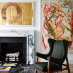
too good to not share them. When I looked at Thom Filicia‘s space the first thought I had was that he had set up his shop in the middle of Kips Bay Show house, although none the less beautiful. His space (above) called “The Gallery” was a walkway between the dining room, living room, entrance and hallway and every piece of furniture in it belongs to one of Thom’s many furniture lines. The space had only two small walls of about 3 to 5 feet and
two other even smaller ones. Magically Thom made it feel like a room. My conclusions of how he nailed it!

Painting the ceiling the same color as the walls not only make the space bigger by (blending the boundaries but at the same time it encloses it by making the space feel more like one whole space and giving the fifth wall (the ceiling) a more important roll. The high gloss walls bring movement. A Light and airy chandelier instead of a closed one or a shaded one helps open up the space.


Fashion-isha
I'm so excited about going today!! I love the previews here!
xo
Sharon
Callie Grayson
WOW that ceiling is gorgeous! Live the green and black
In the space
Xx
Callie
therelishedroost
Going tomorrow so excited to see the rooms!!! Great post!!
affordable home decor
Interesting post. Would love to find more resources like this.
affordable home decor
Dawn | enterloop
I loved Thom Filicia's gallery! That green was spectacular and the green and yellow graphic art on the one wall really popped. I like your take on painting the ceiling the same color, and I'm dying to try high gloss walls in my next apartment. I also loved that he filled the space with art, which made me want to stay there and take it all in.