Category: Interior Design

On Friday morning I got a preview of this year’s Columbus Decorator’s Show House where as I posted here, 11 designers had the challenge and privilege of creating 11 spaces inside Columbus Museum of Art.  Each space was unique with each Interior designer’s own interpretation of their spaces.  If you live in the Columbus area you should really go and see these spaces in person because photos don’t do them justice.

A Sneek Peek to Columbus decorator's show house, columbus decorators show house david berg

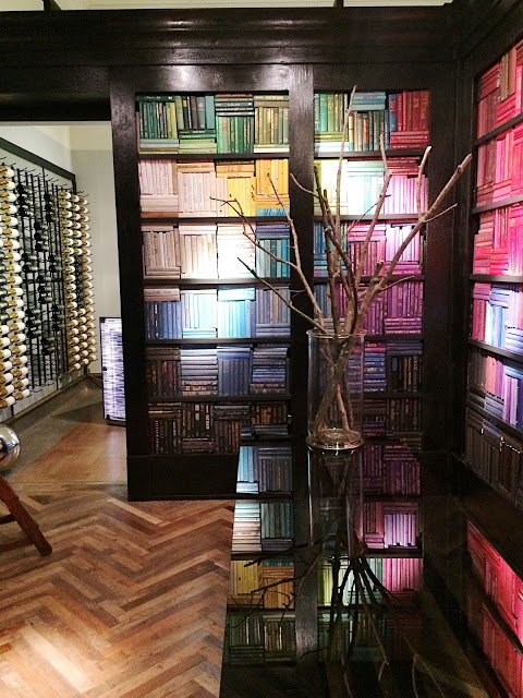
The Portal by David M. Berg. According to David, the space is like an Art installation in its self, and an anticipation of things to come.  The spaces were on the small side and photographing them wasn’t too easy, especially to capture the best of these rooms.  The photos of this entryway don’t do it justice: the space is very inviting with reclaimed herringbone floors and the way David organized the books in an ombre effect was very clever and artistic.

Read More…

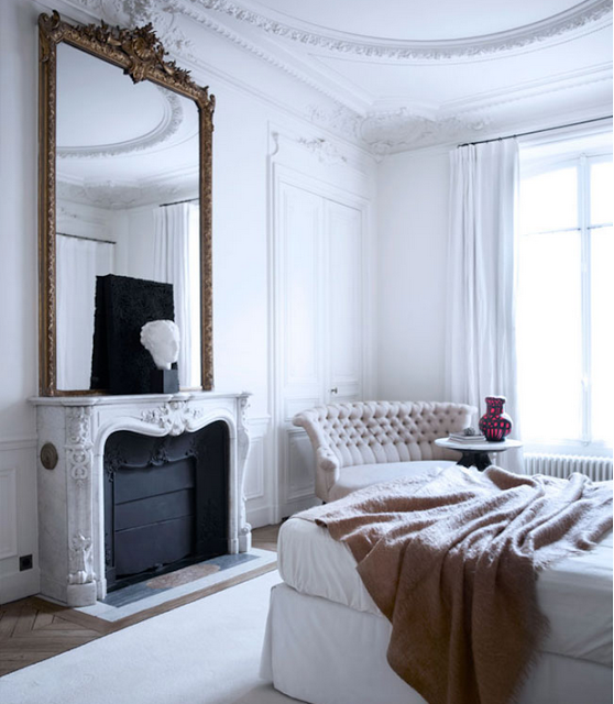
Gilles and Boissier is a world renowned Interior Architectural firm with international recognition and success that mostly everyone in the Design world have heard of or seen one of their creations by now, I’m specifically referring to their more than famous 19th century apartment located on Boulevard Malesherbes in Paris, France.  The surprisingly young couple, Patrick Gilles and Dorothee Boissier, are also partners in life, they have two children and according to their website they use their differences in creative disagreements to create elegant and beautiful interiors, like that complementing one another.

Gilles and Boissier via belle vivir blogPatrick favors clean and straight lines in organic physical forms as wood and Dorothee elegantly and harmoniously fusions together all the elements.  The couple were once mentored by renowned Interior Designers Philippe Starck and Christian Liaigre.

Gilles and Boissier have created elegant and beautiful interiors worldwide from hospitality projects, restaurants and luxury boutiques like Monclair.  They also designed Remo Ruffini, Monclair’s owner’s villa in Lake Como.

From the successful design due came Gilles and Boissier Maison Label a bespoke furniture and lighting collection where the firm design philosophy ‘neither minimalist nor decorative’ is the inspiration behind their creations.  In this aesthetic point of view,
their vast experience and their extraordinary taste translate in many of their high-end designs which is perhaps more exemplified in their own Parisian apartment which the
couple renovated keeping their two children in mind.  Most of the furniture and lighting employed in the apartment were designed by Gilles and Boissier themselves.

Read More…

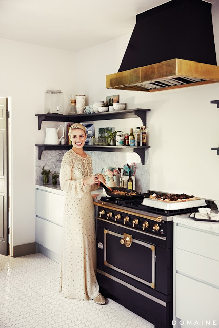
kitchens with black stoves and ranges a kitchen with white hexagon floor tiles, wooden shelfs, black stove with brass trim

 Love the regal look in this kitchen.  Hexagon tiles on the floor give it an old-world feeling.  The cabinets are of a very light green color which gives the black stove a free rode to reign by itself.  Via My Domaine.

The thought of owning a kitchen with a black stove may make some sneer.  Having stainless steel appliances as the first choice for homeowners, a black range may not sound too appealing.  But once you get to see these fantastic, beautiful kitchens, all featuring black stoves, you may not only change your mind, but they might also prompt you to save some money to buy one yourself and put it in your kitchen.  These stoves don’t come with a cheap price tag, though.  Since they don’t always appeal to everyone, their exclusivity and rarity come with a hefty price.  Expect to pay a minimum of around four thousand among the most affordable ones and up to sixty thousands for others.  Since we are looking for a house in Columbus, Ohio, I’ve been contemplating different range options.   My husband loves to cook, he says it relaxes him, and I cook dinner almost every day except the nights when the mood calls for some Thai takeout.  My dinner cooking is effortless, baked fish which is
usually salmon, steamed vegetables and or salads.  It may sound boring, but it’s delicious and super easy.  I joke with Evren my husband sometimes when I suggest having the salmon outside occasionally.  We are a family who is obsessed with good eating, so we like to make everything from scratch hence an excellent functional kitchen is a priority in our home. But more than me being a cooking fan, I really enjoy beautiful kitchens and watching my hubby cooking on the weekends so I thought it would be nice to have a very good looking stove in either black or another color and the only range I’ve come across with a more reasonable price is Verona, last picture.  It comes in many different finishes and sizes, and the design is the result of a perfect interpretation of a transitional stove.  It’s clean with not too fussy lines, and I know I will be able to live with for a long time.

Read More…

Transitional design is like meeting traditional and modern interior design halfway.  It integrates all the right elements of both styles.  It’s a midpoint between traditional and contemporary styles.  While Traditional Style can sometimes feel too inflexible and Modern Style too cold, a transitional design style balances harmoniously creating spaces that not only feel timeless but chic as well.  Transitional living spaces are created by keeping furniture lines simple without extra ornamentation, more straight lines, using neutral tones and combining all with modern art.   Neutral tones or neutral colors can go from varying shades of beige tones to a different range of greys but, that doesn’t mean that only earthy tones can be used.  Colors derived from nature undertones can also fall in a similar category, such as greens and blues.  The overall feeling in a transitional style room is harmonious, comfortable and it appeals to most people’s taste.  It induces grace and rapport.  In essence, this style of decorating creates cohesive spaces that stand the test of time.  And who doesn’t want that?  Transitional interiors can perfectly combine a feminine and masculine approach seamlessly making the style very appealing to a young family.   Because it’s a style that is supposed to go into the future without any regret, the rooms stay away from too many accessories as well as trends.  Keep scrolling down to see examples of transitional style living room design.  As a Columbus based Interior Designer,  I’m always looking for inspirations and decorating ideas.

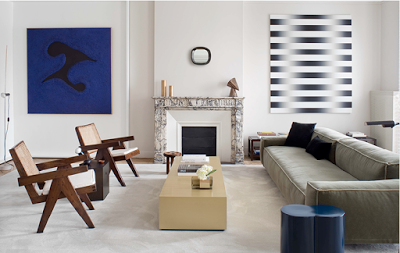
transitional design, transitional style living room, Pierre Jeanneret chairs, modern art and clean lines sofa

A transitional living room designed by Stephane Parmentier.   The Interior Designer used straight lines with more neutral color fabrics.  The color palette in this living room is soothing but sophisticated.  Pay attention to the placement of the art, and you notice a more refreshing way of symmetry.  The chairs are by Pierre Jeanneret, an enduring French modern classic.  Love this clean-lined room.

Read More…

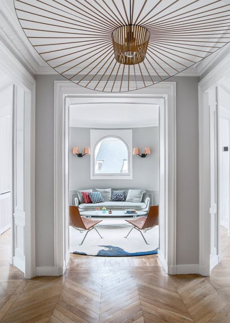
entry way with chevron floors, grey walls and vertigo pendant by constance guisset

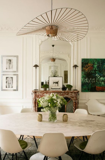
In this entryway, the vertigo pendant lamp seems to welcome guests.

Every so often comes the case when a designer creates a classic.  Vertigo Pendant by Constance Guisset is one of those and it appears to have been around for a longer time.  It’s the kind of sculptural lighting that recalls a timeless style although it is a new design.  Its lines are visually strong, feel subtle and organic and I can only imagine how beautiful reflections it
creates on the walls and ceiling when lit up night time.  The pendant supposedly moves when the breeze touches it conveying a sense of freedom and rhythm. This is the kind of lighting fixture that can seamlessly be incorporated in any kind of style, however I’ve
noticed the it looks more cohesive when paired with furniture of neutral colors and pale walls.  Better yet if the walls have some molding on them.  The Vertigo Pendant
which is very light weigh, comes in two different sizes and in different finishing, has slowly become an Interior Designer favorite.  I like it more when it’s fixed to the ceiling rather
than hanging giving the pendant the appearance of an upside down hat.  A bit poetic, a bit fun, a bit young. In Europe you can buy it at Petite Friture.  In the US it is available at MoMa, 1stdibs and Finishing Design Shop.

dining room with modern chairs and vertigo pendant

In this room, the lamp adds to the beautiful composition of modern and old.

Read More…

interior decorator writes about a classic and modern parisian apartment

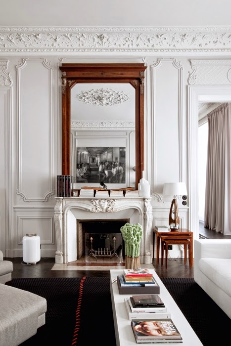
I love to see classic interior structures decorated with more modern furniture, as I stated here.  The contrast is beyond exited and chic.  This Modern Parisian Apartment is gracefully decorated between classic and the modern.   The quintessential Parisian apartment with Haussmann Architectural Details is furnished with fabulous furniture from different
periods with common clean lines.  The apartment is designed by double g.  The walls with ornate moldings and boiseries were kept white – who needs a color-splash when you have ornate crown moldings like these!

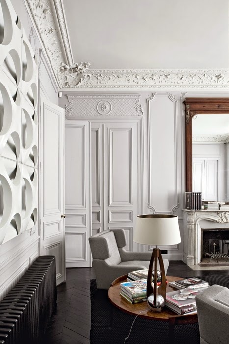
Interior designer tour a parisian apartment

Keeping the furniture in neutral colors bring balance and tranquility to a very ornate room.  Keeping the wall in white adds to this.

Read More…