Month: August 2009

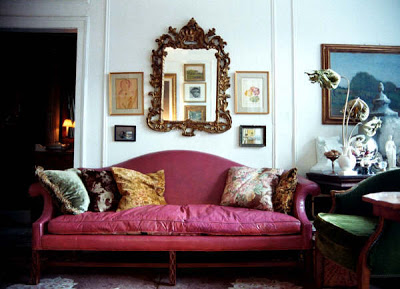
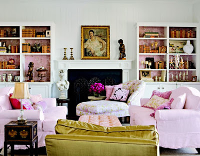
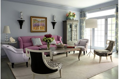
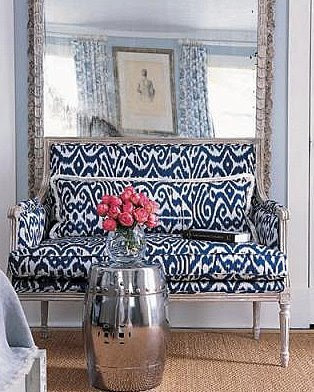
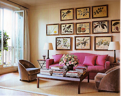
Every little girl might have dreamed of having one but a pink sofa can also appeal to adults.  As all these images here prove, is best suitable when use as a statement piece and paired with more neutral objects and decorative pieces.   
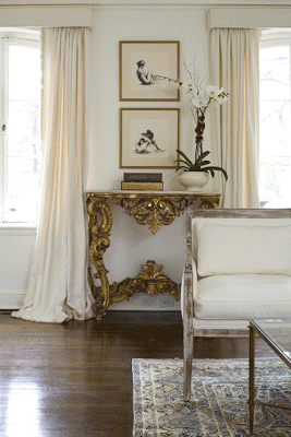
I love how the designers incorporated something new or modern in these spaces to bring a fresh touch to an otherwise rigid design.

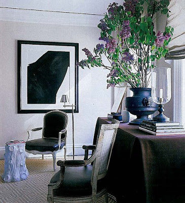
The black and white photograph and the modern stool paired with some classic elements keep this room light.

The new and unexpected finish on the stool brings it up today.

The black and white wall art makes this room unexpected.

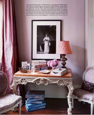
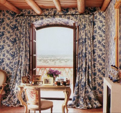
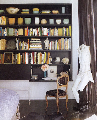
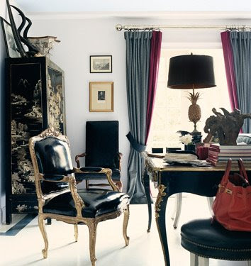
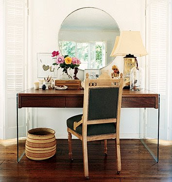
I would be more than happy opening letters or doing some home related paper work from one of these gorgeous spaces. I especially love the Carolina Herrera Jr.’s room (second from top) overlooking the fantastic Spanish country side. For the City I would be content with the top room. How about you guys, which working space would you pick?

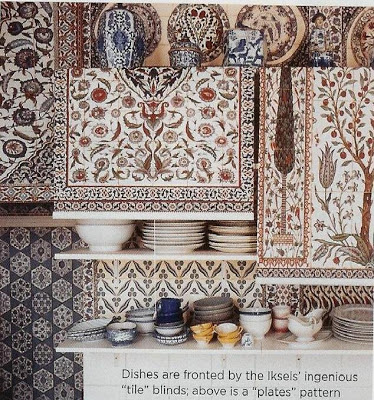
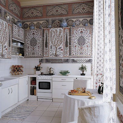
I was going trough my files and came across this Kitchen of the Paris flat in Dimonah and Mehmet Iksel, featured in Elle Decor some time ago. The first time I saw it I was so fascinated by its simple yet elaborate and romantic design. The owners designed the fabrics used in the rolling blinds (for the cabinets), the curtains and also the wallpaper after Iznik patterns. Somehow the contemporary Thai and Chinese blue-and-white pottery seem to work very well in front of the busy background. This is possible because the Iznik patterns have the same color scheme all around the room. To this day I still love it. I know many of you may find it difficult to live with this Kitchen in an everyday basic. What do you think? Would you live in this Kitchen or not?