Month: March 2011

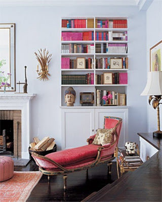
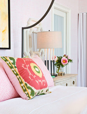
 La Fiorentina is an absolutely stunning fabric designed by David Hicks in 1970 then edited by Ashley Hicks for Groundworks. It’s 100% Linen with a width of 55″. I have 4 yards and 3/4 of “La Fiorentina” in gray on dark tint at $40 a yard. This neutral color combination would, literally go with any other color and it will blend in effortlessly. You can upholster a chair, the back of a sofa, like I did in the top image or a headboard. Whichever way you decide to use it this fabric will make an elegant statement. If you’re interesting, please email me at bellevivir@gmail.com, thank you and have an excellent day. 


Ruthie Sommers via Domino
Angie Hranowsky

I’m looking forward to starting my weekend and disconnect. 

Have a gorgeous eclectic weekend!

last image photo by Daniel Jackson for Teen Vogue

I’ve been smitten by Chloe since I ever remember and have been coveting one of their capes for an even longer time. Their clothes are always soft and feminine with a touch of youthfulness seduction that I can relate to and would feel utterly feminine while wearing them. These images below are from their pre-fall 2011 collection and the poncho… is undoubtedly to die for.

Yes, after a cup of coffee I usually think like this (below). Coffee is my best friend.
I hope your week so far, is an “almost completed to-do list”.

Design process is better done in layers. Can you tell this room’s walls are wallpapered? I didn’t, until I saw the close-up of the below picture. Having a vision when decorating is what a professional starts with but for whoever is not a professional is better doing it slowly. Stepping back and seeing one layer (paint, wallpaper, etc) and imagining what the next piece to come will look like is easier and a more assuring way of doing it without making mistakes that can be costly. I’ve been decorating my home slowly. I think the best way of doing it is while you’re living in the house and realizing slowly what you need in the process. Even professionals change their minds in the process after seeing that something is not working. A few months ago I had the back of a sofa upholstered in a graphic fabric (the back of the sofa is one of the first things you see when walking into our house), after seeing it I realized that a patterned curtain will be too conflicting. It called for plain fabric curtains. I can visualize this room above empty with only the wallpaper installed and quickly figure out that it needed a graphic sculptural bed that would not be too bulky and clumsy and that would still carry on the soft and feminine atmosphere.

Can you imagine this bathroom without the polka dotted wallpaper? Sometimes a bold move makes a big difference in a white room.

images via.

The past few days have been gloriously sunny and I couldn’t be happier. In the prelude of Spring all the great things seem to start happening, only waking up earlier is not such of an effort anymore, editing our home decors seem to flow naturally. It feels exactly what it is, a breath of fresh new air that won’t freeze your lungs. When I think of the beginning of spring I imagine greenery and I love the use of it in the last photo; put in a collection of clear glasses and accessorized with jewelry. In the first image, however there is no greenery anywhere but the clarity of it and the stacking of the books is very fresh and young in a way. Recently I posted about how I enjoy seeing real bookcases. I have the books in my kitchen’s built-in displayed with the paperback side facing back the wall so there would be more symmetry in color. Here is a sneak peek of my kitchen’s bookcases if you wish to see.

1st image via,