Month: May 2011

Pieree Yovanovitch interior design living room beam ceilings
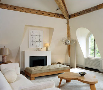
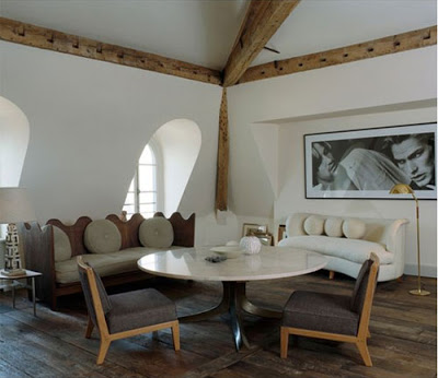
While visiting the opening night preview gala of The Spring Show, I came across the work of Pierre Yovanovitch featured in a magazine given out to attendees.  The 2,150-square-foot house is located on the top floor of an Hotel Particulier in Paris.  Pierre Yovanovitch has been named by Architectural Digest as one of France’s most exiting young interior design talents.  Yovanovitch’s introduction to interior design was merely by chance when his friends asked him for help to decorate their homes while he was designing clothes for Pierre Cardin.  What I love most about his home is how he can combine comfort with rustic to a very polished result.   

Pierre’s style is what Modern Magazine called sophisticated modernist and I couldn’t agree more. About his home he says “This is my interpretation of rustique chic

 pierre yovanovitch design library with exposed wood
Love the exposed wood in the library.
pierre yovanovitch interior design

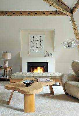
A mid-century daybed by James Mont and a wood and cork table by Paul Frankl used in the living room.
pierre yovanovitch dining area
pierre yovanovitch dining room

Pierre opted for a more bohemian approach for his dining area while still using mostly mid-century furniture. When friends come over, the sofas are pulled up to the Jules Wabbes’ table.
pierre yovanovitch desing
Below, more eye candy from his work.
pierre yovanovitch paris design
pierre yovanovitch design
red sofa in cozy living room
This post was edited on April 3, 2017 for accuracy.
 

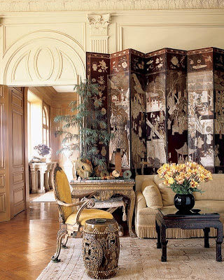
Coromandel
Screens or Chinese screens as many know them, were first introduced to
England, and then eventually to continental Europe, in the 17th century.
It’s recognized today as a distinct element of Chinoisserie but it was
also widely used during the Art Deco period with less elaborate
decorations. The folding screens took their names after the Coromandel
Coast in south-eastern India where many shipments from China were
gathered and then shipped over to Europe. The design on the screens
are carved onto the many layers of dark lacquer, sometimes decorated
with gold leaves and then painted over, that it’s what give them their
rich texture and relief.
I personally love them because of their great Architectural
enhancement effect. Whichever way you like to use them, they come in
handy when dividing a space as well as hiding clutter in a corner.

Miles Redd, via

via Elle Decor

Coco Chanel apartment. This time she used one of her 32, yes you read that right, Coromandel screens in a corner for an Architectural touch. Below she used a few fixed on the walls.

I love this room by Windsor Smith via Architectural Digest.

A table setting with an elegant Chinese screen in the background. via

Pamela Skaist house. via

Below are a few finds available.

 
Three Panel wood Coromandel screen via and an Art Deco screen via Inviting Home.


Ming Dynasty Screen via

8 Panels Coromandel Screen via
Olivia Palermo’s great sense of style is no secret to anyone. There is even a blog dedicated especially to her that chronicles her personal style. Her style is very fashionable in a polish, feminine classic way. Even though we’re not planning any vacation for this year. No, no sailing in the Aegean sea or immersing myself in the Mediterranean sea this year. Spending that money in bathroom renovations… Not sure if that’s smart or not. Anyhow, if you’re planning to go somewhere this year here are some inspiring outfits for me; I mean, you to consider.


Comfortable and stylish while strolling with her boyfriend.

3.1 Philip Lim satchel, white dress, necklace, sunglasses, ballerinas

Love her choice of a long airy dress in a hot day.
earrings, dress, sandals, weekend bag, scarf and sunglasses.


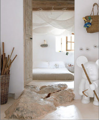
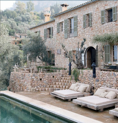
One of things I enjoy the most over the weekends is to sit down and enjoy my weekend readings. While reading T magazine I came across this spectacular vacation home in Majorca, Spain that belongs to Alexandre de Betak, a very top notch event producer, art director and designer who has organized fashion shows for many important clients from Rodarte to Dior. I was perplexed by the perfect adjustment of this stone house to it’s surroundings. White plaster walls cover the surface of the interiors, including the ceilings, while the kitchen floor is cover in pebble tiles. Every small detail was carefully planned from the rock shelves on the walls that seem like they were formed naturally to the lighting that appear to have grown out of the rocks. The coolest feature for me is the kids room with three blob-shaped sleeping caves, I mean really? How incredibly fun is that? The only extra thing I would ask for this house to have? Well, It would be to have Nadal as the next door neighbor.


The tv room with over-sized pillows covered in vintage linen. I can only imagine the great texture.

all images for T magazine.