Month: August 2011

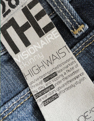
This past week has been a little more than hectic.  Between work projects, Luca’s bathroom renovation and rushing-in last minute shopping, I was also getting things ready for our get away for a week.  We have rented a house in The Hamptons specifically in Sag Harbor and I’m so looking forward to just disconnecting starting from tomorrow.  Whenever I’m going away I like to refresh my wardrobe by getting a few pieces that could relate to the place I’m going to and when I found these jeans with an uber-cool tag on it, I was sold.  Because nothing says more “Boho-Chic” to me than Sag Harbor.  I’ve heard a lot of good things about Tahitian Monoi oil so I was happy when I found this one (below) and even happier when I tried it.  It’s unbelievably soft and smells heavenly.  The great thing about is that it’s not greasy at all.  It feels more like a silky touch.  It really is incredible!

While up-and-around in the City I use sunblock that don’t smell like sunblock but for the beach or a beachy town I want to smell sunblock all over.  After all that is a smell that I absolutely adore.  I’m looking forward to trying this one below.  Available here.  If it turns out that it doesn’t smell too much like sunblock we’ll have Jack Black, a product we’ve been using for a few years now. 

when under the sun I like to spray this L’Occitane product on my hair because it protects it from the sun rays, sea water and the pool.  A girl’s gotta take care of her hair!

A Paul Rafferty’s painting of Sag Harbor’s main St.
Bon Voyage! I’ll make sure I stop in once in  a while. 
Have an excellent weekend everyone!

 Mid-Century Italian Pottery via belle vivir

Mid-Century Italian Pottery via belle vivir

While visiting Columbus, OH a couple of weeks ago I came across my newest obsession: Mid-Century Italian pottery.  I purchased these two pieces (above) and I am so happy with them.  I didn’t know much about Mid-century Italian ceramic when I got them but it has for sure awakened my interest in knowing more.  All I know is that they are hand-thrown, embossed, painted and then glazed.  Each piece of ceramic can be as diverse as Italian pasta sauce can be, having that Global-Chic look I so much love, I think I found a reason to start a new collection.

Mid-Century Italian Pottery via belle vivir

Gambono Style mid-century horse in gilded Italian pottery available here.

Mid-Century Italian Pottery via belle vivir

this piece of glam is available here.

Mid-Century Italian Pottery via belle vivir

 These set of striped Raymor Era ceramic vases are available here

Mid-Century Italian Pottery via belle vivir

Whimsical pair of table lamps, here.

Mid-Century Italian Pottery via belle vivir

This entire collection, designed by Aldo Londi in the 1950’s for Bitossi has been re-produced and is available here.  Below, two homes featuring Mid-century Italian pottery and plates.

Mid-Century Italian Pottery via belle vivir

Read More…

When I saw this kitchen the first thing that caught my eye were the ceiling pendants.  Designed by Tom Dixon they are actually made of a type of plastic with a metalised copper mirror finish, which are available here.  This kitchen gives me the impression that it’s been lived-in by two owners with two completely different tastes where the second one added the warm side to it.  Everything from the island, which can also work as a separator and as an occasional buffet table, to the copper ceiling pendants and the Herman Miller molded plastic side chairs could have been the clever touch to jazz up this open, no-upper-cabinet kitchen.

“In most people’s vocabularies, design means veneer. It’s interior decorating. It’s the fabric of the curtains of the sofa. But to me, nothing could be further from the meaning of design. Design is the fundamental soul of a human-made creation that ends up expressing itself in successive outer layers of the product or service.” Steve Jobs


Have a well designed and decorated weekend!
Designed by Ashley Whittaker Photos by Francesco Lagnese
Miles Redd, Danielle Rollins's home, living room via belle vivir blog

Yesterday I went into Miles Redd’s website and was more than happy to find more and new images of this amazing Atlanta home designed by him and featured in Town and Country a few months ago.   The home belongs to Danielle Rollins, Veranda contributor editor.  Danielle Rollins’s home is what dreams are made of.  The house was restored by Gil Schafer and decorated by the very talented Miles Redd.  What seems to be a girl’s vanity (down below) is just adorable.  I could say so much about Miles Redd, for instance, that I dig his style. His signature style, Cozy Glamour translates itself flawlessly into any home he designs.  I love how he plays with drama, philosophy, grandeur, and reality to create his one of a kind incredible interiors. He relies on innovation and imagination to re-create classic and elegant interiors that express the client’s personality.  The many often use of stacked books in his projects make me also define his style as a “Modern Intellectual” approach in the actual world.  Miles Redd began working for antique dealer John Rosselli, later working for decorator Bunny Williams. After making his apartment a statement of his signature “Cozy Glamour” and clients arising encouraged him to open his own office in NYC in 1998. Since then his career has skyrocketed. In 2003 Miles Redd was named the creative director of Oscar de la Renta Home.  Who could ask for more? To see how Redd designed his mom’s house go here.  But first, let’s feast our eyes.

Miles Redd, Danielle Rollins's home, living room via belle vivir blog

Lovely sophisticated combination of blue and brow in the living room. An extraordinary mixture of fabrics and patterns in Miles’s hands is magic.

Read More…

I have the below bathroom image designed by Windsor Smith in my inspirational board for a while and when the opportunity to renovate Lucas’/guest bathroom came I wanted to create a similar nautical feel but with a more global atmosphere while considering our adult guests.  While searching for another project a few months ago I came across this fantastic antique brass half moon sconce (above) and I haven’t been able to take it out of my mind so I knew this was the time for me to squeeze it in somehow.  The wallpaper is Kattie Ridder’s although it’s not the final color.   I’m planning to use it on two walls of the bathroom while the rest of the walls will be covered from floor to ceiling with 8×8 white porcelain tiles.  If I don’t get to use it due to the fact that the bathtub is going to be also a shower, then I’ll stencil something similar.  On the floor I decided to go with white penny tiles with a blue border around the room.  The mirror (not exactly the one pictured) will be inside a big wall niche above the sink console which is going to be custom made to fit the space.  I don’t really believe all hardware in a bathroom have to be from the same design or finish for that matter, that’s why I’m using two different styles of bathroom fixtures and in this case even two different finishes.  Edwardian bathtub faucet in polished nickel and one single whole faucet for the sink in antique brass to complement the sconce and the Ralph Lauren marine porthole ceiling fixture.  For more conservative people this may not even be in question but if I don’t wear a matching suit everyday why should my bathroom
 

I love the creativity touch of the ship’s helm and that little penguin, how adorable is he?