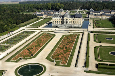
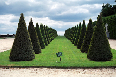
Jardin à la Française or French Formal Garden is a garden design based on harmony and balance born during The Late Renaissance in France. There French Landscape Architect named Andre Le Nôtre has received all the credit for The French Formal Garden. He got the accolade after he was responsible for the transformation of the gardens of The Castle of Vaux le Vicomte, which after that became to be one of the most spectacular Chateau in France of its time. This Garden design has its origins in Italy during the Renaissance revival. Andre Le Notre is also responsible for the famous The Petit Trianon’s garden which he designed while working at gardens of Palace of Versailles, the beginning of what is today The Avenue des Champs-Élysées, Chateau Fontainebleau and many other spectacular gardens not only in France but also in England, Italy and Germany. The landscape architect was a pure genius as you can see… The Jardin à la Française style combines the use of parterre or bed of greens in geometric shapes divided by gravel walkways, topiaries, fountains or pools in symmetrical patterns in an attempt to create a perfect integration to the Architecture of the Chateaus resulting in a perfect perspective view from miles away.
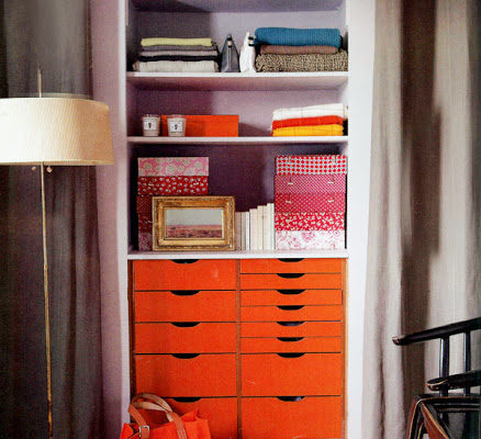
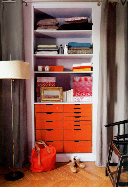
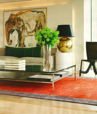
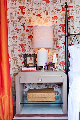
Color seems to revamp me every time. It always makes me feel like I have freshly woken up from a great night’s sleep! It’s no news to anyone that Pantone has declared Tangerine Tango the color of 2012 and with good reason. Tangerine is such a happy color and it seems to go well and complement almost every other color. Below are a few images from my Pinterest: A Colorful Life Board.
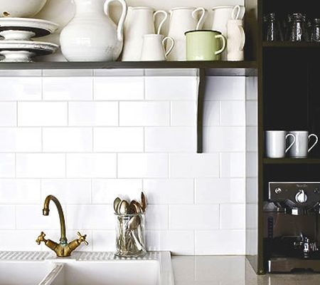
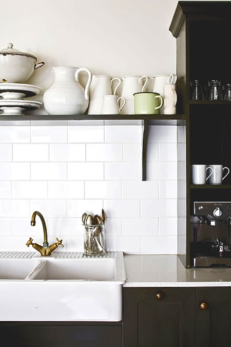
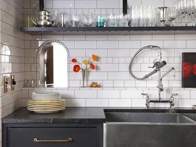
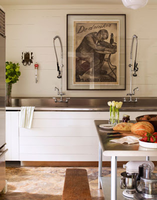
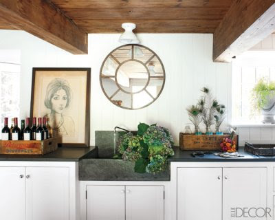
From industrial necklaces to industrial sinks in the kitchen. Somehow, the relationship is there because in these kitchens sinks are not only functional but they play the role of accessories as well, lending the kitchens a feeling of old and well lived. Not something anyone would look forward to in fashion though.
Absolutely adore the use of different tile sizes in this kitchen. The faucet looks like a very cool mess, is like a sculpture on its own. The honey black marble counter picks up the light gray grout. Love the aged chrome handles.
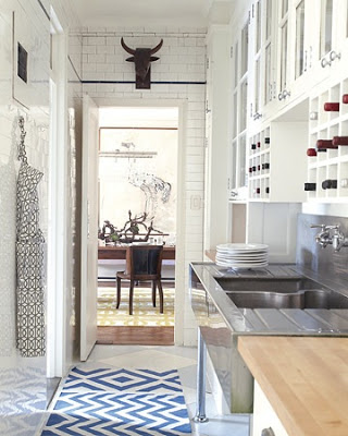
White floor to ceiling subway tiles with a black or navy blue penny border make this narrow space a lot bigger. In this butler pantry, the space above the industrial sink is smartly used with wine racks.
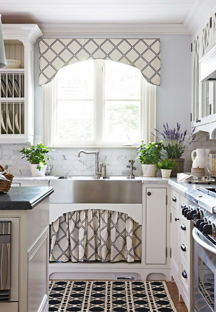
This kitchen from Traditional Home magazine is more on the dressy side than anything industrial, but the sink is and so is the faucet, which kind of makes it a bit country. Very lovely and charmy!


