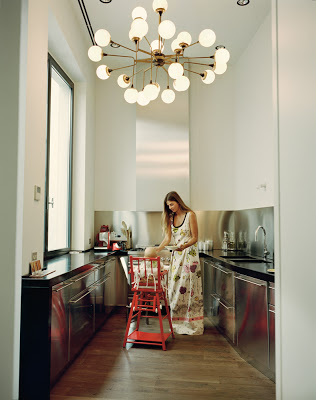
Although I’m more inclined to a mixture of modern and traditional. My Interior Design style consists more of classic lines combined with modern touches; I appreciate modern and clean lines in Interior Design. Especially because it’s a smart way to go when dealing with tiny and narrow spaces as in these small kitchens. As it’s well known “less is more” and I’m not one that uses that term very often because mathematically doesn’t make much sense, lol. On the other hand, though these small modern design kitchens featured here are all small and with clean line kitchen cabinets, they all have something in common that stop them from being boring. These unique elements are the finishing on the cabinets, fixtures, and accessories. These smart designers kept things interesting with finishing such as lacquer, stainless steel, gorgeous marble as backsplash, and a lot of brass or gold accents. Lovely details that can make all the difference. Who said that modern kitchen design has to be boring?
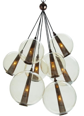
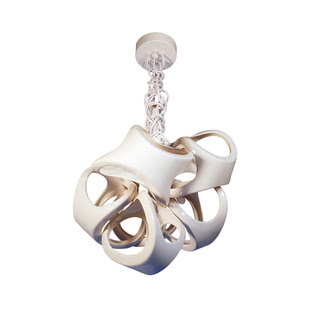
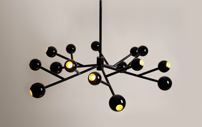
Caviar Lighting by Laura Kirar.
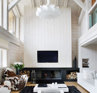
While many rich and famous take the first month of the year vacationing to warmer weather destination, others like myself go back to work and duty. Unnaturally though I would rather be somewhere else where there is a lot of snow and mountains- at least for a very short time. A Cabin like this one in Megève to come back to after a long day of skiing (with an aching body from all the falls) is of course part of that wish. The basic black and white
of this cottage is very soothing and fitting for the million dollar view of the Swiss Alps, however I would rather have seen a bit more shades of brown throughout. The cowhide chairs for instance are the queen of this house, what do you think? The kitchen with its monochromatic palette is a big focal point of the cabin and the tulip chairs with rabbit pillows are also a great warm detail. Enjoy!
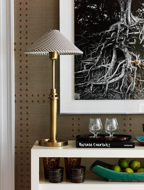
Studded Nailhead Upholstered Walls is one of the most elegant and relatively inexpensive ways to add elegance into your home. Bringing architectural interest into our home can be done by simply upholstering the walls in fabric or wallpaper and adding nailhead along the edges of the walls or in different patters as if forming a nailhead trim. This type of wall treatment brings dimension to any room. I’ve said before how I think that upholstered doors is the ultimate attention to detail. That is of course if there are no upholstered nailhead walls nearby to compare them to. The is definitely a great amount of work and effort that goes into creating one of these amazing studded nailhead upholstered walls. Especially those that form specific patterns over the wallpaper or fabric. This technique also brings instant coziness to any home decor style. There is already wallpaper designed to look like studded walls making the process a lot easier, and none the less beautiful. Phillip Jeffries has a collection called Rivet that comes in different color contrast. Shown in the picture below Enjoy!
This image above shows one of Philip Jeffrie’s Rivet Collection where the wallpaper appears to have embedded nail heads. You get the great result without the extra effort.
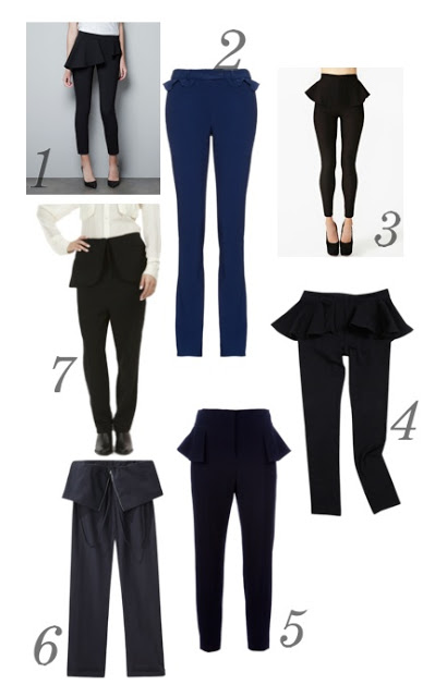
One of the coolest things that’s happened to fashion lately is Peplum. It’s feminine, whimsical and beautiful! It’s nice to see it’s not going anywhere anytime soon, instead is spreading to other important wardrobe pieces such as pants. All of these models here would ook great with a cropped top. Don’t you think? Enjoy!
1- Zara, 2- Preen, 3- peplum skinny pants, 4- Peplum legging, 5- Alexander Mcqueen, 6- Peggy Peplum pants, 7- Crinkle Apron trousers

