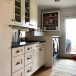
When I asked my client what atmosphere was she looking to feel after this kitchen renovation, her response was, “I want something that feels more like a cottage,” I instantly loved the idea. I loved the fact that she wasn’t looking for a pretentious looking kitchen which would’ve been in complete disharmony with the rest of her home. It all started with a hand sketch of my vision, which she immediately fell in love with. We stayed away from white kitchen cabinets and instead went with semi custom-made grey distressed finish ones. For more of a country feel we chose beaded cabinet doors — Interior Design by Julie Paulino Design.
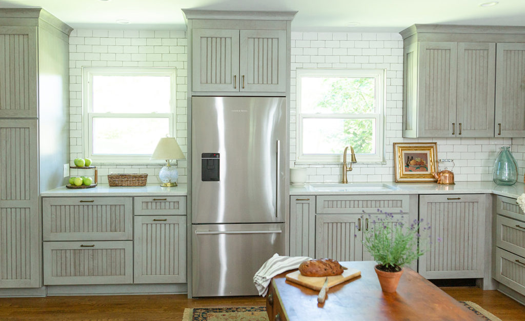
My client has other homes around the country, and she hardly uses this kitchen, so we were able to ditch some of the upper cabinets. That last option made the kitchen feel grander and brighter. For contrast, we chose hand-made glazed white subway tiles, which also add great texture to the walls. Below, are three computer renderings that we provide our clients once the design is agreed. Further down, a before picture of the old kitchen.
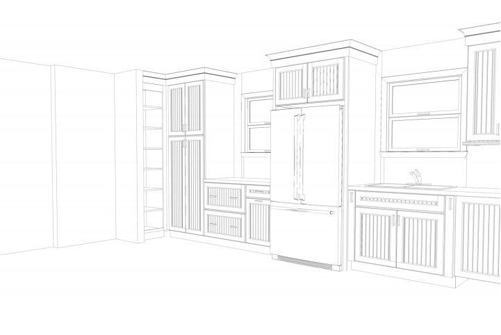
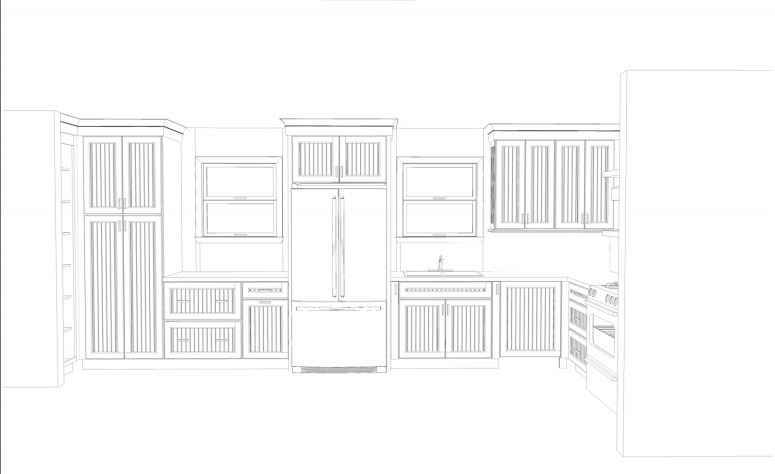
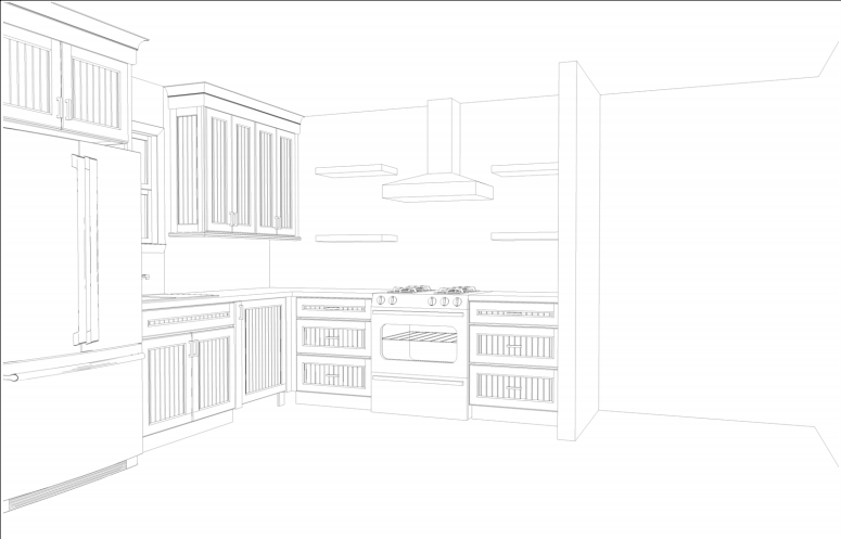
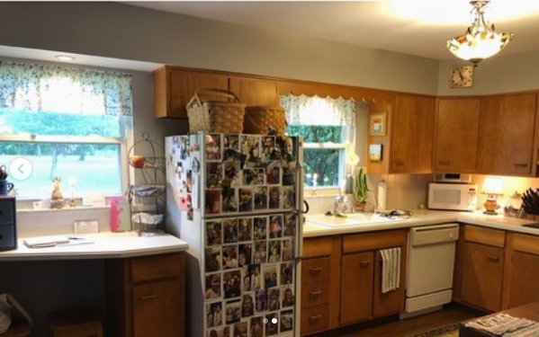
As you can see, the kitchen was very dated. We got rid of the soffit and completely gutted the entire room. We replaced the fake chandelier for recessed lighting to bring more artificial light into the kitchen. We also replaced all the white appliances for stainless steel ones. Even though this kitchen was meant to feel authentic and non-pretentious, make no mistakes, there was no DIY involved in this kitchen remodel, and the final cost of the entire project was within the range of 60K-80K. If you want a well-designed space that consists of renovating and professionals, it won’t be cheap. But the most rewarding feeling is when you as a client get what you always wanted, what you ever dreamt of and when it’s built to last for decades to come. DIY won’t give you either one of those results.
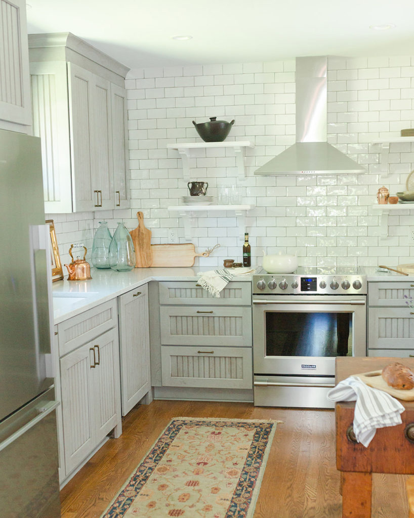
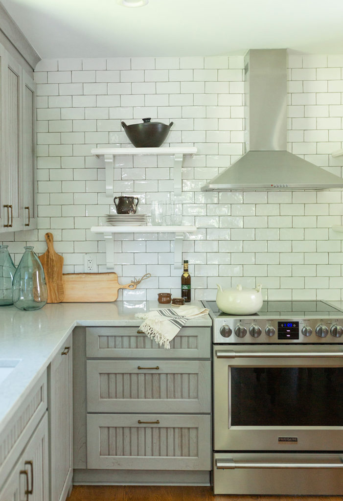
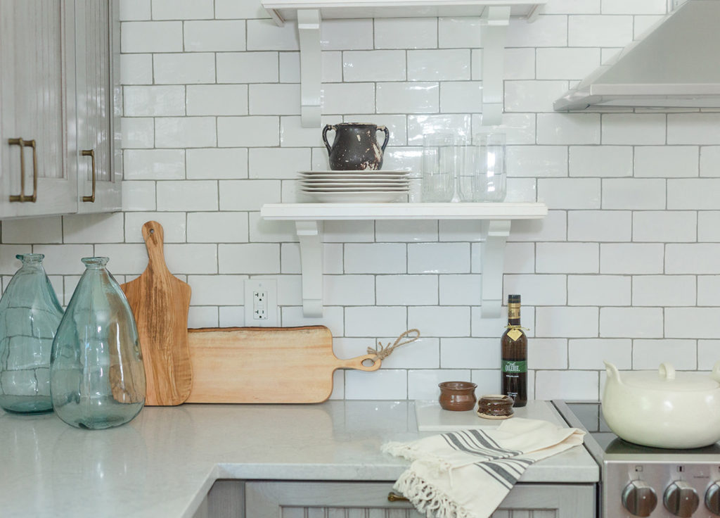
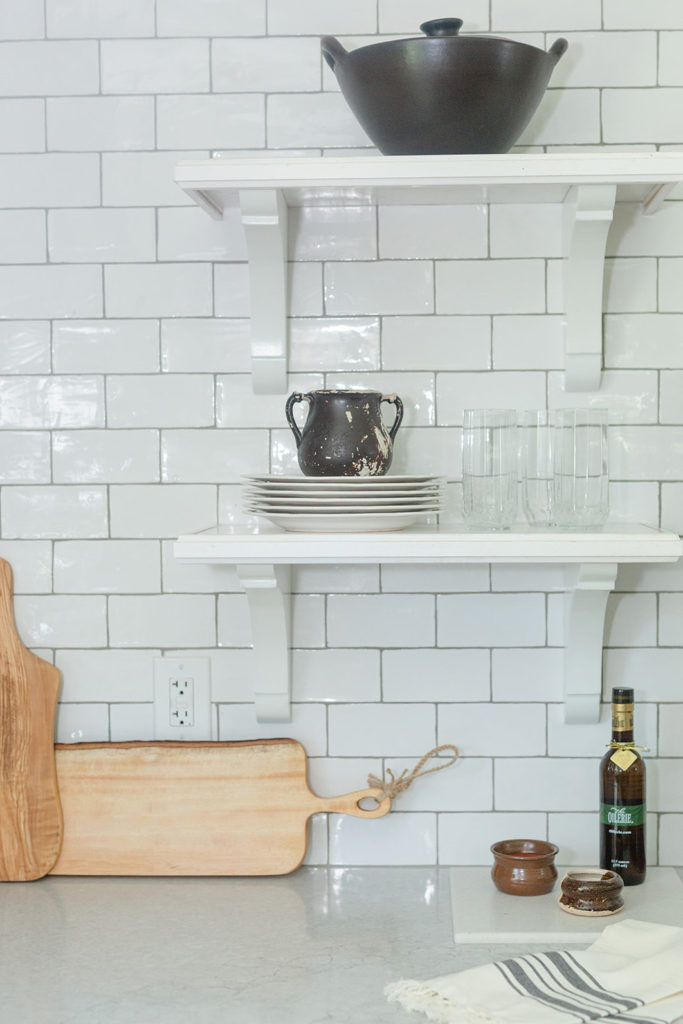
The pretty glazed subway tiles add light and texture to the stainless steel stove and hood. We added wall shelves with brackets, very appropriate for the cottage theme of the kitchen design.
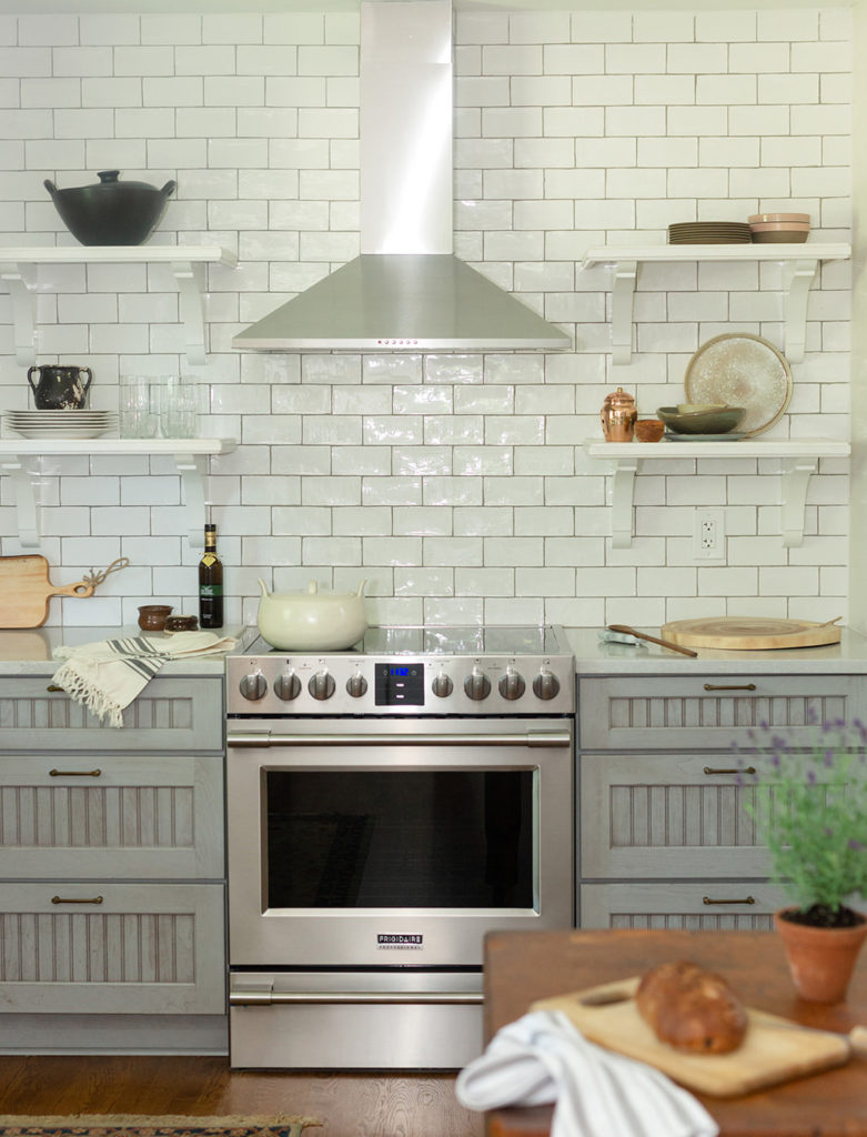
My client is a very practical and active lady, so we decided on no window treatment for the sake of mere practicality.
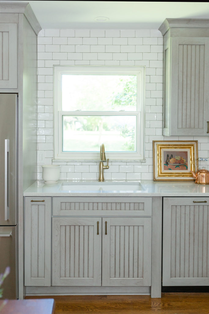
We chose bronze color hardware for the cabinets and drawers.
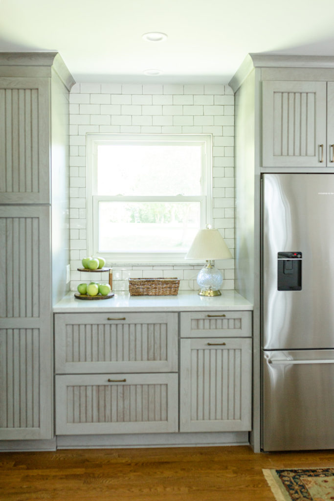
The fridge is counter-depth, something essential for me so it wouldn’t jut out.
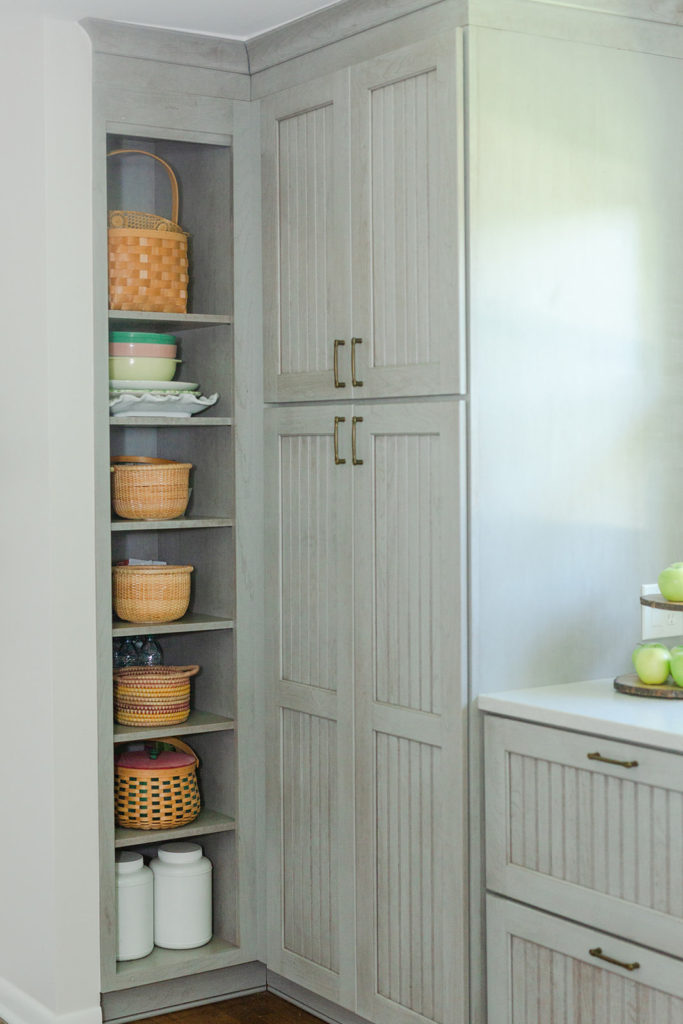
We left a tall cabinet with open shelves so she could display her wicker baskets and for easy reach for her dog’s food.
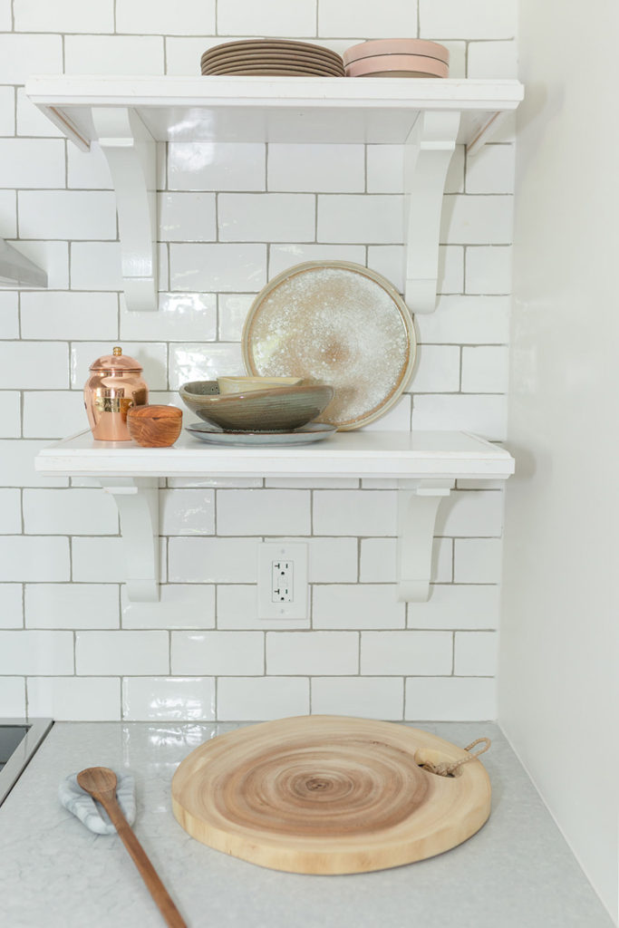
A close up of the right side of the stove. We wanted the subway tiles to stand out, so we used light grey grout. The countertop stone is quartz.
Designed by Julie Paulino Design. Photos by Emily Sommers.
The total price range of this kitchen remodel was within 60K-80K
“I am so grateful for Julie Paulino Design! She held my hand and brilliantly guided me through my remodel. Her initial rendering of how my new kitchen and master bath would look upon completion was powerful enough to get me through the process. She knew what she wanted from contractor and retail services and did not waiver. I am 100% satisfied.” Judy

