Category: Accessories

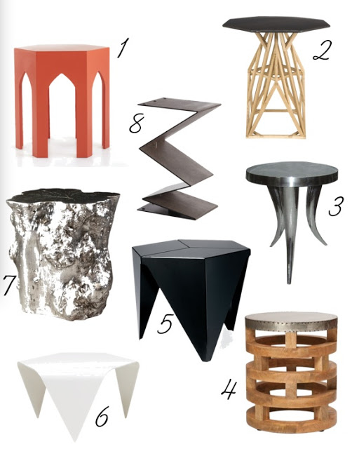
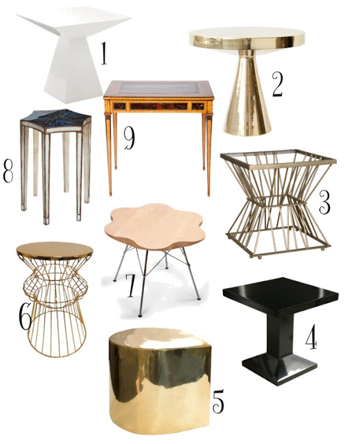
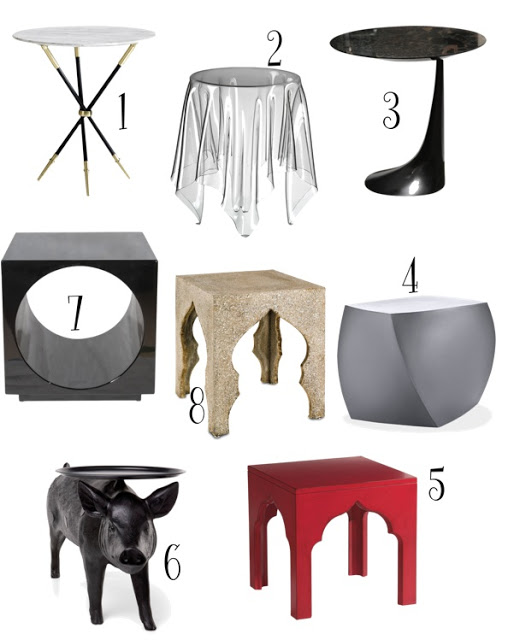
Our homes will never be really ours unless each piece reflects our taste and lifestyle. Magazines are great for sources, inspirations, and knowledge but if we pick everything in our homes based on the magazines we look at, then our places are going to be nothing else but a recollection of trends.  Of course our choices will depend on our budgets as well; however, it’s better to build our homes slowly over time and invest on pieces that we genuinely love and are willing to live with for a long time.  Since long gone are the days when rooms looked like period rooms, small pieces such as side tables are a great way to incorporate interest and individuality in our homes.  Here is an excellent shopping suggestion of an eclectic selection of side tables of all styles for your delight.  Enjoy!

An eclectic selection of side tables roundup of all styles for your delight.

side tables roundup via belle vivir blog
1, 2, 3, 4, 5, 6, 7, 8,
side tables roundup via belle vivir blog
1, 2, 3, 4, 5, 6, 7, 8, 9
side tables roundup via belle vivir blog


1, 2, 3, 4, 5, 6, 7, 8

Read More…

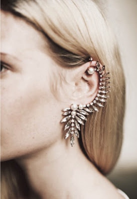
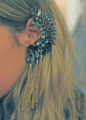
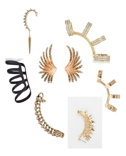
A statement necklace is not enough anymore! Now it’s time for the statement fever to climb up onto our ears and stick on like a frog, literally.  Ear Cuffs are the “it” accessory for Spring 2013!  From simple hanging chain ones to fancy ones with stones in all kinds of shapes, we have it all to our likes.  Here is a small selection for you all cos’ you’re special!  Enjoy!

Two cuffs above are by Ryan Storer

Clockwise from top right, Century 21, Repossi, Repossi, Spiked bar cuff earring, Crystal lobe cuff, Black elongated spiral ear cuff and center Ca & Lou.


Read More…

I’m especially exited today because after four long living-with-rental-furniture-months we are finally getting our stuff tomorrow.  It’s play time! I have a pretty clear idea of where things are going to go, but boy can’t that change? One thing that I’m certain though is the gallery walls I
want to create around the house.  I’m a big fan of picture cluster walls and I’ve realized that when there is a lot of different ways to create them and/or to display them, each produces a different background.  From a complete harmonious and balanced display, to careless and Bohemian one to a more eclectic grouping.  Each and everyone translates the personal
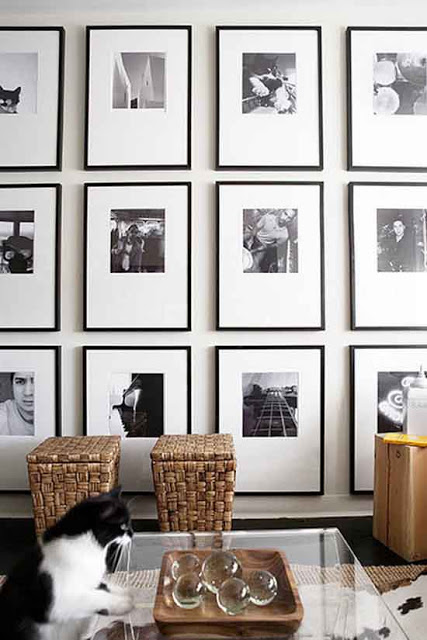
lifestyle of their owners, as it should be.  So I’ve been paying attention about how to create the best gallery walls or wall art composition as some call them.  For creating a harmonious and balanced gallery wall is good to keep things simple and hang each picture at the same distance vertically and horizontally speaking.  One thing to keep in mind is to keep all frames and matting in the same color.

how to create the best gallery walls, black and white gallery wall via belle vivir blog

A display of black and white photography hung with the same identical distance between them creates a more modern aesthetic.
Read More…
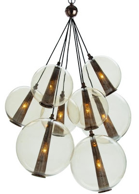
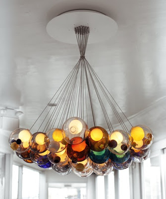
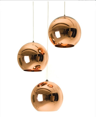
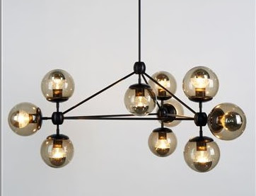
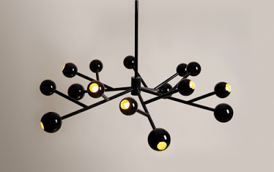
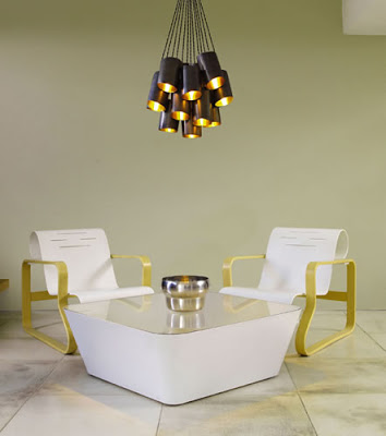
cluster chandelier roundup via belle vivir blog

 Caviar Lighting by Laura Kirar. 

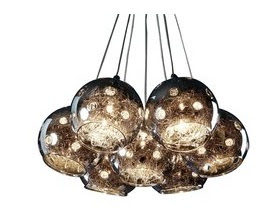
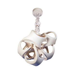
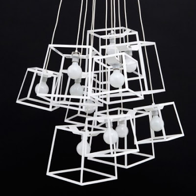
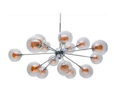
Often people underestimate the power of lighting.  Lighting doesn’t just create the perfect mood or ambiance (tranquility, serenity, romanticism or harmony) in a room but more often than not becomes more of a focal point by itself.  Take for instance the chandeliers we choose for our dining rooms where they usually hang more at eye level.  It would be a very noticeable mistake, if not costly, to choose the wrong one.  The cluster chandeliers I’ve seen lately in design magazines may just be what the doctor ordered offering simplicity and sculptural element at the same time.  Their hanging globes (sometimes in different size) are together and connected by either wires or a metal structure.  They also may come with facing down shades.  Either style you choose these are destined to be a classic.  Enjoy!
cluster chandelier roundup via belle vivir blog
Bocci
cluster chandelier roundup via belle vivir blog
Artcraft Lighting
cluster chandelier roundup via belle vivir blog
 Cluster Chandelier
cluster chandelier roundup via belle vivir blog
Tom Dixon
cluster chandelier roundup via belle vivir blog
Modo 10 Globe Chandelier
cluster chandelier roundup via belle vivir blog
 Above and below, Usona

Read More…

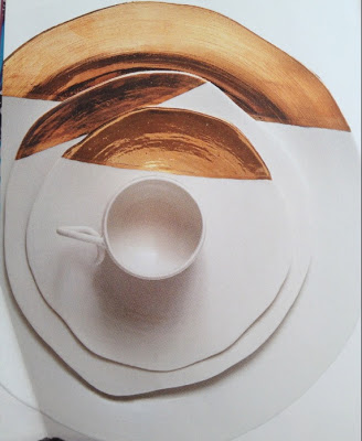
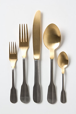
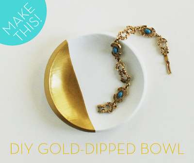
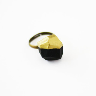
Good morning beautiful people.  I feel like it’s been ages since my last post.  I’ve been busy getting to know my surroundings a bit and enjoying myself and family.  I’ve been also working on that thing I’m planning that I told you about.  Who doesn’t need some shimmering in their lives and what better place than on your table?  I’m loving the selection of Gold-Dipped accessories and tableware available now.  There is so much available now from plates to flatware and even jewelry.  I put together a list of my favorites for those of you who might be interested.  The top first pictures is from a Brazilian artist, Nicole Toldi who makes wonderful porcelain and ceramics and recently came out with these glamorous set of gold-dipped tableware set.  I’m immediately in love with it for many reasons but, mostly for its organic form.  Notice the handle of the cup.  Very beautiful!  Enjoy

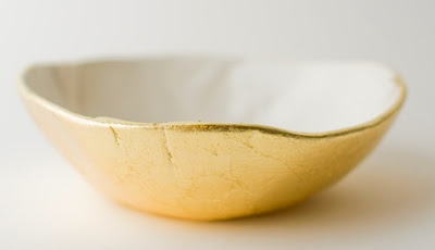
Gold bottom dish at up in the air somewhere.  No really, that’s the name of the website!

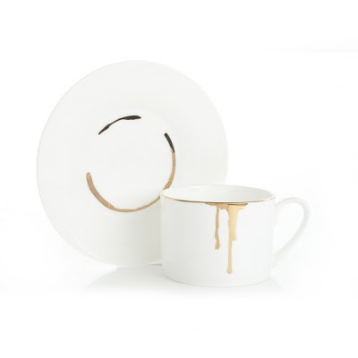
And then food marks on your plate and your cup has never looked this nice.  Add some dripping glam for your morning coffee with this set of drip tease teacup and gold saucer at Reiko Kaneko.

Gold-Dipped flatware at Wanelo.


A really cool DIY for making your own gold-dipped plates, for those who are very handy here.


Love the modernity in this ring available at Etsy.


Read More…

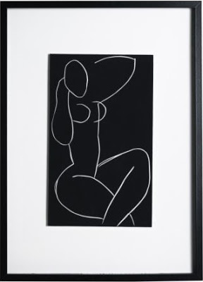
Everyone knows that designing a house and making it feel like a home takes many long and exhausting months, if not years.  So when I realized that I would only have two months to plan, design, execute, anticipate the smallest details and to think about what we might be needing in the future, I know that in order to not go insanely crazy, I had to rely on things that were not too expensive and too valuable but still good looking.  I don’t know much about Sao Paulo yet, but I know that things tend to cost three times more.  So where did I go to for basic
things as art? right! Ikea.  I was planning to buy things such as a mattress for our little one, a foot step for his sink  and so on.  Imagine my surprise when walking around I found very good looking prints!  God, was I glad, there are an awful lot of empty walls in this house that will need to be filled. We got the second one below by Deborah Azzopardi for Lucas’s room, of which I will only tell you that it will have a bunch of stripes.  Yeah!


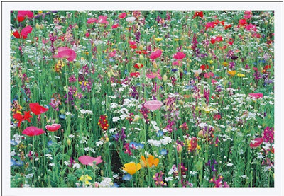
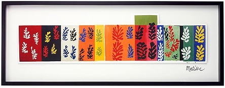
 The top is a motif by Amelia Lancaster.  Bellow, Ikea’s selection of Matisse motifs.   We also got one or two of those.

Read More…