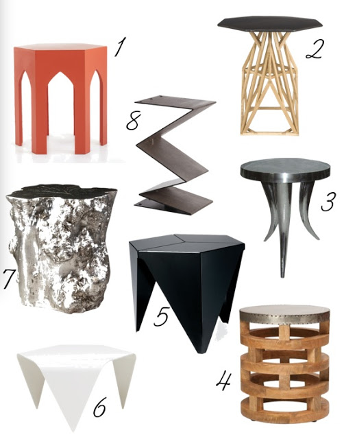
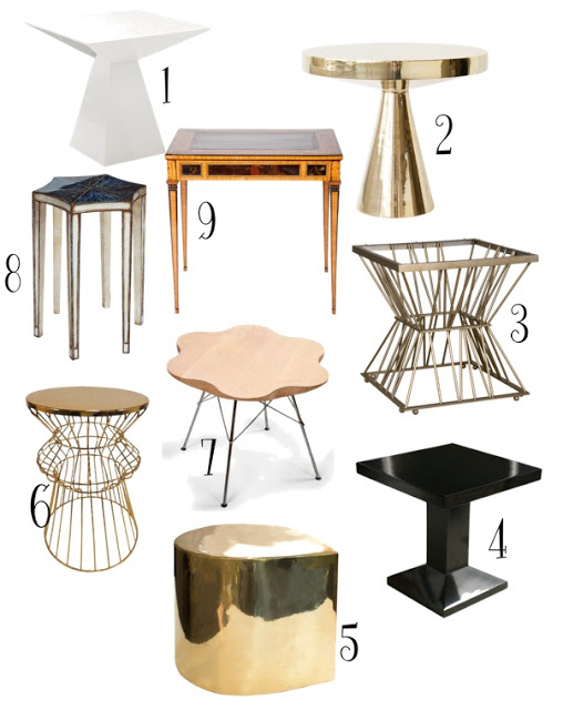
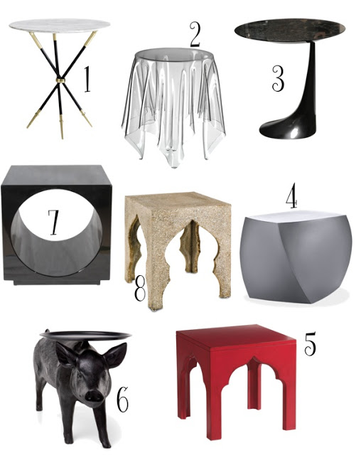
Our homes will never be really ours unless each piece reflects our taste and lifestyle. Magazines are great for sources, inspirations, and knowledge but if we pick everything in our homes based on the magazines we look at, then our places are going to be nothing else but a recollection of trends. Of course our choices will depend on our budgets as well; however, it’s better to build our homes slowly over time and invest on pieces that we genuinely love and are willing to live with for a long time. Since long gone are the days when rooms looked like period rooms, small pieces such as side tables are a great way to incorporate interest and individuality in our homes. Here is an excellent shopping suggestion of an eclectic selection of side tables of all styles for your delight. Enjoy!
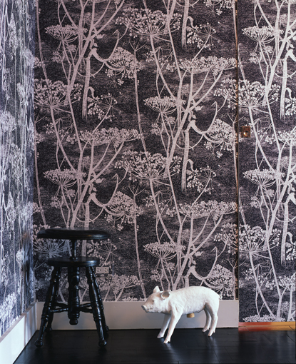
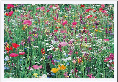
I love wallpapers, preferably geometric ones, because they seem to not get old (in my eyes). Cow Parsley by Cole and Son though has been in my “wanted list” for a while now and having seen it here and there and still love it the same, I know I won’t get tired of it. It’s not-too-precise-design perhaps has something to do with it. It allows my eyes to travel and rest
while looking at it. It comes in twelve different color combinations but my favorite is the black and white (sort of a Grisaille effect). I think this wallpaper would be amazing in a lobby. Enjoy!
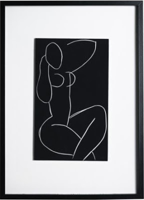
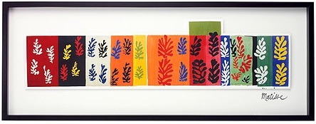
things as art? right! Ikea. I was planning to buy things such as a mattress for our little one, a foot step for his sink and so on. Imagine my surprise when walking around I found very good looking prints! God, was I glad, there are an awful lot of empty walls in this house that will need to be filled. We got the second one below by Deborah Azzopardi for Lucas’s room, of which I will only tell you that it will have a bunch of stripes. Yeah!
The first picture below is not the best picture of the folding screen I’m referring to, but you get the idea. How to make a folding screen: I believe, correct me if I’m wrong, there is no standard size for the width of the panels of a folding screen, but there is a need for the thickness to be at least 1-1/2″ in order for the screen not to tilt over. I had the frame custom made (cut-assemble-paint) by my carpenter and then I wallpapered it myself. Now, here is the trick of how I did it. To make the entire process a lot easier for me I asked my carpenter to make each panel the same width as the wallpaper. That helped me to avoid cutting the wallpaper along the sides, which is very complicated and time consuming. The size of the screen is 7′ tall with four panels of 20″ wide. I liked the Block Wallpaper by Erika Wakerly in brown, gold and beige.
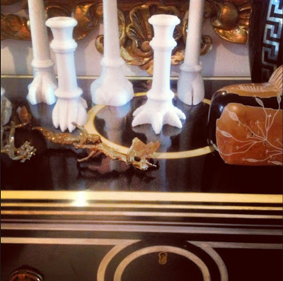
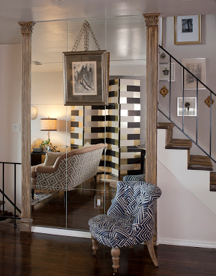 I can’t believe that exactly four years ago we moved into this house and started remodeling it slowly. And just when it’s finished it’s time to pack up and move to another country. I look forward to moving to Sao Paulo and start designing our new home. Nothing like having complete autonomy when decorating a home. Below are two more shots of vignettes in our home. On a separate note, the genuine and sweet Ada from Classiq invited me to be part in her beautiful Chic Files series and I’m more than flattered. If you want to see me pretending to be an important person and answering a few fashion-related questions and wearing my loving stripes then head over there. Enjoy!
In case you’re interested. Above, an ebonized inlaid commode from Italy and it’s from Lerebours Antiques at E 60th St. The alabaster candle sticks are by Jardins en Fleur, the Greek key base is a Home Goods find, the brass sculpture, the marble lion sculpture and mirror are from a local vintage store.
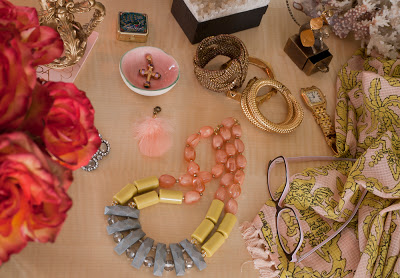
A vignette of my vanity. The necklace and scarf are from Anthropologie, the cross is custom made (my mom’s), the coral and the pill case are from Turkey, two of the bangles are from C. Wonder and the one next to the watch is from the Antique Garage Flee Market.
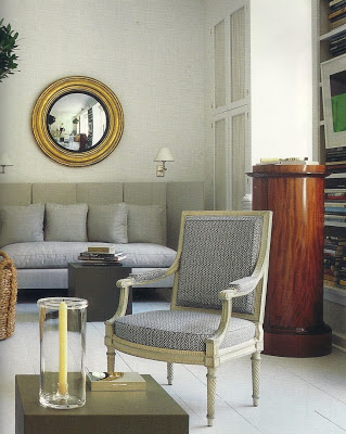
Probably the mirror used by the witch in Snow White was a convex mirror since it’s a mirror with a power of optical illusion. Also referred to as Bulls-Eyes mirrors, curved mirrors and witch mirrors, convex mirrors reflect images in a way that they look to come from a central point, inside the mirror. The curvier the mirror the closer is the reflection. The outward curvature of convex mirrors make the reflected image look sort of virtual. History has it that for centuries convex mirrors were the only ones existing, as it can be depicted in antique paintings. The mirror became popular in the US during The Federal period where the Eagle was added as a symbol of the Country. I would love one as big as possible for our new house in Sao Paulo. The beauty of the federalist convex mirror is in in the ornamentation that many of these mirrors have. They can bring glam and character to any room when needed. They look great as a stand along wall accessory or as part of a gallery wall combined with other curved or round mirrors. These mirrors are also more fun than regualr one-dimension mirror because the images reflected by them have more movements.
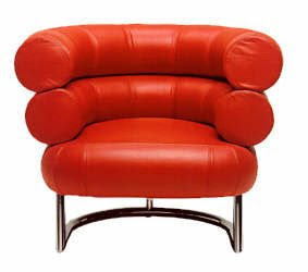
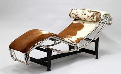
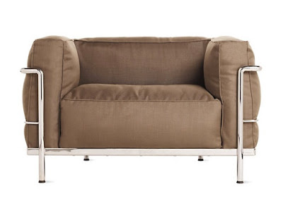
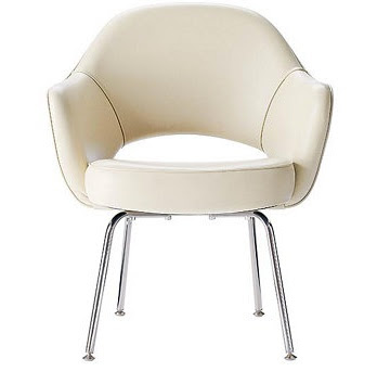
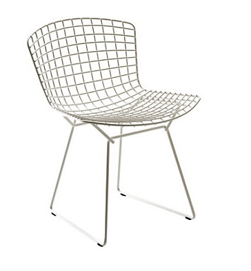
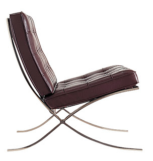
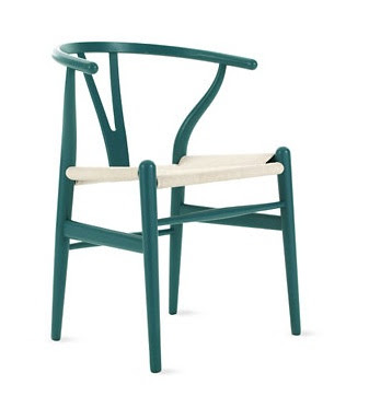
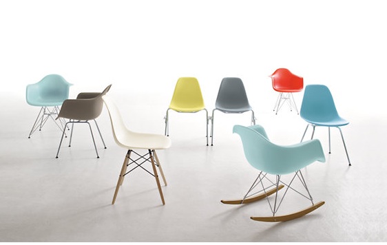
As a designer I appreciate all kinds of furniture from very traditional to modern and contemporary ones. An Interior designer should be able to create all different kinds of style for their clients. From contemporary design to traditional, from glamorous to unpretentious ones. My lovely mother-in-law, whose taste is more contemporary, once told me “you don’t like modern” and my response was “I like modern furniture with classical reference.” We find comfort in what we know and/or we can relate to, so these types iconic furniture which are modern but have been around for over half a century are the kinds that offer an incredible balance between tradition and modern. Here are some of my favorite Modern classic furniture.

