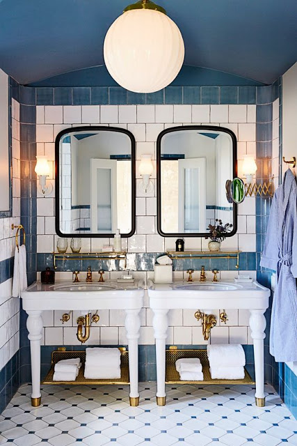
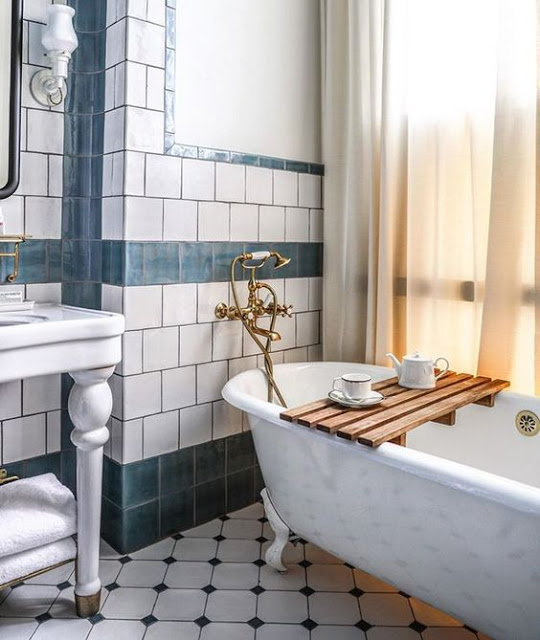
From Chinoiserie wallpaper, mosaic flooring and iconic Salamandre Zebra
wallpaper to free standing tubs, all these bathrooms have a must have feeling of coziness.
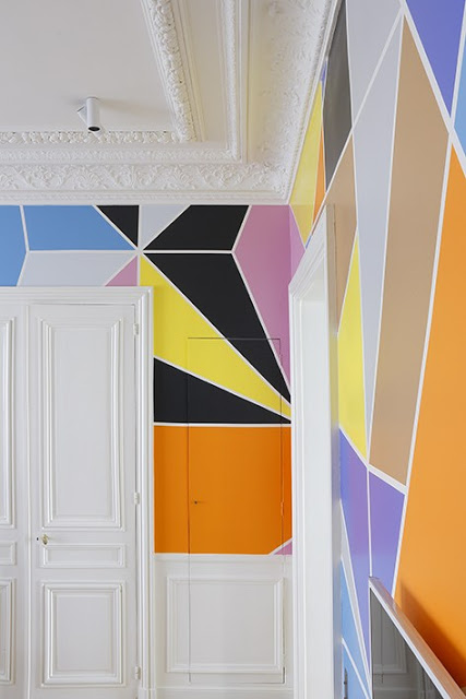
This modern Parisian apartment was designed by Studio Razavi. The clean lines throughout the apartment was an attempt to step away from the neo-classical features of the Haussmannian style, hence the use of geometric colorful murals on the entry walls and modern custom furniture. The theatrical decor is a nod to the owners love for contemporary art and film.
The geometric murals in this entryway can be a great weekend project.
Green is certainly the color closest to nature. From rich saturated ones to more soothing tones, it can create an oasis of serenity. Green has been a beloved color in America for a long period of time, yet few choose green when it comes to wall paint. Here are 12 gorgeous rooms that I hope will inspire you to go green. By the way, “Greenery” is Pantone’s color of the year 2017.
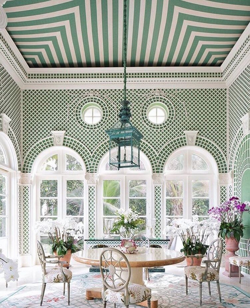
This Orangery/Greenhouse is covered with white trellis on green background and green and white striped fabric covers the ceiling.
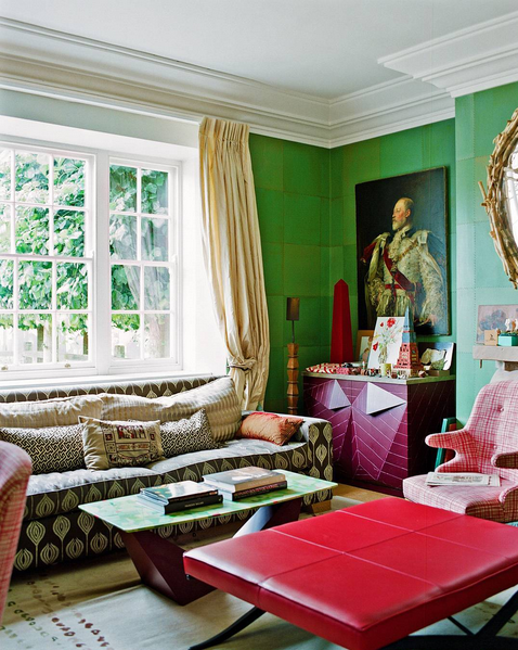
Ashley Hick‘s green drawing room contrast with reds and browns.
Susan Ferrier is a very well recognized Interior Designer who was born in New York and later moved to the South where in 2000 she partnered up with Bobby McAlpine and Ray Booth to form the very praiseworthy McAlpine, Booth and Ferrier. In 2005 she founded the firm’s Atlanta Design Studio. Susan’s interiors are grounded in the classics with a good dose of comfort and glam and they have been recognized by many prestigious publications such as Architectural Digest, Elle Decor, Atlanta Homes and Veranda. The latter one featured Susan’s own home in 2015, describing it as “an atmosphere of intrigue and wonder”. I love how Ferrier can effortlessly make a grand space feel comfortable and inviting. One of her source of inspirations is her many travels and she describes her work as “Romantic and Sensual, my interiors are layered and curated with diverse textures and shimmering accents. A house is not simply visual, it should evoke a feeling”. Susan co-authored the book, Art of the House, published by Rizzoli.
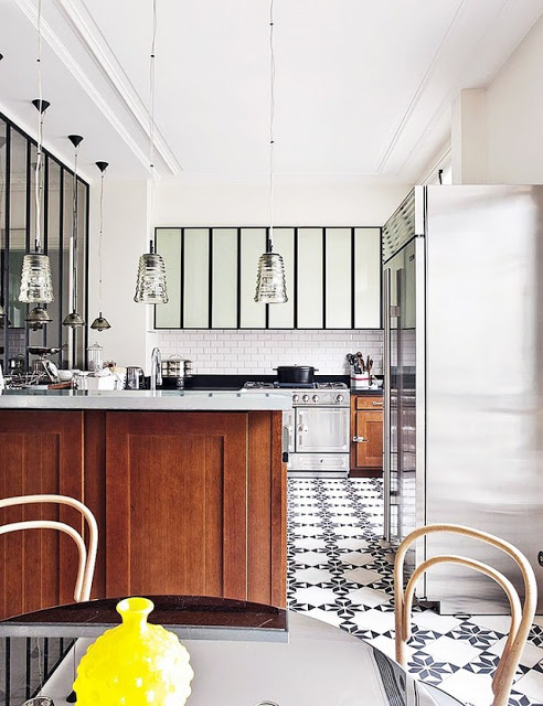
It should not take you by surprise the fact that Americans love to collect, thus their love for big kitchens with lots of cabinets. European kitchens, on the other hand, tend to be smaller for the reason that Europeans tend to buy only and mostly for current consumption, instead of purchasing and freezing food for weeks. Americans love functionality and comfort, Europeans love the simplicity and no hustle. Kitchens in America usually have big room pantries where they stack up on all kinds of food. On the aesthetic side, Europeans gravitate towards no upper cabinets perhaps as a reflection of their more simple lifestyle.
American Kitchen vs European Kitchen
European Kitchens
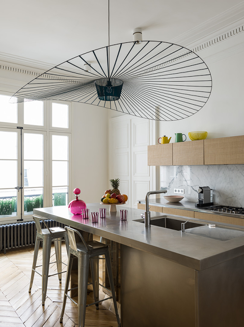
A kitchen designed Studio Razavi

