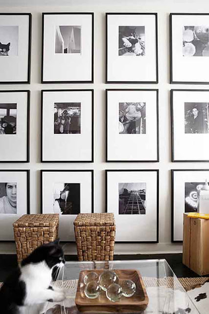
I’m especially exited today because after four long living-with-rental-furniture-months we are finally getting our stuff tomorrow. It’s play time! I have a pretty clear idea of where things are going to go, but boy can’t that change? One thing that I’m certain though is the gallery walls I
want to create around the house. I’m a big fan of picture cluster walls and I’ve realized that when there is a lot of different ways to create them and/or to display them, each produces a different background. From a complete harmonious and balanced display, to careless and Bohemian one to a more eclectic grouping. Each and everyone translates the personal
lifestyle of their owners, as it should be. So I’ve been paying attention about how to create the best gallery walls or wall art composition as some call them. For creating a harmonious and balanced gallery wall is good to keep things simple and hang each picture at the same distance vertically and horizontally speaking. One thing to keep in mind is to keep all frames and matting in the same color.
Read More…
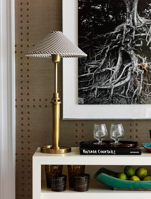
Studded Nailhead Upholstered Walls is one of the most elegant and relatively inexpensive ways to add elegance into your home. Bringing architectural interest into our home can be done by simply upholstering the walls in fabric or wallpaper and adding nailhead along the edges of the walls or in different patters as if forming a nailhead trim. This type of wall treatment brings dimension to any room. I’ve said before how I think that upholstered doors is the ultimate attention to detail. That is of course if there are no upholstered nailhead walls nearby to compare them to. The is definitely a great amount of work and effort that goes into creating one of these amazing studded nailhead upholstered walls. Especially those that form specific patterns over the wallpaper or fabric. This technique also brings instant coziness to any home decor style. There is already wallpaper designed to look like studded walls making the process a lot easier, and none the less beautiful. Phillip Jeffries has a collection called Rivet that comes in different color contrast. Shown in the picture below Enjoy!
This image above shows one of Philip Jeffrie’s Rivet Collection where the wallpaper appears to have embedded nail heads. You get the great result without the extra effort.
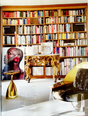
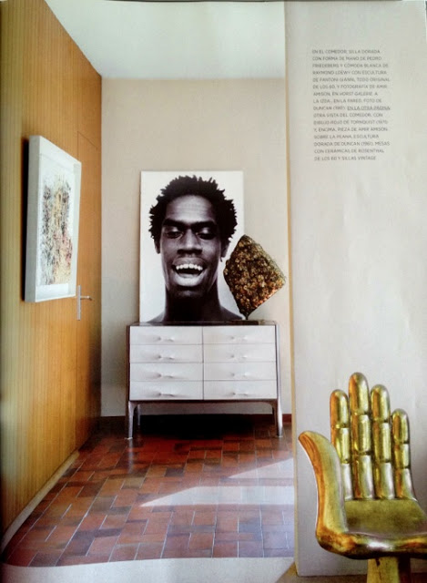
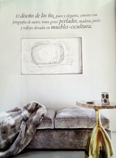
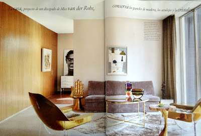
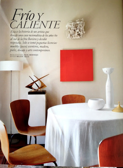
While in Buenos Aires a couple of weeks ago I bought a the November edition of Architectural Digest Spain where they showcase a home of an anonymous artist (yes, some people do so well don’t need the publicity) who inherited a home in Bavaria. The house was built in the 60’s and he smartly decided to furnish it with nothing less than gorgeous pieces of furniture from the same period. Most of the furniture is by Philippe Hiquily. The result is a modern setting of a very spare and sophisticated home with an good amount of gold throughout that assures me this owner’s work should be amazing. I took photos with my iPhone to share the beauty of this home with you. Enjoy!
The sofa is upholstered in a Manuel Canovas velvet. The two beautiful gold chairs and side gold table are by Philippe Hiquily. The painting is by Neruth.
Original photos by Belen Imaz
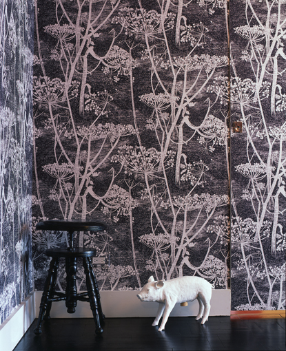
I love wallpapers, preferably geometric ones, because they seem to not get old (in my eyes). Cow Parsley by Cole and Son though has been in my “wanted list” for a while now and having seen it here and there and still love it the same, I know I won’t get tired of it. It’s not-too-precise-design perhaps has something to do with it. It allows my eyes to travel and rest
while looking at it. It comes in twelve different color combinations but my favorite is the black and white (sort of a Grisaille effect). I think this wallpaper would be amazing in a lobby. Enjoy!
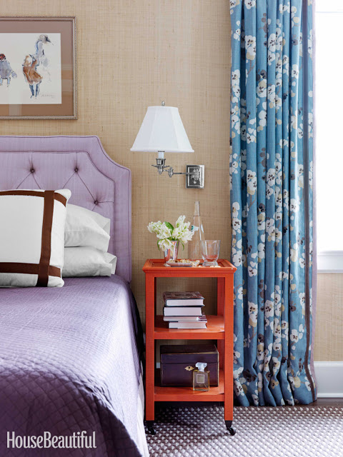
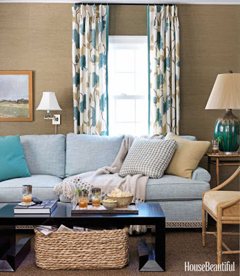
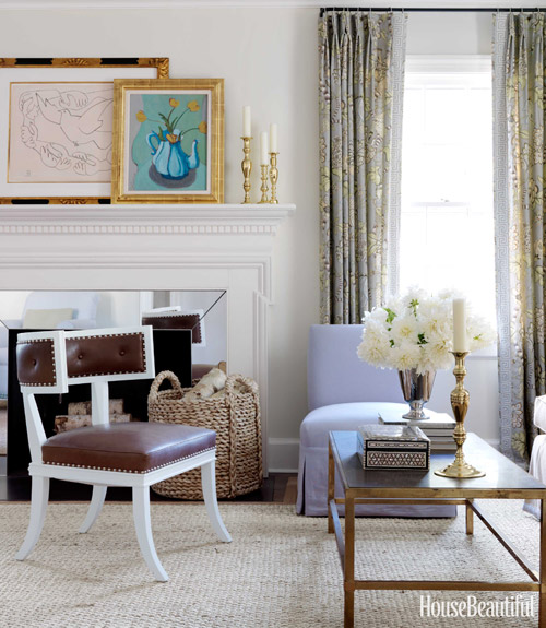
I’m happy to have been contacted by House Beautiful to write a post on Grass Cloth a week ago and very honored for the mention that will appear in the December/January issue. If you have an iPhone you’ll be able to link to Belle Vivir through the HB Connect app. It’s amazing how dynamic and personal magazines have become. House Beautiful was kind enough to send me the article so I can see it and new watermarked images that will appear in the December/January issue. Kevin Isbell knew how to make this1930’s center-hall colonial home current by injecting warm and intrinsic details such as geometric trims to floral curtains, gross-grain ribbon tape to a plain white sofa and visually connecting two separate rooms by custom painting grass cloth walls the same color as the ceiling. “Grass cloth has a warmth that paint does not, and darker colors are more cocoon-like” Kevin Isbell.
I love the contrast between the modern looking cocktail table and the wicker basket in the family room. Notice the detail of the tape on the sofa. It’s all in the small details that slowly reveal themselves to you. In this room the grass cloth used is a bit more textured than the one used in the bedroom above. A very applicable difference, I think.
You know how I feel about any klismos and klismos influenced chairs. It’s forever my favorite chair. And the contrast here between the lilac slipcovered chair and the leather brown on the klismos chair is the perfect union of masculine and feminine. I didn’t want to spoil the article so I’m only posting the three images above, the two below are from Isbell’s website.

