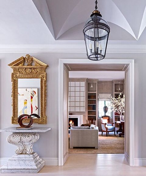
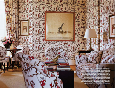
Many of you may have already seen this home in Houston designed by Bruce Budd in collaboration with Bute King Architects, previously featured in Architectural Digest. The Georgian style home is redecorated portraying a quintessentially Bruce Budd style, elegant and classic with modern touches in the form of art. The relaxed but elegant atmosphere of the decor throughout the home was the response to the homeowner’s request for a home with a welcoming environment to entertain his grown children and grandchildren. The transitional style is timeless and up-to-date. The home’s casual and relaxed but still formal decor is thankful to the mixture of expensive antiques, modern art and humble materials as woven straw, linen, cotton, materials that are usual staples of Budd’s design. To give the formal home a sense of lightness, Budd limed the Louis XV boiserie paneling as well as the floors and millwork throughout the house.
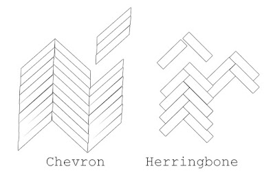
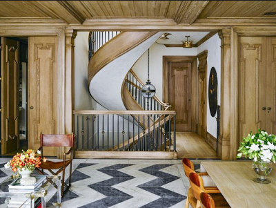
Parquet flooring from light wood to darker tones, herringbone or chevron floors can be used in many types of home decor. From elegant and classic style to modern to rustic, Herringbone and Chevron parquet flooring can add not only architectural details but dimension, texture and sometimes even drama when used in contrasting colors as the second image below illustrates. These types of parquet wood floors share two very similar types of zigzag pattern, and it’s easy to confuse one with the other. For those still confused, Chevron pattern floors meet at a straight line, forming a more zigzag or rectangular design, while a Herringbone floor, the ends butt against each other, cut at an angle creating a broken zigzag pattern. Herringbone floor may make installation more challenging than chevron floor, but both types of wood flooring design are equally worth the work and time.
Difference between Chevron and Herringbone
In this space above the tiles are thick but still form a beautiful black and white chevron floor. Love how the wood paneling and coffered ceiling warm up the space.
Gilles and Boissier is a world renowned Interior Architectural firm with international recognition and success that mostly everyone in the Design world have heard of or seen one of their creations by now, I’m specifically referring to their more than famous 19th century apartment located on Boulevard Malesherbes in Paris, France. The surprisingly young couple, Patrick Gilles and Dorothee Boissier, are also partners in life, they have two children and according to their website they use their differences in creative disagreements to create elegant and beautiful interiors, like that complementing one another.
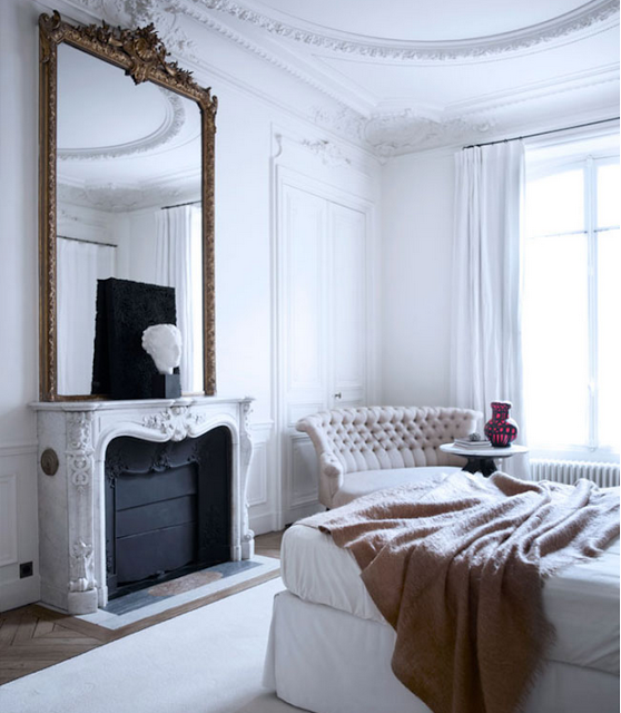 Patrick favors clean and straight lines in organic physical forms as wood and Dorothee elegantly and harmoniously fusions together all the elements. The couple were once mentored by renowned Interior Designers Philippe Starck and Christian Liaigre.
Gilles and Boissier have created elegant and beautiful interiors worldwide from hospitality projects, restaurants and luxury boutiques like Monclair. They also designed Remo Ruffini, Monclair’s owner’s villa in Lake Como.
From the successful design due came Gilles and Boissier Maison Label a bespoke furniture and lighting collection where the firm design philosophy ‘neither minimalist nor decorative’ is the inspiration behind their creations. In this aesthetic point of view,
their vast experience and their extraordinary taste translate in many of their high-end designs which is perhaps more exemplified in their own Parisian apartment which the
couple renovated keeping their two children in mind. Most of the furniture and lighting employed in the apartment were designed by Gilles and Boissier themselves.
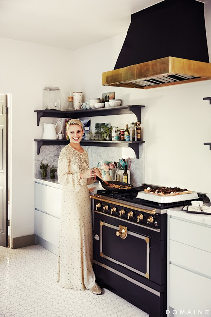
Love the regal look in this kitchen. Hexagon tiles on the floor give it an old-world feeling. The cabinets are of a very light green color which gives the black stove a free rode to reign by itself. Via My Domaine.
The thought of owning a kitchen with a black stove may make some sneer. Having stainless steel appliances as the first choice for homeowners, a black range may not sound too appealing. But once you get to see these fantastic, beautiful kitchens, all featuring black stoves, you may not only change your mind, but they might also prompt you to save some money to buy one yourself and put it in your kitchen. These stoves don’t come with a cheap price tag, though. Since they don’t always appeal to everyone, their exclusivity and rarity come with a hefty price. Expect to pay a minimum of around four thousand among the most affordable ones and up to sixty thousands for others. Since we are looking for a house in Columbus, Ohio, I’ve been contemplating different range options. My husband loves to cook, he says it relaxes him, and I cook dinner almost every day except the nights when the mood calls for some Thai takeout. My dinner cooking is effortless, baked fish which is
usually salmon, steamed vegetables and or salads. It may sound boring, but it’s delicious and super easy. I joke with Evren my husband sometimes when I suggest having the salmon outside occasionally. We are a family who is obsessed with good eating, so we like to make everything from scratch hence an excellent functional kitchen is a priority in our home. But more than me being a cooking fan, I really enjoy beautiful kitchens and watching my hubby cooking on the weekends so I thought it would be nice to have a very good looking stove in either black or another color and the only range I’ve come across with a more reasonable price is Verona, last picture. It comes in many different finishes and sizes, and the design is the result of a perfect interpretation of a transitional stove. It’s clean with not too fussy lines, and I know I will be able to live with for a long time.
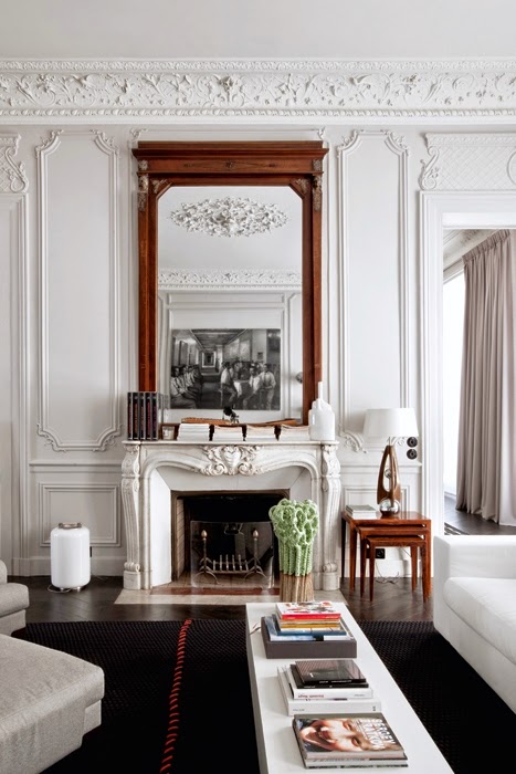
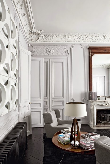
I love to see classic interior structures decorated with more modern furniture, as I stated here. The contrast is beyond exited and chic. This Modern Parisian Apartment is gracefully decorated between classic and the modern. The quintessential Parisian apartment with Haussmann Architectural Details is furnished with fabulous furniture from different
periods with common clean lines. The apartment is designed by double g. The walls with ornate moldings and boiseries were kept white – who needs a color-splash when you have ornate crown moldings like these!
Keeping the furniture in neutral colors bring balance and tranquility to a very ornate room. Keeping the wall in white adds to this.
Interpreting Classic Style in Home Decor: Traditional ainterior Design
The Paris library of Lee Radziwill has a very classic decor which makes it look regal and sophisticated.
While I was driving around with my husband a couple of weeks ago admiring classic as well as modern architecture, while disliking others, made me wonder why some style or home decor become outdated so quickly? Which brought me to the conclusion that our eyes love and accept what we recognize, understand and make us feel comfortable. Whether modern or traditional design, as long as they enjoy classic elements, are more appealing and pleasing due to the fact that we can relate to them. Hence this article about Interpreting Classic Style in Home Decor. As much as it is important to be unique and different, it is equally important to not stand too far from the classic or traditional characteristics in order for our home not become antiquated and unappealing too quickly.
Elle Decor has a very interesting article about Classic elements every traditional home should have. The article doesn’t specify choice of color when it comes to a more classic decor, however the home chosen as an example is not in whites or neutral. Interestingly though, lately I see a pattern where people exclusively attribute only neutral palettes to classic style. I understand why some people may tend to associate only neutral colors with traditional design. Neutrals are soothing and they always match but, ever since the Baroque times, classic style rooms have been painted in rich saturated colors. Classic style can also be found in modern lines such as those found in Mid-Century modern furniture and architecture. New York Times wrote a very interesting article about Why mid-century design won’t die?
Interpreting Classic Style in Home Decor

