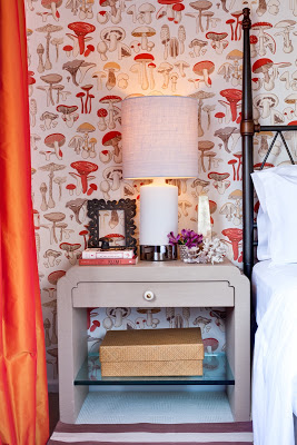
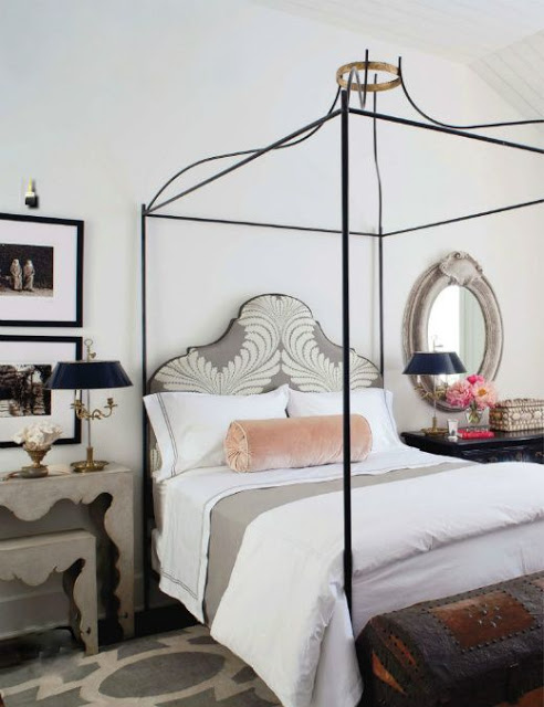
There was a little bit of misunderstanding with yesterday’s post. Apparently some lovely people thought that the first image was part of my home, it’s not. I found the image at New York Social Diary. The post was intended to inspire a different way to approach Christmas Decoration. I apologize for the confusion. For that reason I decided to post a few images of our home, which I don’t do much because we all know that magazines would not be interested in featuring somehing that’s been already published. This past Saturday the photographer Marco Ricca was here and took many lovely pictures of two of our bathrooms, the guestroom and Lucas’ room. For the guestroom above I wanted to create a magical space that was cozy, inviting and dreamy. So my first thought was the movie Amelie. Since I love French movies for their lightness and happiness underlined I designed our guestroom inspired on Amelie, hence the whimsical and unique wallpaper and the color scheme. The wallpaper is Champignons by Brunschwig and Fils, the side tables are designed by a Karl Springer apprentice. I don’t remember his name. The handle is one sculptural gorgeous thing but you can’t appreciate it much unless you click on the picture an zoom in.
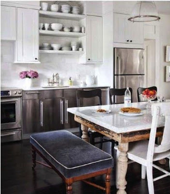
A kitchen with walls covered from floor to ceiling tiles gives the impression of being well finished. Regardless of what type of back splash is covering the walls, the simple subway tiles, marble slabs or hand painted tiles, the whole effect gives the kitchen a feeling of grandeur and cleanness. For an even more seamless appearance some people go with grout of the same color as the tiles while others who prefer a more contrasting effect decide on gray or black grout. I prefer a darker grout especially if the kitchen is all white to give it depth. There are many different shades of gray from darkest to lightest. Enjoy!
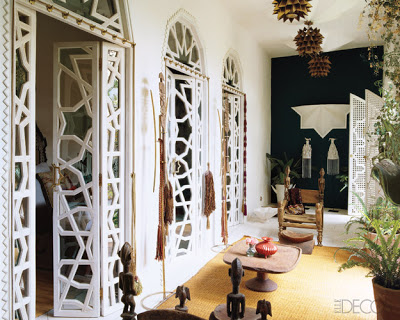
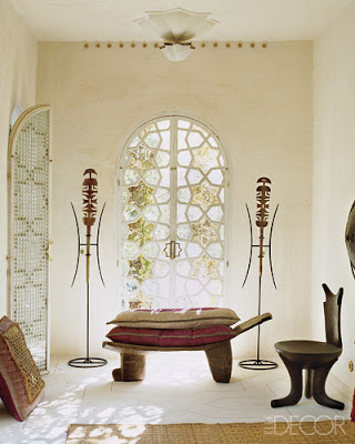
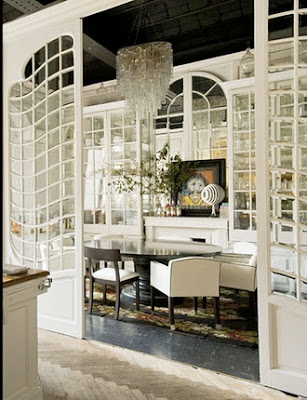
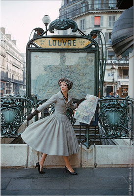
I was talking to my friend Cathy from Lerebours Antiques last Friday over dinner about Classic Architecture and she was telling me how much she loves early and late Neoclassical Architecture. I told her that I liked everything from Gothic to Art Deco- excluding Art and Crafts. I love the (concept of Art and Craft) but I don’t like the aesthetic outcome of it. Ah.. nope! I was surprised when I read Lonny on Saturday night and found their very interesting cover of Art Nouveau period and it made me think about how little influence is there now-a-days from that period. And then I remembered this very exotic home that was recently featured in Elle Decor and Lazaro Rosa Violan‘s amazing office doors which have a bit of Art Nouveau influence in a modern way and the results were stunning! Enjoy!
William Hogarth 1697-1764 England, was a painter satirist and social critic during the 18th ct. His satiric paintings and engravings mostly covered and criticized social and political situations by ridiculing conventional and social standards of his times. One of my favorite work of his is Marriage à-la-mode, a series of six paintings which were later engraved and published, ridiculing arranged marriages where of course the unhappiness of the entire family ends with the tragedy that covers everything from murder to suicide. Go figure! “Moral: don’t listen to evil silver-tongued counselors; don’t marry a man for his rank, or a woman for her money; don’t frequent foolish auctions and masquerade balls unknown to your husband; don’t have wicked companions abroad and neglect your wife, otherwise you will be run through the body, and ruin will ensue, and disgrace, and Tyburn” And you may be wondering why am I reading all this and you’re right! but William is entirely responsible for what’s called Serpentine Line or Line of Beauty which is the S-shaped curved elongated line that frames an object. He thought that curves, not Sophia Vergara’s in this case, were more dynamic, more interesting to see, more lively and not as dead and static as straight lines. And I so much agree. When my professor said these things in class last year I thought “Clever man!” He probably had no idea that his theory would transcend to furniture, hence the Serpentine sideboard and many more wonderful good looking furniture and sculpture that we enjoy today. Below, a few images that show gracious and beautiful curves.
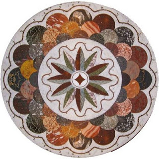
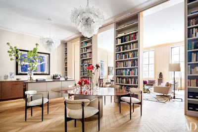
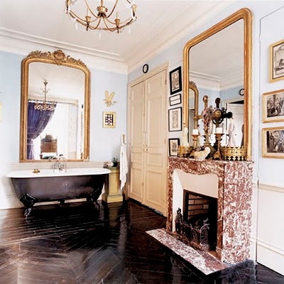
Patterned floors have been mostly used in middle eastern design for centuries. Ranging from elaborate and intrinsic techniques such as Mosaic– small pieces of stone or glass (mostly the same size) are glued together to form a scene or picture to Pietre Dure- where small pieces of semi-precious stones are cut in different shapes and forms and then glued together to form geometric or figurative patterns most often used on floors, walls or tables; to Parquetry-where a similar process (in geometric shapes) is done with wood. There are simpler and less compromising methods such as painted or stenciled floors. Although many people would be afraid to commit to patterned floors permanently when a consecutive geometric pattern is used, as seen in these images, the result can be as classic and easy to adapt to as plain tiles or wood floors. And the outlook could be simply stunning.
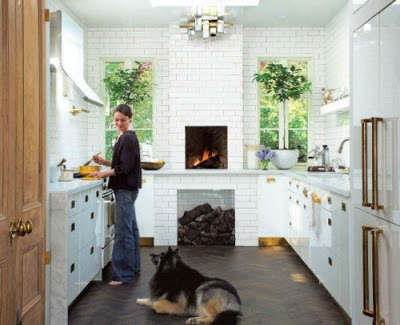
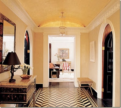
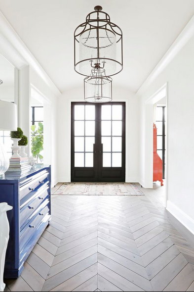
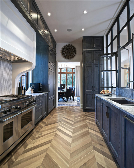
Chevron floors have been a main part of European Interior Design for centuries. Chevron Parquet floor with its zigzag pattern brings elegance and interior architecture into any home decor. Now a days you can find chevron wood flooring in porcelain tiles for bathrooms or kitchens as well. With this type of parquet flooring you can also create an effect of stripes on your floor by using two different colors creating a very fresh and young atmosphere in bathrooms or foyer as in the the picture below. Chevron floors can look great in all kinds of home decor from classic interiors to modern.
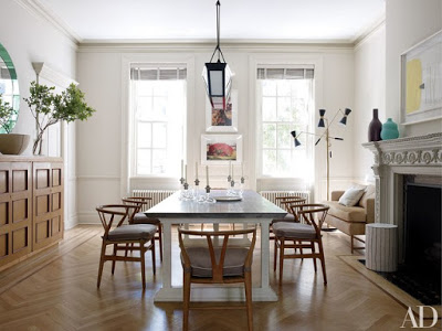
In a more clean dining room with chair rails on the walls, Hans J. Wegner chairs and an ornate fireplace the herringbone floor blends seamlessly.
A bright blue sideboard and simple lanterns is all this entryway needs when it has beautiful honed finish chevron floor.
Kitchen with chevron patter floor.
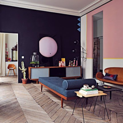
images from Cote Maison and my files.

