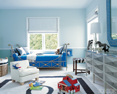
Love the serenity in this children’s room designed by Reed Krakoff. This bedroom may be for a child, but it’s not short on style. The steel and bronze bed is by Maison Jansen and the chair is from my favorite furniture design period, 1940’s by Jacques Adnet. Some are born with a silver spoon. Happy Monday.
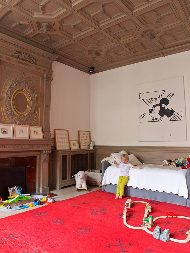
Children’s bedrooms, where kids can grow in and be creative are the best and ideal rooms. I think this can be done by treating the room as a place where children would play, study and spend time with their friends instead of just a room where they would go only to sleep. Functional elements as task light for reading, multi-functional furniture and if money it’s not a problem, build-ins with space for homework area are ways to make the room not only more spacious and tailored to their growing needs, but also a space where their imagination can go wild. As every other room in the house, children’s bedroom should be designed to the kid’s own style and needs while prioritizing safety, of course with the guidance of a professional designer and or a stylish parent. They are never too young to start polishing their taste, right?. I love each and every one of these 12 modern children’s bedrooms below. They are beautifully done while child-tailored-made without looking too adult or too childish. Enjoy!
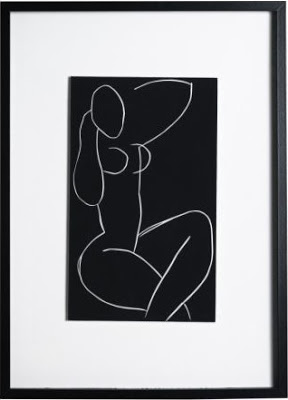
things as art? right! Ikea. I was planning to buy things such as a mattress for our little one, a foot step for his sink and so on. Imagine my surprise when walking around I found very good looking prints! God, was I glad, there are an awful lot of empty walls in this house that will need to be filled. We got the second one below by Deborah Azzopardi for Lucas’s room, of which I will only tell you that it will have a bunch of stripes. Yeah!
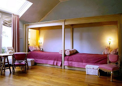
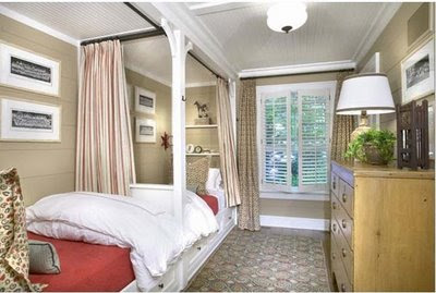
What a great way of making better use of narrow or awkward spaces. Notice in the bottom picture how the ceiling was customized to frame the beds to define the space better and make the room feel cozier. I love the contrast between the pink fabrics and teak wood in the top picture.
images from Barbara Frua De Angeli and Tom Scheerer.

