This kitchen is small in size but big in style and originality. I love the combination of materials and color, the stove and the use of brass throughout. I also love how the walnut contrast with the white. Lovely indeed. Enjoy!
This kitchen is small in size but big in style and originality. I love the combination of materials and color, the stove and the use of brass throughout. I also love how the walnut contrast with the white. Lovely indeed. Enjoy!
This kitchen designed by Miles Redd for a family in Connecticut is in the July issue of Architectural Digest. I love how the blue of the walls and wood color of the cabinets contrast each other. Miles really knows how to make an impact. Enjoy!
Having a TV in the kitchen is a common practice in the American family. It can be either beneficial or not beneficial, depending on how is used. Many people have a TV aversion. Sort of like the TV will slowly morph into their brains, brain wash them, and wake up the next day as an even worse person. I can understand the sentiment, however as everything else in life moderation is the is the key. A TV in the kitchen can be helpful for the mornings when everyone is multitasking while getting ready to rush out the door. Let’s not forget that balance is a very important discipline in life. I currently don’t have a TV in our kitchen but, I’m guilty of turning on the one in our living room and keeping it on while making in the kitchen, hello CNN in the background. It keeps me company while well informed! However in the mornings when we find time to sit down and have a decent breakfast, the TV will be off for quality family time. Another benefit is the feeling of familiarity a TV provides to any room. Below, 7 Stylish Ways To Incorporate A TV In Your Kitchen.
Keep it highly above the Fridge. By keeping it high enough and not a at eye level, it becomes more of a sound device and will keep you from visual distraction.
Keep it next to your morning coffee station. Having a small TV next to where you prepare your coffee every morning is deal to catch up with the news briefly.
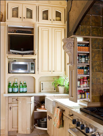
Customize a space for it and treat the TV as if it were an appliance. By camouflaging the TV into a custom wood wall it practically disappears.
Hang it from the upper cabinets. Now this way takes it to the next lever because it doesn’t occupy any space of your counter. I love the red in this kitchen where the TV is attached to the upper cabinets.

A kitchen with walls covered from floor to ceiling tiles gives the impression of being well finished. Regardless of what type of back splash is covering the walls, the simple subway tiles, marble slabs or hand painted tiles, the whole effect gives the kitchen a feeling of grandeur and cleanness. For an even more seamless appearance some people go with grout of the same color as the tiles while others who prefer a more contrasting effect decide on gray or black grout. I prefer a darker grout especially if the kitchen is all white to give it depth. There are many different shades of gray from darkest to lightest. Enjoy!
Steven Gambrel is an Architect so therefore it’s no surprise that his interiors are so opulent, elegant and full of architectural details. This kitchen takes my breath away and gives it back to me with the use of Indian mica as backsplash? or is that mother of pearl? Even fancier! The island is designed to look as a free standing piece of furniture, while the detail of the decorative hinges brings out the brown in the striped marble top. One very characteristic touch in Steven Gambrel’s design is the use of nail head in his custom made furniture. Very Architectonic!