Category: Interior Design

Today is a very exciting and busy day.  We are starting to set up the room for the Showcase.   As I mentioned before here, I’m participating in the Designer Showcase at the Columbus Museum of Art.  You can read all about it and buy your tickets here.  Since I don’t have much time, I’m reposting this yummy home originally posted in 2012.  Yes, that’s how old this blog is.

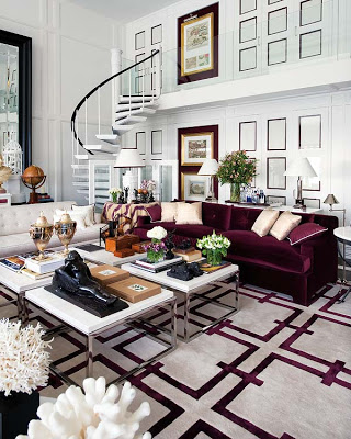
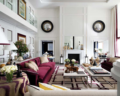
Pablo Paniagua and his Studio team designed this beautiful home in Malaga, Spain. They were in charge of almost everything from the architecture to the design and designing of furniture. All done with the very important goal of reaching a harmonious result. I love how the dark colors stand out on the white background. Enjoy!

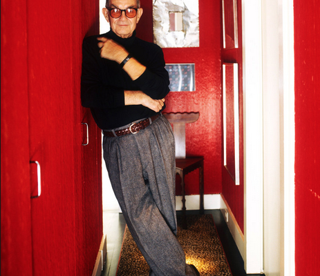
Albert Hadley red hallway

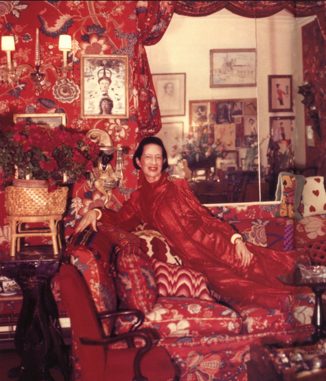
It would be impossible to talk about the color red without mentioning the all-red living room of Diana Vreeland, the renowned columnist for Harper’s Bazaar and later Vogue magazine editor-in-chief.  Originally featured in Architectural Digest in 1975, it is still today a source of inspiration, as well as a great example of what bold, daring and unique design, could look like.  “All my life I’ve pursued the perfect red,” she said.

Diana Vreeland red room

“I want my apartment to look like a garden: a garden in hell!” Diana told the famous designer Billy Baldwin.

Read More…

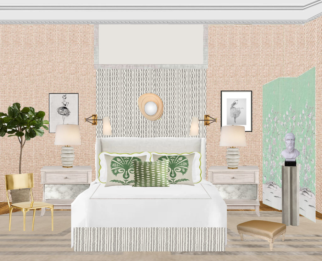
As I briefly mentioned before, I’m participating in this year’s Designer Showcase at the Columbus, Museum of Art and I’m very excited about it.  I’m creating the Guest Bedroom Suite and I couldn’t be more pleased with the design I came up with.  I wanted to create a bedroom that felt casually elegant with a livable sophistication where guests felt comfortable and at ease.  The color scheme I chose- green, taupe, gray, and a bit of pink here and there, is coincidentally suitable to welcome Spring.

My inspiration came from the desire of having a bedroom which can provide guests everything they need during their stay.  From a sitting area where they can read or enjoy a drink, a desk where they can do some work or write a note, to of course a comfortable bed with luxury bedding where they can enjoy a good sleep.  The overall aesthetic of the bedroom is ingrained with classic lines and a modern sensibility that reflects my Chic Comfortable Spaces signature style.

All proceeds support Wonder School and other creative initiatives.  To learn more about 2019 Designer Showcase, please visit the Columbus Museum of Art.

Read More…

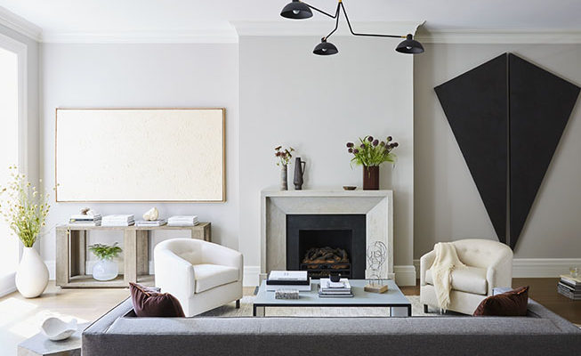
milimalist interior design, living room JENGER

The term less is more is intuitively connected to minimalist interior design.  The reason is that it is a style which is purely based on form and function.  It’s a design concept that focuses on notable functional design while emphasizing on facilitating a more simple way of living.  Minimalist design is an interior design style which people either hate or love; some find the style cold, simple or stark, others find it ideally soothing and relaxing.  If you find yourself between the two polarized corners of the style, you can find ways to benefit from a simple more paired down interior design.  By cutting down furniture, accessories, and trinkets, rooms in your home can turn into minimalist retreats ideal for unwinding, relaxing and recharging.

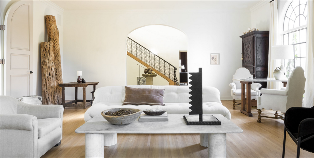
milimalist interior design, living room nate berkus

Nate Berkus

Read More…

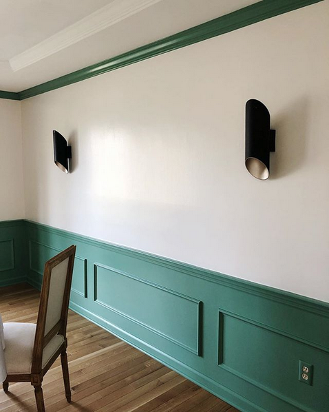
Nothing can make more impact, with little expense, in a room than a fresh coat of paint.  The color green can add a touch of liveliness or on the other hand, calmness to any room in your home, from rich jewel-tones like emerald for the walls to subtle ones like light sage for pillows, there is a wide range of green tones to pick from.  Green is good for many different reasons, as I stated here.

Recently I painted our dining room with the most perfect green possible, in my opinion.  It’s a strong green; however, it’s not overwhelming.  I used Parisian Patina by Sherwin Williams, and I couldn’t be happier with the result.  Below, 10 rooms that use green beautifully.

Read More…

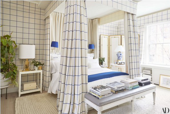
Using the same fabric for walls and furniture may sound old school; however, when interpreted in modern ways, it can be timeless while up-to-date.  Besides being aesthetically beautiful, there are many other benefits of doing this.  From making a room feel more spacious, to more harmonious to even more artistic, using the same fabric or pattern- sometimes in the form of wallpaper for the walls and fabric for the furniture, can indeed enhance any space.  See for yourself below a list of good reasons why it is a design element worth trying.

It Makes The Room Feel Spacious

Derek Blasberg's bedroom in ralph lauren fabric

Derek Blasberg’s Manhattan bedroom where canopy bed, walls, and headboard share the same Ralph Lauren fabric.  Design by Virginia Tupker via AD

Read More…