Category: Interior Design

We all agree that the kitchen is the most important room in a home… the heart of the home.  It’s the space where we cook our best and worst meals and where we create our best memories together.  It’s also the room where most of the money in a remodeling goes to.  So much to think about when remodeling this room, functionality, flow, durability and ultimately design.  A gray kitchen can greatly help or enhance the latter since gray is perhaps one of the most forgiving and sophisticated color options available.  Having a functional kitchen is the priority but taking time on deciding the color of your cabinets is paramount if you are deciding to live for a long time in your home.  Gray is warmer than the color white and easier to live with than dark bold hues.
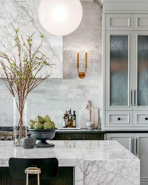
gray kitchen functional kitchen with marble covered vent via belle vivir blog

A beautiful juxtaposition between the traditional light gray cabinets and the clean line of the carrara marble island and range hood.   The brass simple scones and reeded glass on the cabinets lend elegance to the design.
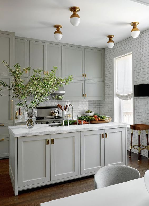
gray kitchen, functional kitchen with white subway tiles via belle vivir blog

A small gray kitchen with a more down to earth and approachable design.  Floor to ceiling traditional white subway tiles and brass flush mount ceiling lights give a more custom look to the overall design.

Read More…

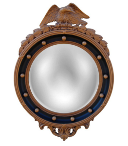
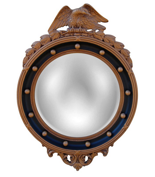
I love a good sale, who doesn’t… As a matter of fact I enjoy buying my clothes on sale more than on regular price.  I think that I’m becoming very frugal, curiously enough this new practice of mine doesn’t always cross over to home decor purchases.  However I’m always in the look-out for beautiful accessories on sale, also for furniture or for fabrics or anything in between.  For the special deals of the week I found these beautiful and elegant neutral-tone home accessories on sale that I couldn’t help sharing them.  It’s true that you can’t go wrong with a neutral tone decor.  There is something so special and remarkable about the mixture of browns with blacks, brass and beige contrasting with textures of rattan, plaster, sisal and hemp fabrics…  The overall effect often found in a neutral decor is dramatic to the eyes yet soothing to the senses.  The first one in the list being an Eagle Convex mirror.  In case you didn’t notice, we love a Convex mirror.

neutral decor special deals of the week via belle vivir interior design blog


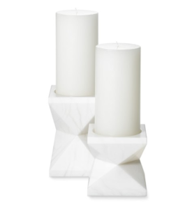
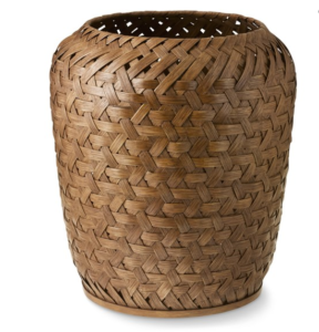
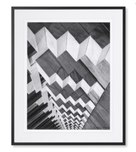
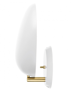
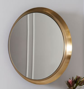
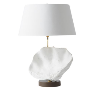
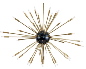
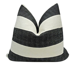
Alabaster Pillar holders in two different sizes.  This rattan basket also comes in two different sizes. The strong and abstract lines in this black and white Skyscraper photograph is pretty modern and classic at the same time.  Regency Eagle convex mirror is always a good idea for when you are looking for a way to incorporate a classic elegant object in your home.  And of course the clean modern sconces to contrast with any other strong traditional element. Recessed wall mirror in antique brass finish for a touch of glam that never fails to impress.  A shell lamp in case you have  beach house or you just want to bring the beach feeling inside instead.  This chandelier has been in too many a dressing room, but perhaps it would go well in a hallway…  And finally a Moroccan hemp pillow in graphic black and white stripes.

Read More…

Architect Peter Pennoyer transformed this 1857 New York City townhouse after the interior has been altered too many times.  The building or the townhouse is a four-floor Italianate redbrick building in Greenwich Village which had been previously converted into separate apartments and as a consequence many of its original features and layout had been removed.  The owner of the townhouse enlisted Architect Peter Pennoyer for the major undertaking of the Interior Architecture and Shawn Henderson for the Interior Design.  Pennoyer is known for his elegant classic aesthetic “I usually like to keep the old materials, the beams, at least,” the architect says. “But this was unsalvageable.”  as told to AD.  And so it all began on a three year renovation project to restore the single family home and bring it back to its original beauty.  The serpentine staircase illuminated by a skyline is the master piece of the renovation and it was further embellished with subtle texture and flecks of silver leaf added by Henderson over its white plaster walls.  To see the before pictures of this impressive transformation go here.

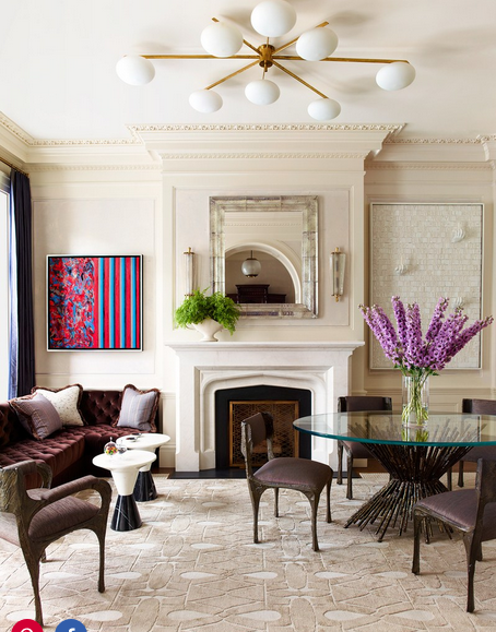
Peter Peter Pennoyer livingroom Shawn Henderson

This living room is the epitome of glamour, from the color scheme and the art work to the furniture selection.

Read More…

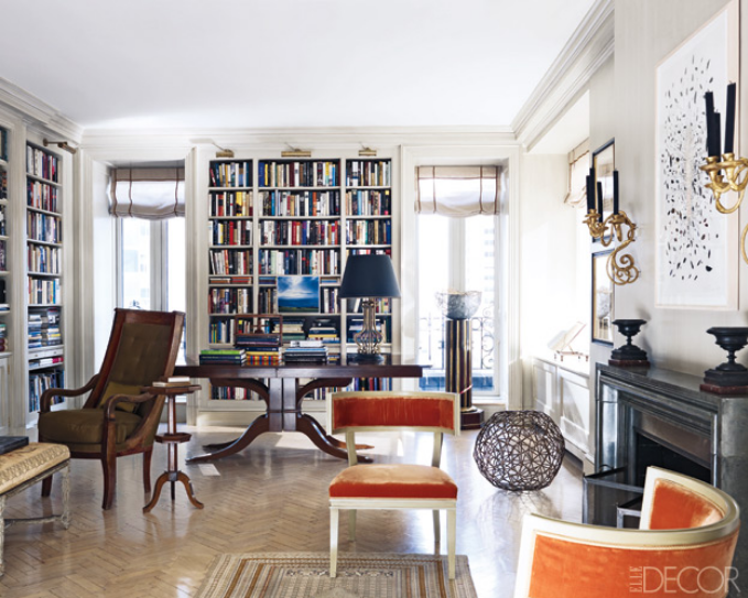
Lynn Nesbit’s home was published a few years ago in Elle Decor and the marvelous thing is that it could be a home ready to be published next month.  No need to change anything in the decor.  That is what transitional style in Interior Design should grant.  The apartment was designed by Courtney Coleman and Bill Brockschmidt and the mixture in the design is timeless as a result of the use of different styles of furniture from different parts of the world. Chinese table, French and English chairs harmoniously live with modern art and exotic accessories.
Lynn Nesbit's home, transitional style in Interior Design, livingroom 2 via belle vivir interior design blog

The use of a bold colorful fabric on the klismos-style chairs help take away form the formality found in the rest of the antique pieces.

Read More…

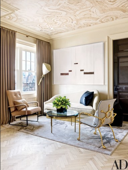
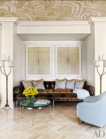
This penthouse in Greenwich Village, New York has all the details of a jewel box with the exception of the jewel tones. Well perhaps you can see one or two. The inspiration for this glamorous and elegant apartment was two chairs but specifically two beige chairs that Interior Designer and Architect Rafael de Cardenas found in Basel, Switzerland. The owner is a London born who moved to New York and whose taste is obviously urban and sophisticated. Although the apartment had been redone previously and was in good shape, Cardenas and its owner decided to make it even better and more appealing to its owner’s taste. Walls were moved and every surface was refinished. The color scheme throughout the apartment is mainly composed of neutrals with lots of pretty details and different metal finishes. Metals such as brass, bronze and steel work as jewelry accessories against the blond-wood herringbone floors and the travertine fireplace. The fireplace has a glamorous brass mantel… or is that painted to look like brass. Either way it creates an alluring effect.
Rafael de Cardenas Interior Designer via belle vivir interior design blog

A Mattia Bonetti chair on the right.  The sofa is designed by Rafael de Cardenas

Interior Designer Rafael de Cardenas living room via belle vivir blog

Brown and blue is a combination that I have always favored.  The day bed is custom-designed by Rafael de Cardenas, the lamps are by Jean Royere.

Read More…

Although a white plaster chandelier is very au courant and very frequently used lately, it’s far from being a trend.  It would actually be quite silly to think otherwise.  These chalky white plaster chandeliers or plaster home accessories have been around for quite some time perhaps as back as 1930’s when Alberto Giacometti brought the material into fashion in Paris.  The plaster lightings we see today are mostly inspired by Giacometti’s work.  With the help of his brother Diego, Alberto created beautiful and understated home accessories made out of plaster and or bronze.  Giacometti created various kinds of home accessories from table lamps, sconces and fireplace mantles in plaster.  Often creating pieces commissioned by Jean-Michel Frank who used a lot of white and plaster in his interiors.  Another great reminder of the use of plaster in interiors is perhaps the most recognizable of all Serge Roche.  He created objects in stucco or mirror which were heavily influenced by the Baroque.  Roche’s iconic designs are regarded as one of the most recognizable ones of the 20’s 30’s and 40’s style.  A more recent reference to this classically modern use of plaster in home accessories would be the work of John Dickinson.  The very acclaimed late American designer from the 60’s and 70’s who created collectable whimsical plaster furniture pieces.  One of his very recognizable and coveted pieces is the African table, a great modern interpretation of the original African stool.

plaster chandelier, white plaster chandelier jvia belle vivir interior design blogeffrey bilhuber via AD

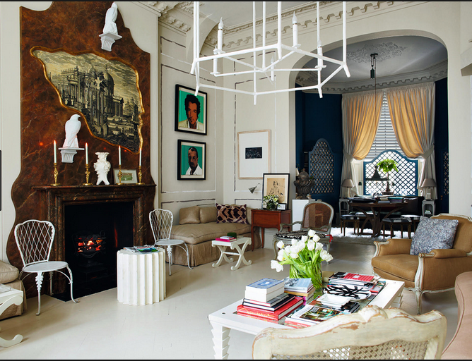
As beautiful as these plaster accessories are, they also evoke a sense of whimsy and fun.  The imperfect finish of the plaster provides these rooms with a more relaxed atmosphere, which is perfect for our modern days.  Room above by Jeffrey Bilhuber via AD.  The white plaster chandelier was custom.

plaster chandelier, white plaster chandelier via belle vivir interior design blog Nicky Haslam home

The home of Nicky Haslam in London.  How beautiful, whimsical and collected is his home…

Read More…