Category: Julie Paulino Design


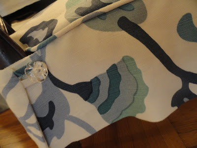
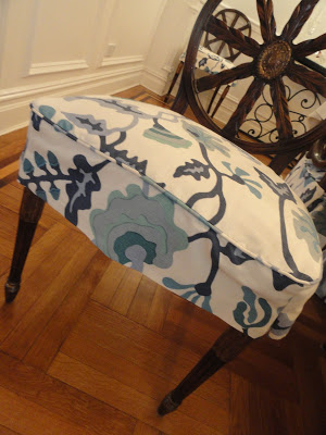
It’s one exciting thing working with a client but it’s an even more fulfilling experience when you work with a client who is knowledgeable and has great taste (she covered her foyer in David Hicks’s hexagon wallpaper- that is how tasteful she is!).  When I sold the Potalla fabric here at my blog I had no idea I was going to end up working the fabric into its final state.  In this case my client wanted to make seat covers for her existing chairs and I think they look gorgeous, young and modern.   We also made the window treatments for the living room and the nursery room.  My seamstress, who has been my friend for more than 10 years is a perfectionist and her work is immaculate.  As you can see below, two separate windows in the living room where the panels are so well detailed and calculated that every geometric pattern of the Victoria Hagan fabric is aligned.

Read More…

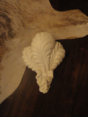
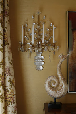
Yesterday while visiting another store I came across with Transit Culture a studio that does everything from product design to Identity Design. The studio itself is worth a visit because it’s beautifully decorated and very inspiring. You can see the workers working in the back. I especially love what they do with plaster. Above is a decorative bracket I got, together with one for a client, which I’ll convert into a wall table for a very narrow space in the entrance. I’m not sure what I’ll do with mine (top image) maybe make it into a sconce? I love it because I’m a definite admirer of everything that resembles Serge Roche‘s work.
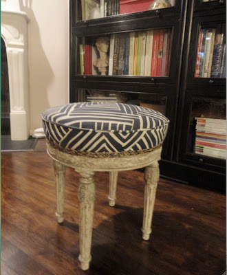
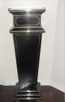
Below are two pieces that I got at a vintage/antique shop around our neighborhood. My husband jokes about me being this store’s best client because almost every other day I come home with something I find there. Remember this? You should see my garage. But hey, when you have a vision you have to have the resources… right? I don’t have an image of how the ottoman looked before, unfortunately I get carried away with the exiting outcome and always forget to take before pictures. I got it covered in “Melinda” fabric by Alan Campbell in navy on tint and embellished it with a braided jute trim I got at M & J trimming. Bottom image is a black lacquered decorative column I found buried under a few old dining tables.

images by moi

Read More…

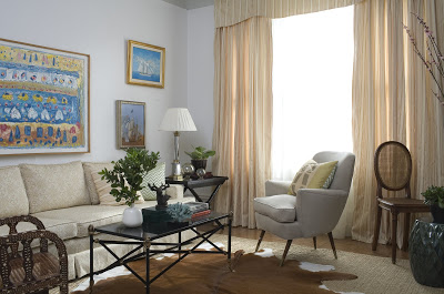
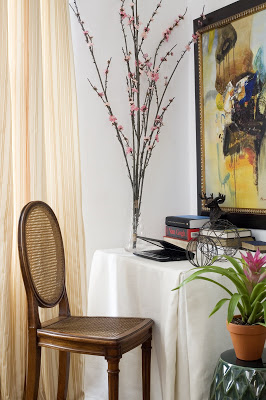
I wanted to share with you a few images of my most recent project. I finished it last week and had it professionally photographed by Robert Levin for my up-coming website. My sweet client and myself are very pleased with the result. Ms. Whiton moved into this small pre-war rental apartment a few months ago and she wanted to make it feel hers as much as possible. Similar to many other pre-war apartments this one was lacking light so we decided to keep it as open, airy and clean as possible. This also served well for the extensive art collection to shine on its own. When I came to this apartment a few months ago there was only an old sofa and plenty of art resting on the walls. The sofa has been under Ms. Whiton’s possession for quit a while now but it was in need of a complete re-do. I chose a neutral tone of damask fabric and added a few pillows in different textures to add some character. The curtains were done in gorgeous stripes that bring out the colors in the pillows and in the sofa. The two chairs are from ABC Carpet in New York. To make the light in the room multiply I painted the mahogany fireplace in white and added a layer of mirror around the inside. The dining room opens up from the living room but we wanted to make it look separate so we wallpapered the walls in Acapulco Sand. I had an inlay console custom made in a long but narrow shape in order for the space to be functional but not crowded. The magnificent sconces are from Lerebours Antiques. Once I saw them I knew they would be perfect for the sophisticated tropical ambiance we wanted for the dining room. Hence the beautiful Louis XVI-style caned chairs. The cowhide rugs used in both rooms are also from ABC Carpet. (you can click on the pictures to see them better)

Read More…

Apologies for the lack of post. I’ve been very busy adding the final touches to this project and I’ll be soon sharing more pictures with you. Here is a sneak peek of the project for eye candy.


Read More…

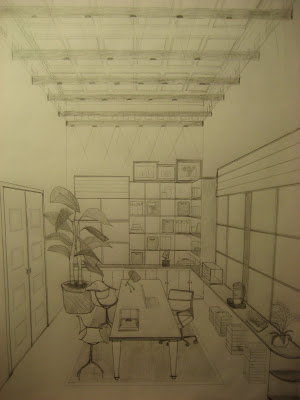
school project, Julie Paulino Design

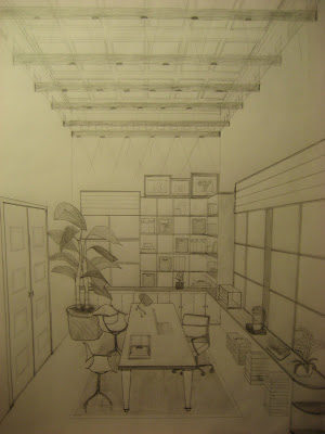
Cassandra‘s post last week reminded me of these drawings I made last year for a
School final project. We, the students, were provided with an empty space with specific square footage to design our dream office. That was a very fun and interesting project. For my dream office the two most essential elements, style, and comfort had to go hand in hand. I decided to divide the space into four sections: my office, a conference room, the secretary/library room, and the reception. Below is what would be my office. I picked the Herman Miller executive chair, my all time favorite.

Read More…

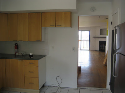
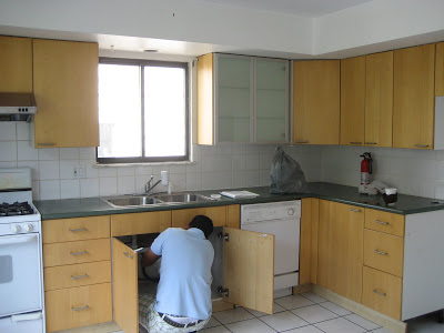
A lot of wonderful things are happening to me these days.  A blessing baby is on his way and with it the need for a bigger house.  So we just purchased a house with this incredible view of New York City in New Jersey.  This view is in every floor of the house.  This may be the only perfect thing about the house since there are many things to be updated.  Walls will come down, kitchen will be completely redone, floors will be refinished. I decided to make it fun and I’ll be posting every milestone.

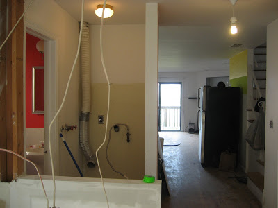
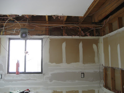
Here I decided to take down half of the wall so we can appreciate the beautiful view from the kitchen, while leaving some countertop space. The wall behind also will come down.
Here, all cabinets and appliances have been teared down.

Read More…