Yesterday morning I attended an early breakfast hosted by Architectural Digest before the Architectural Digest Design Show would open its doors to the public. It was a great opportunity to meet interesting people and also to get a private small tour of the show. The show was very well put together. Each booth was set to look like a real living space, which I personally think makes exhibitions far more interesting to designer eyes compared to booths with only free standing furniture with no relationship to each other. One of my favorite exhibitors and probably the one with the most beautiful booth was The New Traditionalists. Their furniture does honor to its name. It’s American style meets European style in a very up to date comfortable living way. I love all of their pieces. Later I had the pleasure of attending the seminar “Selling Design in a Changing Economy” given by Vicente Wolf, Dakota Jackson and Mitchell Gold. Beside the seminars interesting and informative part I enjoyed the charm of Vicente whom I had the pleasure of meeting afterward. Of course the star of the show for me was Dining by Design so I made sure I paid a visit and absorbed as much as I could. I also took pictures of a few of my favorite tables for my lovely readers to have some table setting inspirations. Enjoy.

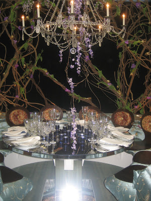
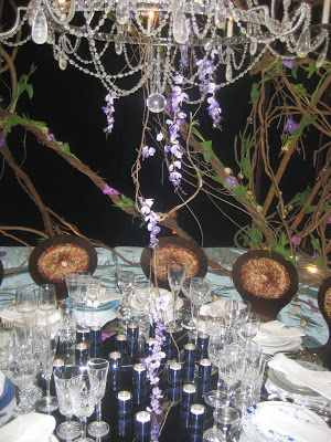
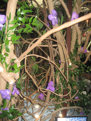
None of these pictures give enough credit to any of these gorgeous table settings but especially the table designed by David Beahm for Continental Airlines which was among my favorites. The table looked like an interior garden with climbing, twisted dry trees with real orchids, bulbs and leafs on them. The round banquette were upholstered in a green silk embroidery fabric with I think, removable wood seats on top of it. The table was entirely mirrored and each table top was different but in such a subtle way that you don’t really notice it until a few minutes pass because all glasses were clear and the difference in plate color were very subtle.
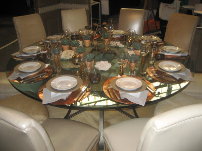
A closer shot of the attached orchids. Below is a more organic table designed by Architectural Digest and Moore & Giles. I loved the detail of a different quote on each plate.
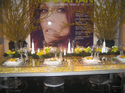
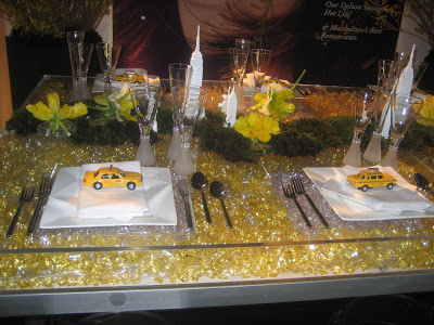
How cute is this Manhattan table setting designed by Marc Wilson designs and Marc Tamayo for Manhattan Magazine. Those yellow cabbies and the NYC hallmark buildings are so much fun.
The delicacy of this table and a movie by Audrey Hepburn as its background was such eye catching especially with that beautiful crystal cascade in the middle. Designed by David Rockwell from Rockwell Group.
Read More…
