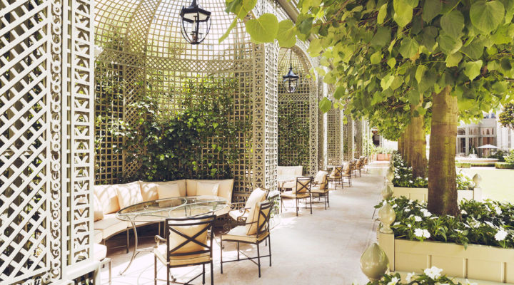
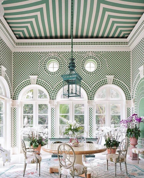
If you’ve been to Paris, then you may be very familiar with the Architectural design element known as trellis, lattice or trelliage. You may have seen lattice all over Paris’s parks and exterior building walls. Originally created as a garden element for mainly the separation between the more wild areas and the formal ones, trellis eventually took a more functional role as structures for grapevines, climbing roses and ivy plants to climb on. Nowadays their most modern use is more for the decorating aspect rather than for its function so much so that we can see it very often indoors covering interior walls. When lattice is used inside the house for covering the walls in intrinsic design its architectural effect is even more of a statement.
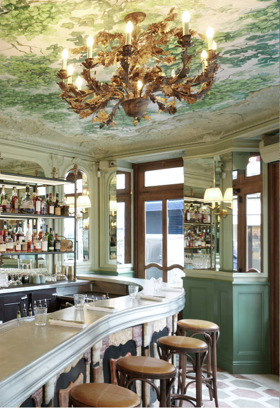
Paris bistro Le Chardenoux is located in the 11th arrondissement, an area known for its gourmet restaurants and hip bars. The stunning restaurant Le Chardenoux is the latest acquisition of Chef Cyril Lignac who hired Martin Brudnizski to give it a fresh decor; Martin is the designer behind the fashionable London club Annabel’s. The bistro features beautiful belle epoque influences with wall mirrors, perfect moldings, a stunning hand painted ceiling, red velvet banquets, brass lighting, and Laduree-like green walls.
Using the same fabric for walls and furniture may sound old school; however, when interpreted in modern ways, it can be timeless while up-to-date. Besides being aesthetically beautiful, there are many other benefits of doing this. From making a room feel more spacious, to more harmonious to even more artistic, using the same fabric or pattern- sometimes in the form of wallpaper for the walls and fabric for the furniture, can indeed enhance any space. See for yourself below a list of good reasons why it is a design element worth trying.
It Makes The Room Feel Spacious
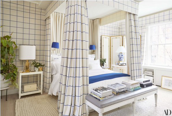
Derek Blasberg’s Manhattan bedroom where canopy bed, walls, and headboard share the same Ralph Lauren fabric. Design by Virginia Tupker via AD
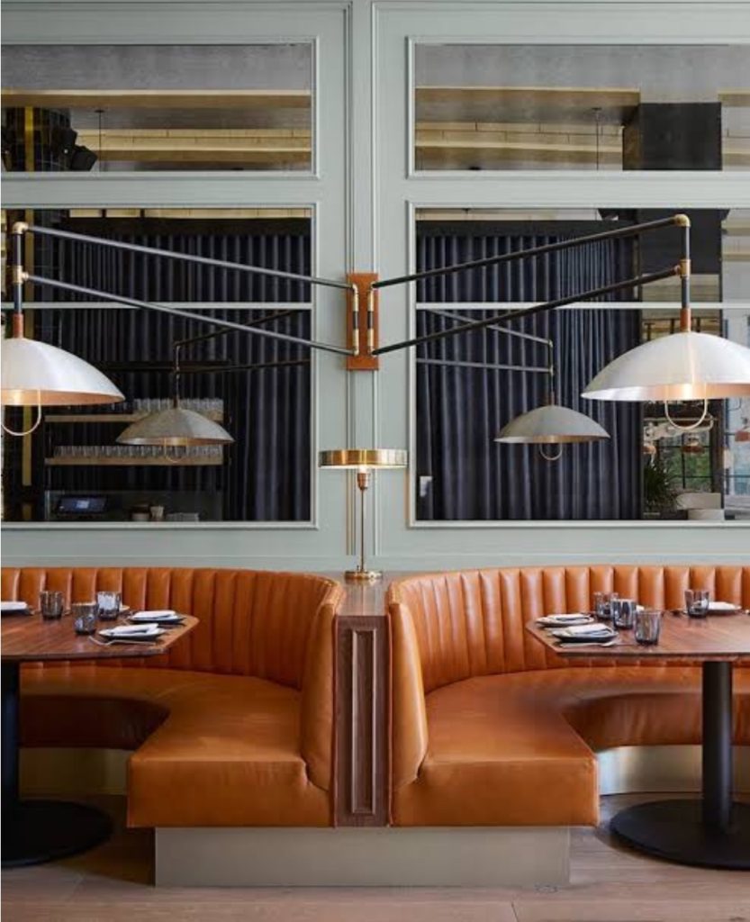
The restaurant Proxi in Chicago is as energetic, fun and tasty as it is beautiful. The beautiful interior was designed by Meyer Davis, with barrel-vaulted ceiling, colorful patterned floor tiles, floor to ceiling windows, antique mirrors and leather-quilted curvy banquettes. The restaurant is located in a former printing press and it’s devided into three spaces in a lofty-like space.
This is a quick repost from last year, instead of our regular Fashion post. I’m in Istanbul with my family to attend a memorial for my mother in law at her school she founded more than twenty years ago. This, my third time in Istanbul, where this one has been bittersweet for the aforementioned, but entirely deserving of such an extraordinary woman that was my late mother in law. We’ll be back on schedule next Friday.
I love a room with just the right amount of colors. Contrary to all-white rooms, colorful rooms look finished, well thought and put together. They also look sophisticated and collected. Conversely, the interior design of any space will depend on the owner’s preference and lifestyle. That said, I believe there is a very attainable balance as these rooms full of saturated colors can attest. It’s in the right balance between the noise in high contrast colorful rooms and the sophisticated ones that don’t scream at you. Colorful interiors have the skill to boost any room’s excitement instantly. The color we choose for our homes can speak volumes about ourselves, preferences and even provide a hint of our inner lives as well. For instance, did you know that the color green means caring and helpful… and black conservative and creative..?
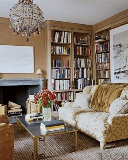
The use of color in a room seems to be more beautiful when it is done in a gradient effect as in Aerin Lauder’s library. Everything in it seems to harmonize perfectly, it’s soothing, perfect for a space for reading and it’s sophisticated, ideal for a drink at night.
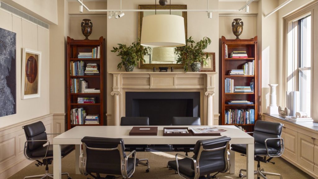
If you are familiar with Architect Gil Schafer’s body of work, you know it’s classic, warm and enduring. His firm, G.P. Schafer Architect’s new office is not the expected kind, and that is a good thing. Often when we hear of touring an Architect’s office, the first impression that comes to mind is that of an ultra modern, all glass and concrete office. Well not always, in this case the office belongs to the beloved classical architect who doesn’t only design building structures, but also decorates houses.
Gil Schafer, head of G.P. Schafer Architect is known for building homes that appear to have been around for longer. His work is very well known among designers due to his many beautiful work published in many interior design magazines as well as in his own design books.