Tag: Interior Design

I’m especially exited today because after four long living-with-rental-furniture-months we are finally getting our stuff tomorrow.  It’s play time! I have a pretty clear idea of where things are going to go, but boy can’t that change? One thing that I’m certain though is the gallery walls I
want to create around the house.  I’m a big fan of picture cluster walls and I’ve realized that when there is a lot of different ways to create them and/or to display them, each produces a different background.  From a complete harmonious and balanced display, to careless and Bohemian one to a more eclectic grouping.  Each and everyone translates the personal
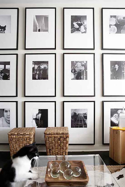
lifestyle of their owners, as it should be.  So I’ve been paying attention about how to create the best gallery walls or wall art composition as some call them.  For creating a harmonious and balanced gallery wall is good to keep things simple and hang each picture at the same distance vertically and horizontally speaking.  One thing to keep in mind is to keep all frames and matting in the same color.

how to create the best gallery walls, black and white gallery wall via belle vivir blog

A display of black and white photography hung with the same identical distance between them creates a more modern aesthetic.
Read More…

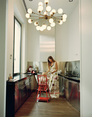
Although I’m more inclined to a mixture of modern and traditional.  My Interior Design style consists more of classic lines combined with modern touches; I appreciate modern and clean lines in Interior Design.  Especially because it’s a smart way to go when dealing with tiny and narrow spaces as in these small kitchens.  As it’s well known “less is more” and I’m not one that uses that term very often because mathematically doesn’t make much sense, lol. On the other hand, though these small modern design kitchens featured here are all small and with clean line kitchen cabinets, they all have something in common that stop them from being boring.  These unique elements are the finishing on the cabinets, fixtures, and accessories.  These smart designers kept things interesting with finishing such as lacquer, stainless steel, gorgeous marble as backsplash, and a lot of brass or gold accents.  Lovely details that can make all the difference.  Who said that modern kitchen design has to be boring?

small modern kitchens, stainless steel cabinets
Carolina Castiglioni with a modern kitchen design, harwood floor and cluster chandelier via T Magazine.
In small kitchens, we may not see a kitchen island or a dining are obviously because of the small space, but we can incorporate many other modern elements into the kitchen design.  Some of my favorites small kitchen design ideas happen to be also functional elements such as open shelving, high gloss cabinets, stainless steel appliances since they all can make a small kitchen look more spacious.  Having open shelvings also provide more counter space for food preparation.  Below, more modern kitchen design ideas.

Read More…

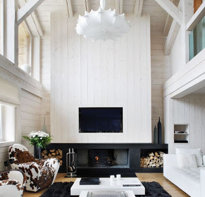
A Monochromatic Cabin in Megeve

While many rich and famous take the first month of the year vacationing to warmer weather destination, others like myself go back to work and duty.   Unnaturally though I would rather be somewhere else where there is a lot of snow and mountains- at least for a very short time.  A Cabin like this one in Megève to come back to after a long day of skiing (with an aching body from all the falls) is of course part of that wish.  The basic black and white
of this cottage is very soothing and fitting for the million dollar view of the Swiss Alps, however I would rather have seen a bit more shades of brown throughout.  The cowhide chairs for instance are the queen of this house, what do you think? The kitchen with its monochromatic palette is a big focal point of the cabin and the tulip chairs with rabbit pillows are also a great warm detail.  Enjoy!

Read More…

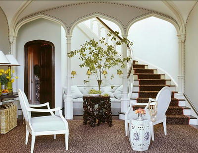
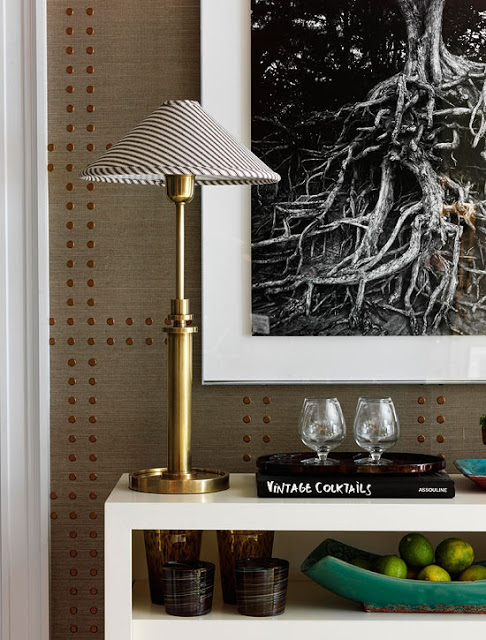
studded nailhead upholstered walls in home decor via belle vivir

Studded Nailhead Upholstered Walls is one of the most elegant and relatively inexpensive ways to add elegance into your home.  Bringing architectural interest into our home can be done by simply upholstering the walls in fabric or wallpaper and adding nailhead along the edges of the walls or in different patters as if forming a nailhead trim.  This type of wall treatment brings dimension to any room.  I’ve said before how I think that upholstered doors is the ultimate attention to detail.  That is of course if there are no upholstered nailhead walls nearby to compare them to.  The is definitely a great amount of work and effort that goes into creating one of these amazing studded nailhead upholstered walls.  Especially those that form specific patterns over the wallpaper or fabric.  This technique also brings instant coziness to any home decor style.  There is already wallpaper designed to look like studded walls making the process a lot easier, and none the less beautiful.  Phillip Jeffries has a collection called Rivet that comes in different color contrast.   Shown in the picture below  Enjoy!

studded nailhead upholstered walls in home decor via belle vivir

This image above shows one of Philip Jeffrie’s Rivet Collection where the wallpaper appears to have embedded nail heads.   You get the great result without the extra effort.

Read More…

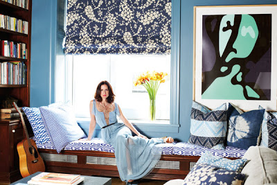
Nothing better than when we get to peak in into the lifestyles of stylish people.  It proves once more than a great sense of fashion doesn’t stand too far from a good sense of living.  Leave it to the Herrera family to show us that.  In the December/January issue of Harper’s Bazaar, you can get a good sneak peek into Patricia Herrera Lansing’s New York apartment.  It’s beautiful and cozy as equally elegant. But that shouldn’t take anyone by surprise, Patricia’s parents are the legendary fashion designer Carolina Herrera and Vanity Fair contributing editor Reinaldo Herrera.

Patricia Herrera Lansing's New York apartment, bedroom

The apartment was Patricia’s husband bachelor pad.  They gutted it and reworked it doing the spaces by color, according to Patricia.  ” I did it by color-a blue room and a green room and so on”  The result is a family friendly home with lots of good art.  “I think you have to have a place where your children can run around freely,” she says, and I agree.

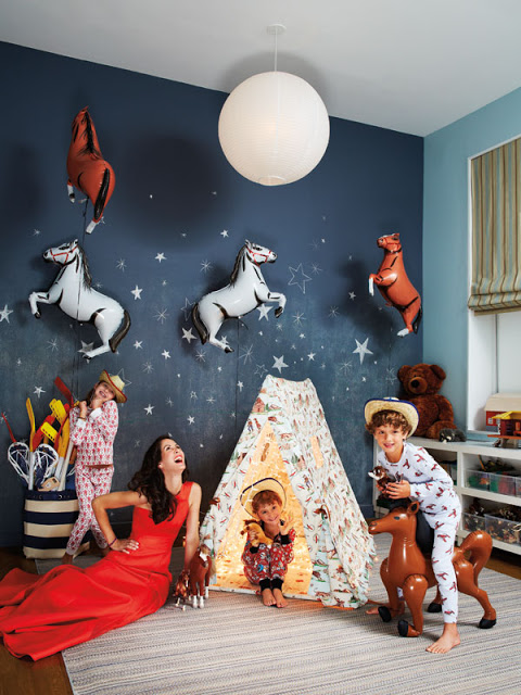
Patricia Herrera Lansing's New York apartment, kids bedroom
A beautiful children’s room with started wall and blue walls.
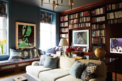
Patricia Herrera Lansing's New York apartment, library
Built-in bookcases in the cozy library.

Read More…

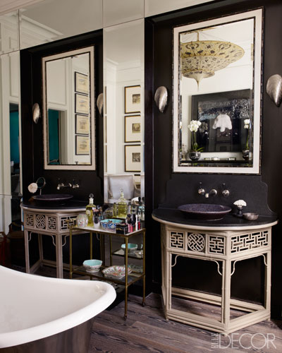
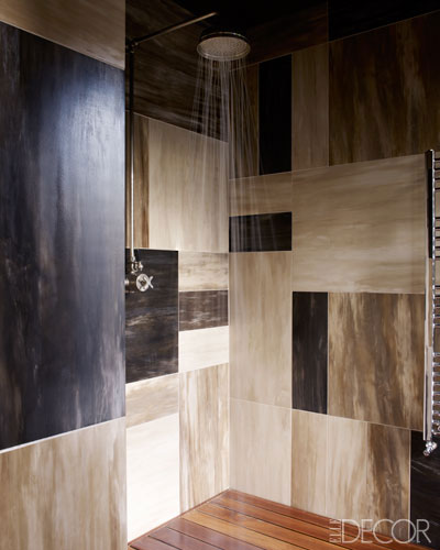
Beauty is what beauty does! Meaning, in this case, that not all bathrooms need to be white in order to be beautiful.  When black bathrooms have good and exotic materials that are utilized and mixed with contrasting elements as brass, light washed wood and a lot or just enough mirror the opulence of a dark bathroom is not only unique and normally unexpected but, it’s also seductive.  I’m in love with the Chinoiserie vanities of the first bathroom below.  I also love the rustic unpolished floor and the detail of the different colors and size marble in the shower below.  It’s a total dream, isn’t it?  The bathroom, first and second images, belong to Kim Herbert, Harper’s Bazzaar uk editor via Elle Decor.