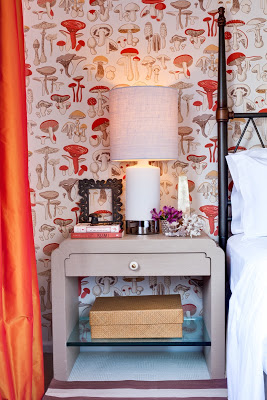
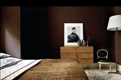
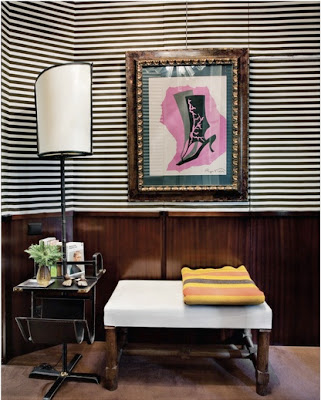
There was a little bit of misunderstanding with yesterday’s post. Apparently some lovely people thought that the first image was part of my home, it’s not. I found the image at New York Social Diary. The post was intended to inspire a different way to approach Christmas Decoration. I apologize for the confusion. For that reason I decided to post a few images of our home, which I don’t do much because we all know that magazines would not be interested in featuring somehing that’s been already published. This past Saturday the photographer Marco Ricca was here and took many lovely pictures of two of our bathrooms, the guestroom and Lucas’ room. For the guestroom above I wanted to create a magical space that was cozy, inviting and dreamy. So my first thought was the movie Amelie. Since I love French movies for their lightness and happiness underlined I designed our guestroom inspired on Amelie, hence the whimsical and unique wallpaper and the color scheme. The wallpaper is Champignons by Brunschwig and Fils, the side tables are designed by a Karl Springer apprentice. I don’t remember his name. The handle is one sculptural gorgeous thing but you can’t appreciate it much unless you click on the picture an zoom in.
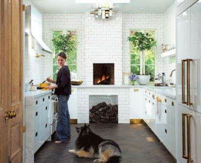
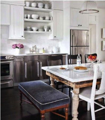
A kitchen with walls covered from floor to ceiling tiles gives the impression of being well finished. Regardless of what type of back splash is covering the walls, the simple subway tiles, marble slabs or hand painted tiles, the whole effect gives the kitchen a feeling of grandeur and cleanness. For an even more seamless appearance some people go with grout of the same color as the tiles while others who prefer a more contrasting effect decide on gray or black grout. I prefer a darker grout especially if the kitchen is all white to give it depth. There are many different shades of gray from darkest to lightest. Enjoy!
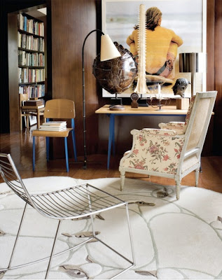
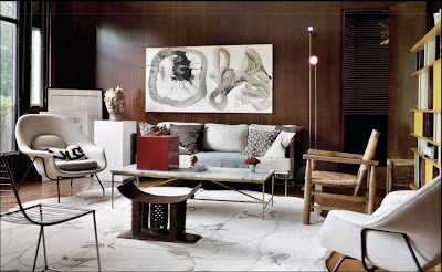
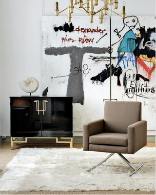
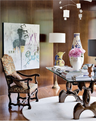
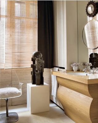
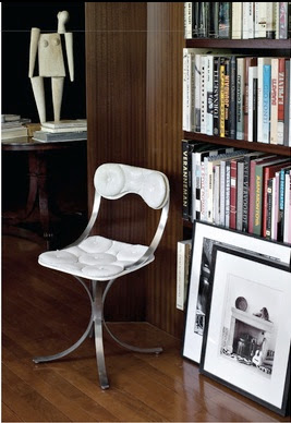
Then last night while sitting in my living room and imploring God for some inspirations to blog about, I came across this pied-à-terre in Tolouse, France that belongs to the Architects Daniel Suduca and Thierry Merillou, the owners of Galerie Saint Jacques. The apartment which they reconfigured to make more open and fluid, is filled with 20th Century furniture by different and amazing designers. This home is a harmonious marriage between the classic and the personal.
As I like to emphasize, I love a home full with Architectural furniture that makes it unique and out of the ordinary.
Jean Prouve chair and table juxtaposed a Louis XVI arm chair covered in chintz. The carpet is by Lalanne.
photograph by Manolo Yllera
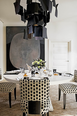
To many people the thought of decorating a home entirely in black and white may sound a little bit too formal or too sober. Colors are too comforting and too welcoming, even if the interior is done in pastel colors. But there are rooms that seem to pull it off surprisingly well, and the common factor seems to be one or two whimsical touches. This dining room above designed by Alberto Pinto, for instance, has a very playful chandelier and chairs upholstered in polka dots. The table setting is also very whimsical.
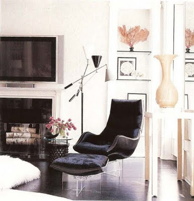
This living area above is also very light in ambiance with lucite based curvy modern chairs and a shag rug.
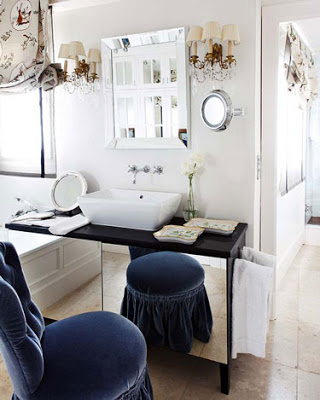
Whims everywhere in this bathroom, from the shade to the skirted chair/stool. The sconces have their own touch too.
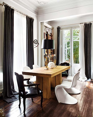
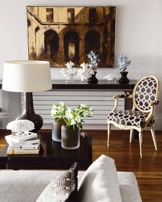
Mix and match chairs in this room include casual Panton chairs and Louis XV style chairs.
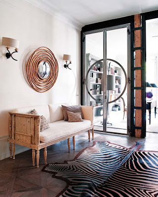
The space above has like a very nice light reflection that gives it a hint of pink. The zebra rug, the round mirror and the sconces pull everything off.
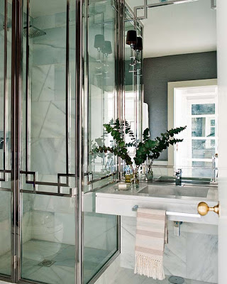
This bathroom is quite spectacular. What doors! Love the size of the sconces and the brass door handle.
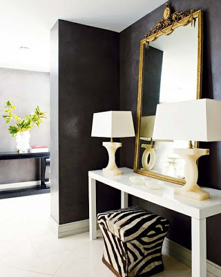
Here again, the zebra stool and the shape of the lamps brake the space from being too sober.
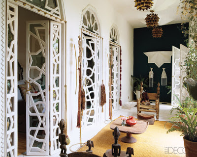
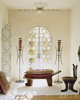
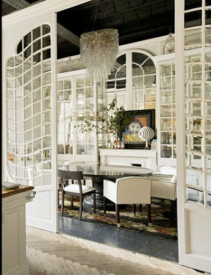
I was talking to my friend Cathy from Lerebours Antiques last Friday over dinner about Classic Architecture and she was telling me how much she loves early and late Neoclassical Architecture. I told her that I liked everything from Gothic to Art Deco- excluding Art and Crafts. I love the (concept of Art and Craft) but I don’t like the aesthetic outcome of it. Ah.. nope! I was surprised when I read Lonny on Saturday night and found their very interesting cover of Art Nouveau period and it made me think about how little influence is there now-a-days from that period. And then I remembered this very exotic home that was recently featured in Elle Decor and Lazaro Rosa Violan‘s amazing office doors which have a bit of Art Nouveau influence in a modern way and the results were stunning! Enjoy!
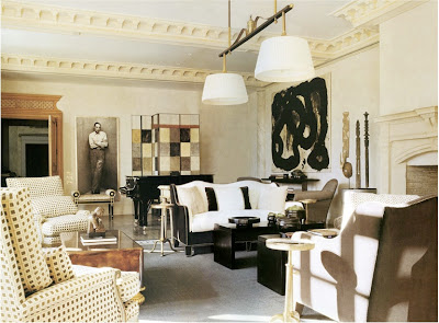
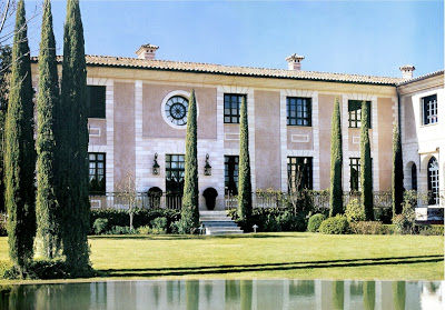
Thomas Urquijo, a Spanish Interior Designer or Interior Architect I should say, is one of those masters who knows how to mix periods and style in one of the most effortless ways I’ve seen. His Interior Architecture is completely classic and elegant but it feels totally livable. It doesn’t make me feel stiff at the thought of living in it.
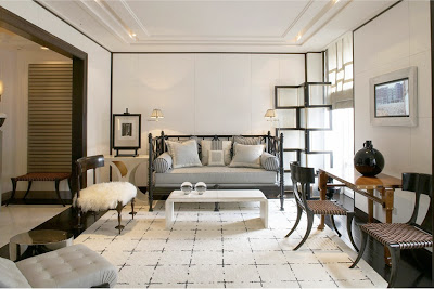
Love this area for a small apartment living room. The architectural screen and the treatment on the walls brings personality to the room while the daybed and the kind of modern or transitional carpet makes the whole atmosphere feel friendly. The Klismos chairs make a direct reference to classic in a very light and chic way.
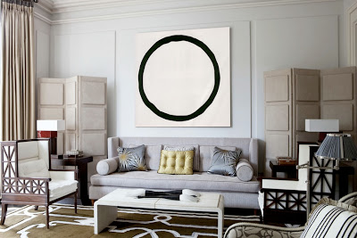
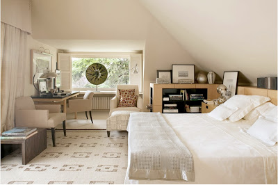
Thomas Urquijo seems to love regency and art deco style furniture, which I would say helps his rooms look transitional. I feel I can never get tired in these rooms.
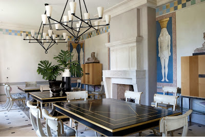
Here, in this amazing dining room, Thomas went completely regency. He painted Egyptian figures on the walls and used a more modern version of the Klismos chair. I adore the checkered border on the upper part of the walls. It’s amazing how a simple little detail can bring so much character into a room.
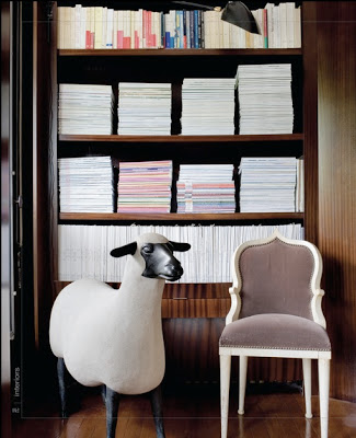
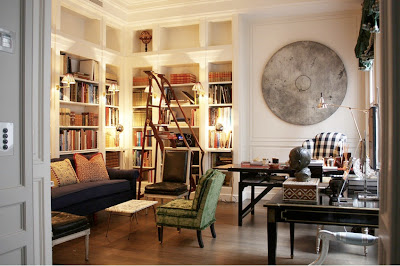
This room has me drooling…. I mean seriously drooling. I can not tell you how much I adore that ladder, does it look a bit Art Nouveauish to you? I have to have a Louis XVI chair upholstered in black leather one day. I know, I know… Check out the circle sculpture on the wall! Can you picture a square one…? nah… The gingham checkered fabric on the wing chair brings a touch of youth to the classic library.

