Tag: Interior Design

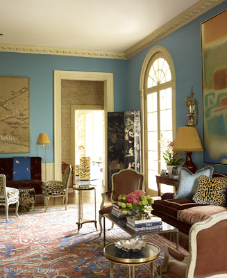
Miles Redd, Danielle Rollins's home, living room via belle vivir blog

Yesterday I went into Miles Redd’s website and was more than happy to find more and new images of this amazing Atlanta home designed by him and featured in Town and Country a few months ago.   The home belongs to Danielle Rollins, Veranda contributor editor.  Danielle Rollins’s home is what dreams are made of.  The house was restored by Gil Schafer and decorated by the very talented Miles Redd.  What seems to be a girl’s vanity (down below) is just adorable.  I could say so much about Miles Redd, for instance, that I dig his style. His signature style, Cozy Glamour translates itself flawlessly into any home he designs.  I love how he plays with drama, philosophy, grandeur, and reality to create his one of a kind incredible interiors. He relies on innovation and imagination to re-create classic and elegant interiors that express the client’s personality.  The many often use of stacked books in his projects make me also define his style as a “Modern Intellectual” approach in the actual world.  Miles Redd began working for antique dealer John Rosselli, later working for decorator Bunny Williams. After making his apartment a statement of his signature “Cozy Glamour” and clients arising encouraged him to open his own office in NYC in 1998. Since then his career has skyrocketed. In 2003 Miles Redd was named the creative director of Oscar de la Renta Home.  Who could ask for more? To see how Redd designed his mom’s house go here.  But first, let’s feast our eyes.

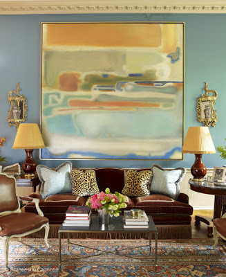
Miles Redd, Danielle Rollins's home, living room via belle vivir blog

Lovely sophisticated combination of blue and brow in the living room. An extraordinary mixture of fabrics and patterns in Miles’s hands is magic.

Read More…

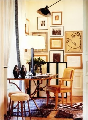
wall art composition, Gallery wall home decor ideas via belle vivir blog
I love the aesthetic of this room above where the color scheme is kept to neutral colors.  I especially love how much the art modernizes the space.
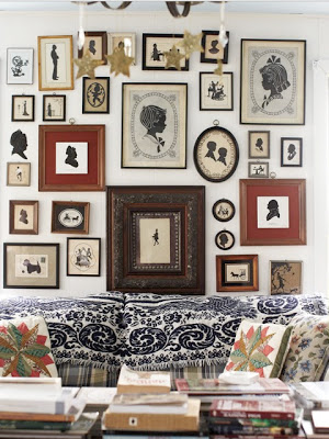
I have had this post about gallery walls Ideas or wall art composition saved for a few weeks, and lucky for me I have something interesting to share with you today.  An art wall composition with mixed and matching frames is to my eye a lot more interesting than one that keeps the same frame and displayed in a contained group. I think it’s a more collective and exiting look.  Here are a few wall art composition ideas to inspire your home decor.  I think that as long as one keeps similar color scheme in the art and in the frames and keeps an equal distance between them, anyone can do it well. Of course having great art doesn’t hurt either. Enjoy!
wall art composition, Gallery wall decorating ideas via belle vivir blog

This room is a great interpretation of ” Glam granny”.  The silhouettes represent the old part of the room but in a very stylish way.

Read More…


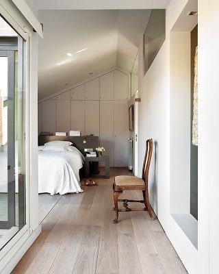
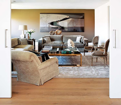
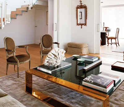
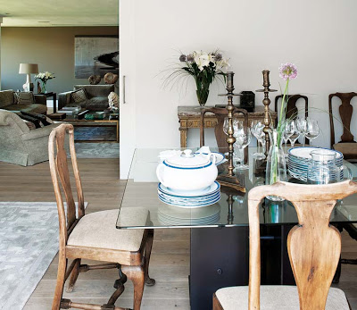
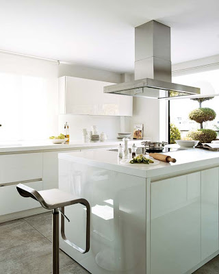
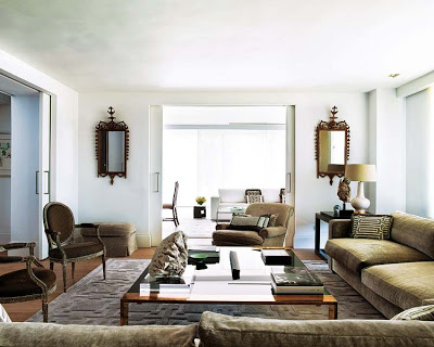
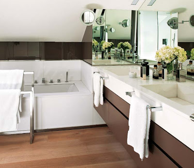
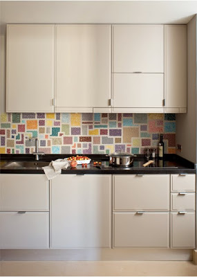
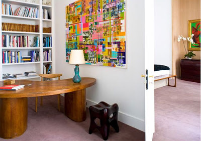
French are graciously eclectic, Italians are modern innovators, but Spaniards are all about clutter-free. Decorator Gema Cidri with the collaboration of Luis Puerta were looking for simple forms to make this home relaxed and elegant at the same time.  Something I’m a fan of if you allow me to tell you.  The layout of this entire flat in Madrid was reassigned to make it suitable to the owner’s lifestyle.  Keeping a monochromatic scheme and all furniture close to one height helps with the serenity of the environment.   Madrilenian design is a bit on the minimal side in a way that they don’t go too much overboard with art.  It seems they rather keep their walls bare more often.  Another aspect very often found in Madrid is the use of sliding, or pocket doors.   I really love that because of their space saving effect.


 This room seems to have no windows but the glasses on the right wall double as an indoor window allowing light from the adjacent room to flow in.

Images via Nuevo Estilo
 

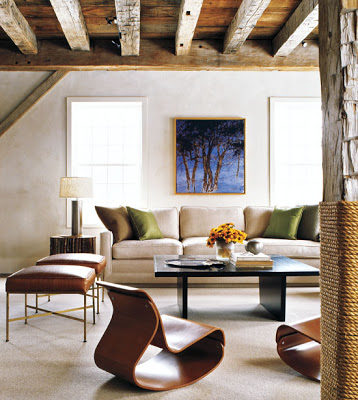
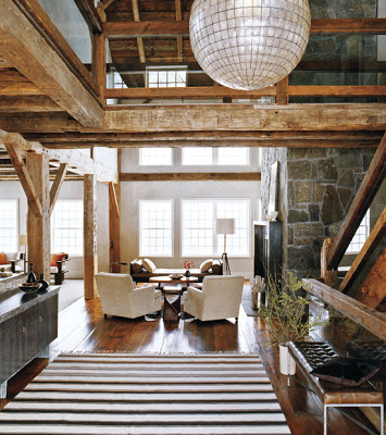
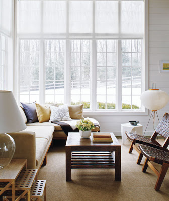
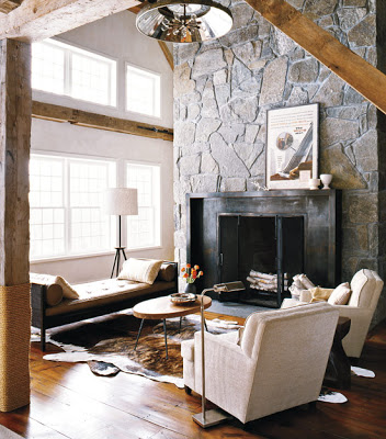
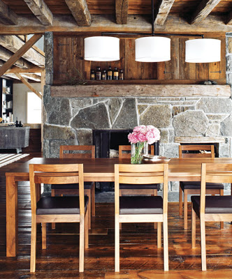
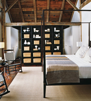
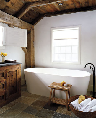
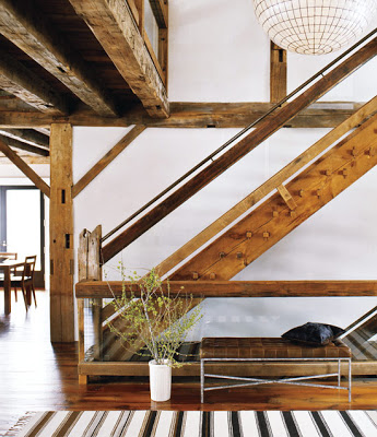
The weekend is around the corner!  With that in mind I wanted to imagine having a weekend home like this in the woods, a place to disconnect from everything and just enjoy leisure time surrounded by family and friends.  It’s good to dream, right?  It keeps you going and also makes you work harder.  Up until I saw this barn that was moved from Canada to Connecticut I had the belief that only certain houses can be moved. Never thought that something in this size and structure was possible.  Not even by pieces.  Russel Groves, the designer and architect responsible for the modern update of this barn, describes himself and firm as modernists.  But in this case, and because of the owners’ lifestyle, he decided to preserve the warmth and charm of the space.  I think he nailed it!In the stunning living room (top image) sculptural chairs, slick ottomans and a over sized sofa with pillows juxtapose exceptionally well due to the muted colors.  Notice the column covered with rope- a very nautical and country touch?

An oversized Capiz-shell globe chandelier welcomes visitors from the double-height ceiling.
Love those windows.  This entire room is very inviting.  Right?
This barn must be huge judging by the different sitting areas. 
The set of flowers on top of that table looks like it’s been naturally bloomed there.


That free standing pedestal tub looks like a cloud in an Autumn ski to me.
The staircase is a sculpture on its own, with glass and a modern bench that offset the massive use of wood.
images from here.
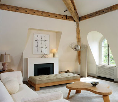
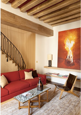
Pieree Yovanovitch interior design living room beam ceilings
While visiting the opening night preview gala of The Spring Show, I came across the work of Pierre Yovanovitch featured in a magazine given out to attendees.  The 2,150-square-foot house is located on the top floor of an Hotel Particulier in Paris.  Pierre Yovanovitch has been named by Architectural Digest as one of France’s most exiting young interior design talents.  Yovanovitch’s introduction to interior design was merely by chance when his friends asked him for help to decorate their homes while he was designing clothes for Pierre Cardin.  What I love most about his home is how he can combine comfort with rustic to a very polished result.   

Pierre’s style is what Modern Magazine called sophisticated modernist and I couldn’t agree more. About his home he says “This is my interpretation of rustique chic

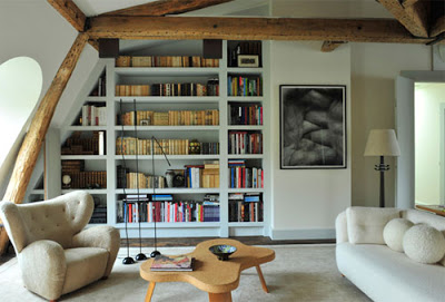
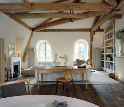
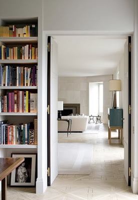
 pierre yovanovitch design library with exposed wood
Love the exposed wood in the library.
pierre yovanovitch interior design

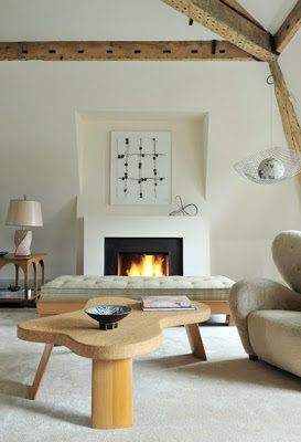
A mid-century daybed by James Mont and a wood and cork table by Paul Frankl used in the living room.
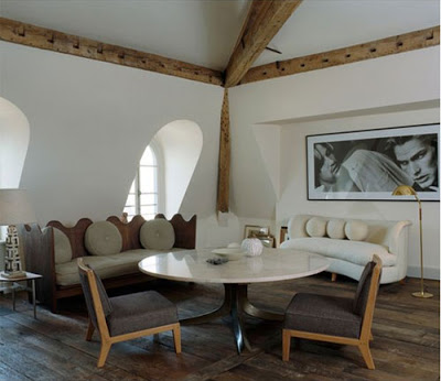
pierre yovanovitch dining area
pierre yovanovitch dining room

Pierre opted for a more bohemian approach for his dining area while still using mostly mid-century furniture. When friends come over, the sofas are pulled up to the Jules Wabbes’ table.
pierre yovanovitch desing
Below, more eye candy from his work.
pierre yovanovitch paris design
pierre yovanovitch design
red sofa in cozy living room
This post was edited on April 3, 2017 for accuracy.
liquide leather upholster

Lacquered furniture have been around for centuries but liquid leather as upholstery is a trend that’s picking up quite a lot lately. Very much loved and used by Steven Gambrel and Nate Berkus in their polished and sophisticated interiors, it may be a trend that stays longer than usual; after all, shiny surfaces is something that is very much loved by a big majority. I personally love the look, what about you; would you use liquid leather as an upholstery option in your home?

liquide leather upholster
Read More…