Tag: Michael S. Smith

Using the same fabric for walls and furniture may sound old school; however, when interpreted in modern ways, it can be timeless while up-to-date.  Besides being aesthetically beautiful, there are many other benefits of doing this.  From making a room feel more spacious, to more harmonious to even more artistic, using the same fabric or pattern- sometimes in the form of wallpaper for the walls and fabric for the furniture, can indeed enhance any space.  See for yourself below a list of good reasons why it is a design element worth trying.

It Makes The Room Feel Spacious
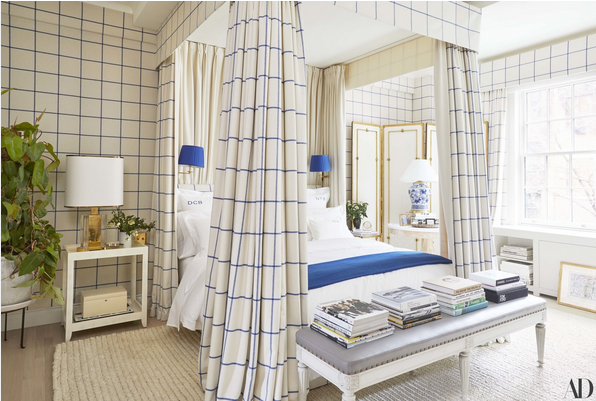
Derek Blasberg's bedroom in ralph lauren fabric

Derek Blasberg’s Manhattan bedroom where canopy bed, walls, and headboard share the same Ralph Lauren fabric.  Design by Virginia Tupker via AD

Read More…

Michael S Smith design Zuber wallpaper
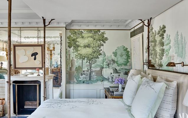
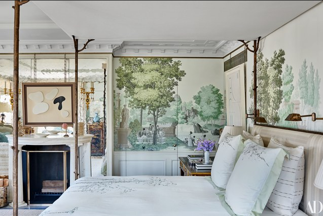
glamorous bedroom, Michael S Smith design Zuber wallpaper

The canopy bed is custom-made by Carole Gratale.

This glamorous bedroom designed by Michael S. Smith, one of my favorite designers, is a product of a long-term relationship between clients and Interior Designer.  Smith has designed more than 12 residences for the homeowners in the span of 25 years.  After a five year long renovation, which involved joining two previously separate apartments, the result is a beauty in every form with a mixture of refined old world and modernity.  The interior design in the bedroom, as well as in the rest of the house is out of the box and without matchy-matchy.  “ There are many high points, but not everything is at full volume.  Overall, the apartment is serene and quiet, not jumpy.” Michael S. Smith.  You can see the rest of this spectacular home at Architectural Digest.

Read More…

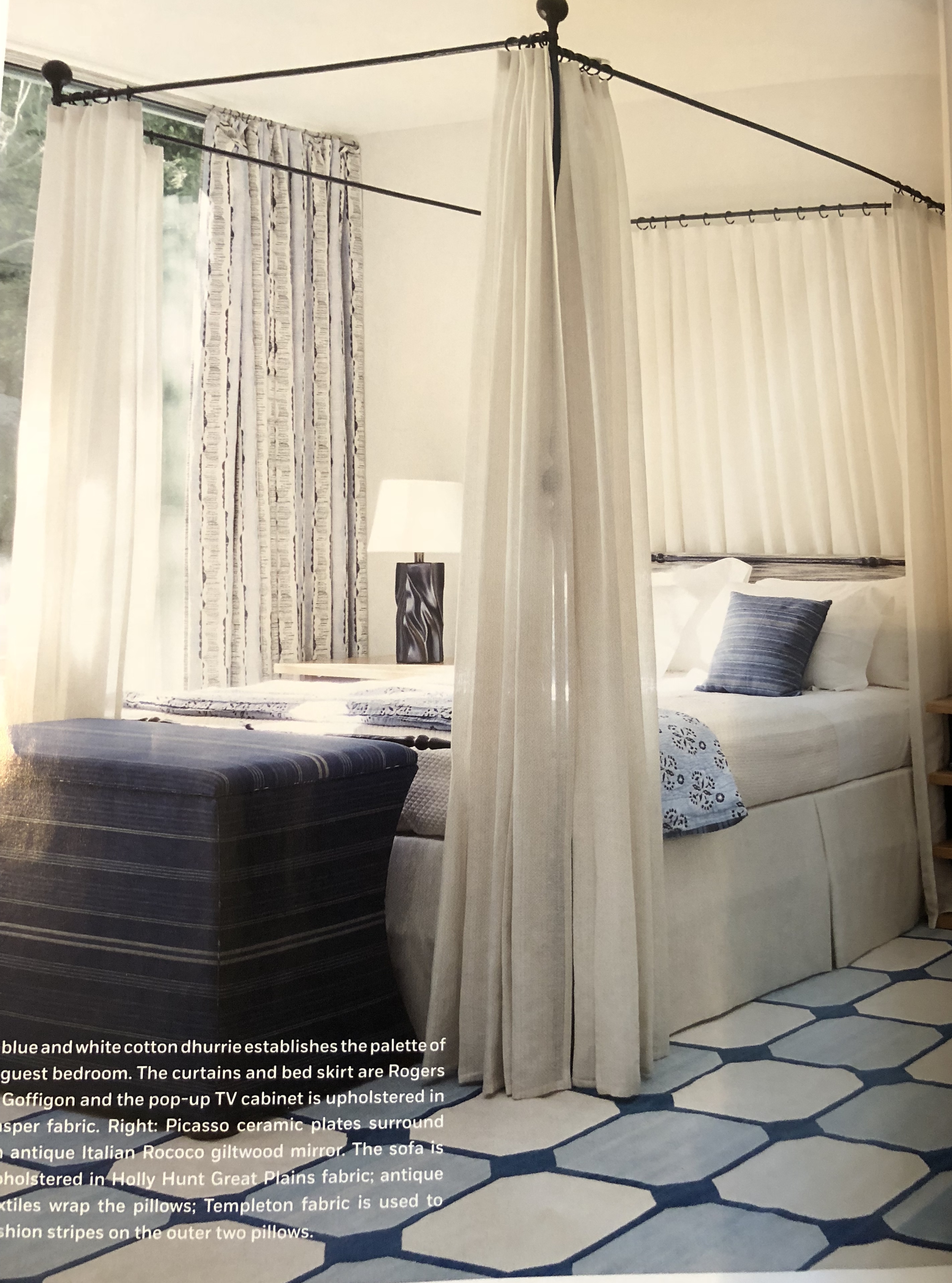
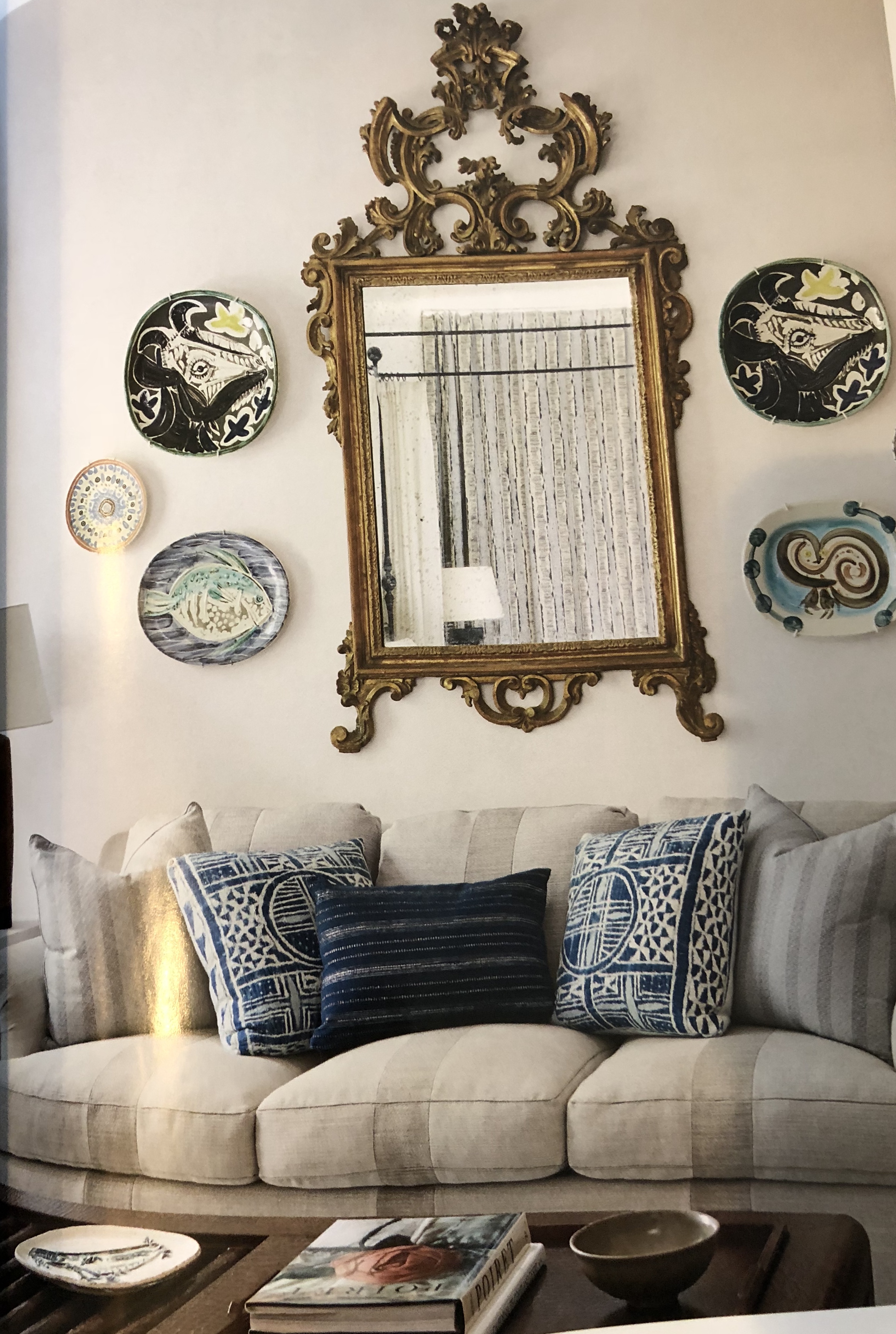
I’ve never been to Palm Springs, however it is on my national travel bucket list.  The desert town has a history of glamour linked to the 50’s and 60’s when a lot of the Hollywood stars owned vacation homes that makes it irresistible.  I love to look at the pictures of Palm Springs with its Palm trees and open landscape.  Interior Designer Michael S. Smith has a ranch there and has recently helped two friends to revamp their 1960 mid-century Modern home into a modernized Palm Spring Style residence.  The house is situated In Coachella Valley, the same area where the popular Coachella festival happens every year.  Michael S. Smith told Milieu that the house is situated high up, allowing a great view of the landscape… I think that would make up for the loud days during the festival.  “Because anything can be defined as ‘a style’, I developed the interiors in the context of what living in a desert means.” Michael.  Smith avoided the traditional look that defines some mid-century design and rather made a home comfortable and inviting with beautiful abstract work and Picasso porcelain that can be seen throughout the house.  The first two images were taken by me of Milieu Magazine spread, where the house is featured for the Spring issue.  If you didn’t know about this new magazine you should check it out.  In the current issue you’ll find a very insightful interview with the amazing and uber talented Philippe Starck.

Palm Springs Style via Michael S. Smith blue and white rugh via belle vivir

Palm Springs Style via Michael S. Smith living room via belle vivir blog

Below, pictures of Smith’s own 1970’s ranch in Palm Springs as featured in AD last year.  Besides the open plan of the Interior Architecture Rancho Mirage feels inviting and cozy.  The use of upholstered furniture, area rugs and neutral tones has a lot to do with the overall feeling of warm.

Read More…