

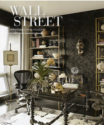
I’m glad I was able to see these stunning spaces in person and was even happier to hear from Kelly that, for two days only (November 11th and November 13th), the spaces will be available for tours. Proceeds will benefit Baby Buggy. For more information on tickets please go here.
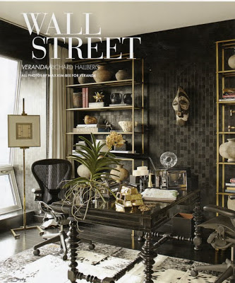
Below, the two first images are from Richard Hallberg’s interpretation of Wall Street where he “mixed 18th century furniture with contemporary pieces, modern art and Roman antiquities to produce a result that is timeless.” I love how the juxtaposition of the brass etageres against the leather covered walls and the ethnic accessories give this room that collected sophisticated feel. The feeling of the walls was amazing. More beautiful and detailed pictures will be seen in Veranda’s January issue.
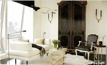
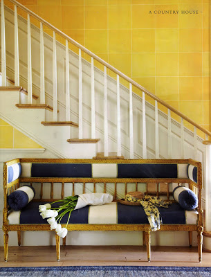
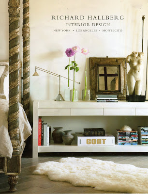
The two images below are from other projects by Richard Hallberg.
images scanned by/for Bellevivir from catalogs given at Designer Visions opening night.

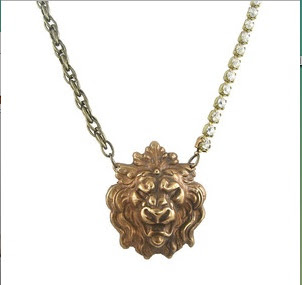
I love Lion heads hardware but I never thought of using one as a necklace until I saw the bottom picture at Chic Intuition and loved it. I would wear it with a pearl necklace a white shirt and comfortable jeans. Available here.
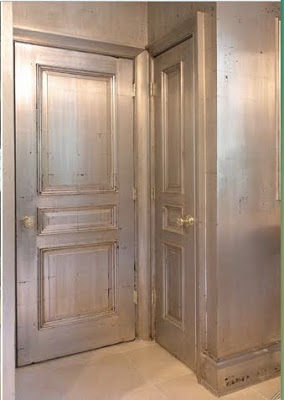
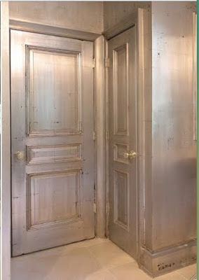
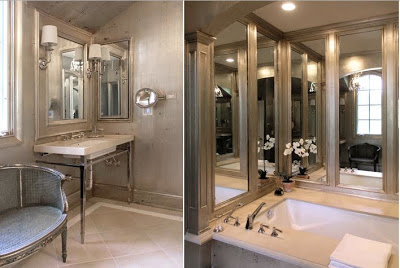
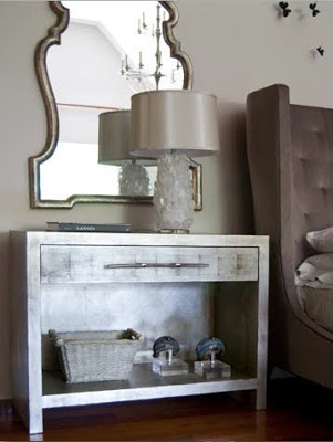
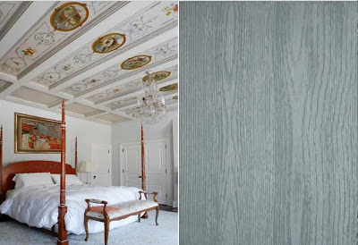
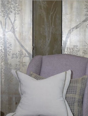
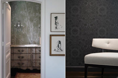
I met the Design Red team at the Architectural Digest home show early this year and was very impressed with their fine decorative painting work. “Design Red is a Chicago based firm that specializes in fine decorative painting, with a commitment to excellence in craftsmanship on every project, and is known for extensive experience, highly skilled artistry, innovative style, creativity, and distinguishing detail. Named by Chicago Magazine for “Best Faux Finishes” in 2007, DesignRed’s clientele include prominent interior designers and architects, and private individuals.” Some of their work can be printed as wallpaper and delivered to their clients making the process more personal and easier. Below are samples of their work. I can only imagine how much work and effort it takes to get these kinds of results.
One of two side tables that were gilded then burnished and detail of an antique gilded bathroom.
Enjoy your weekend!!
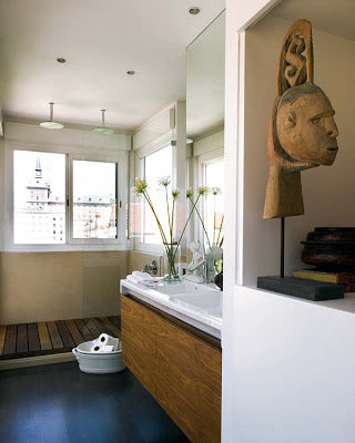
I came across this Atico Madrileno (usually the top floor apartment with a roof terrace) yesterday while browsing Nuevo Estilo. This apartment surrounded by an indoor patio was renovated by Interior Decorator Pedro Rubio, unfortunately he doesn’t have a website to get lost in. The home owners who are frequent travelers asked for a dynamic home where they could enjoy different seating areas, bring in family pieces and display their travel collection. The result was a mixture of different styles and characters using classic and modern furniture with exotic African elements and central Asian textile (suzani). One of my favorite elements on Spanian Interiors is how they enhance or improve the architecture of rooms by incorporating such elements as modern panelings, lacquered walls, geometric painted floors and graphic sliding doors making rooms look more dynamic and interesting.
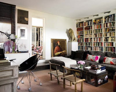
The cozy yet sophisticated library and family room. Those bookcases and those Amalfi Coast chairs really make the room.
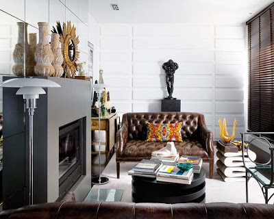
The mirrored fireplace-wall contrasts with the adjacent modern paneling. Love how the use of the round cocktail table facilitates the flow.
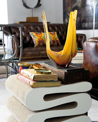
The Wiggle Stool by Frank Gehry seems to blend in effortlessly with the tones of browns and grays in the living room.
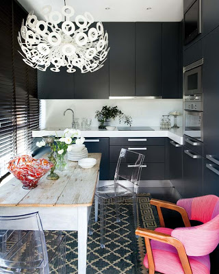
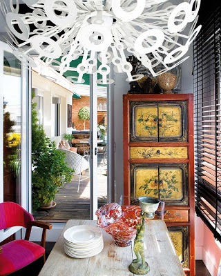
The kitchen table used to be an ironing table and its now, together with the head fixture the focal point of the room.
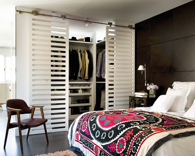
The graphic sliding doors contrast the modern wood paneling. A modern architectural enhancing element that’s easy to replicate.
Images via Nuevo Estilo.

