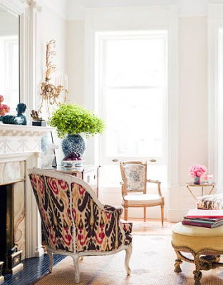
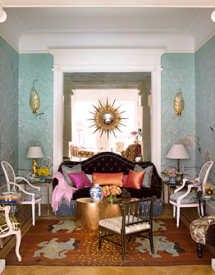
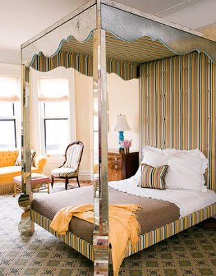
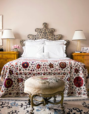
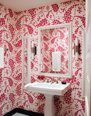
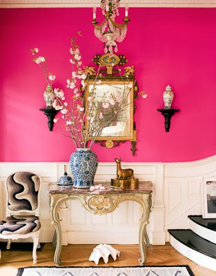
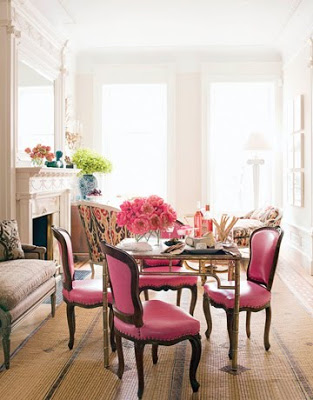
While putting together my previous post I remembered the stunningly bold Brooklyn townhouse designed by Jonathan Berger featured in the July issue of House Beautiful last year. This townhouse is an eloquent example of my last post. It’s daring but elegant and fun. And while it may not be appealing to men, I have to admit that this house is a departure from a more traditional home decor, it’s also an inspiration to not be afraid of mixing colors and patterns. The impressive foyer painted in Razzle Dazzle by Benjamin Moore with accents of white and blue and the bed was designed based on a 1940s Serge Roche model.



C'est Moi: Mak
I love this house too! Neo baroque inteventions always fascinates me! Xoxo
flock of tea cosy
LOVE that fuschia foyer wall. It makes one feel like smiling and that's always a good thing….
Plum Pretty Sugar Loungerie
adore the pink!
mydesignchic
I adore this house and the kitchen…perfection!!
Deepali Kalia Interior Design Blog Filling Spaces
love all the chairs,
Karena
Julia I love it and that chair in the 1st image, sighhhhhhh!
xoxo
Karena
Art by Karena
quintessence
I remember this space – SO fabulous. I also love just about everything about it – especially love the paper in the powder room and the pink leather on the Louis chairs – I'm not even a pink girl and I like it!