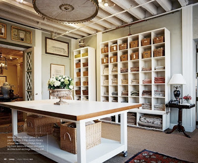
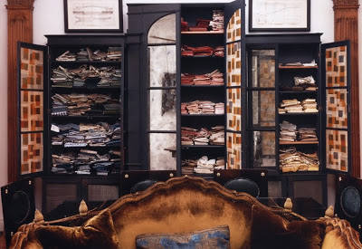
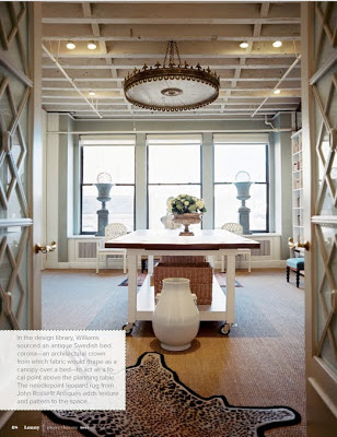
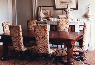
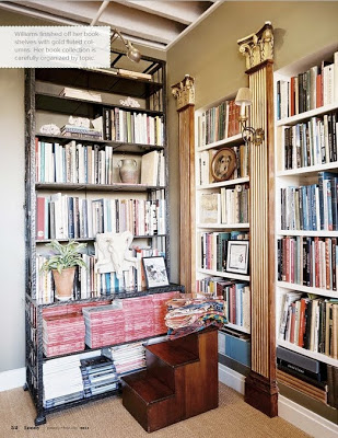
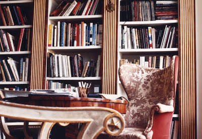
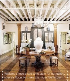
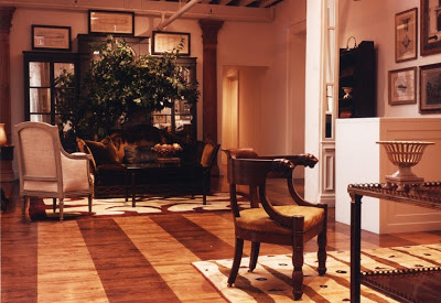
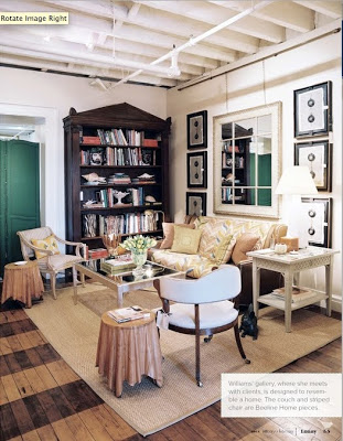
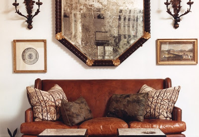
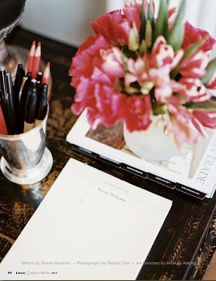
Even the masters don’t stop remodeling and making changes in their homes and offices. This is obviously the case with anyone who loves and/or is involved in Design. When I saw the office of Bunny Williams featured in the current issue of Lonny Magazine I couldn’t help notice how her office has gone through a major transformation from the last time I saw it in her website. This time her office has a more Scandinavian vibe than the more Roman/classic influence of the previous design. New white bookcases make the room lighter, brighter and younger and that yaw dropping Swedish bed corona above that table give another life to the ceiling.
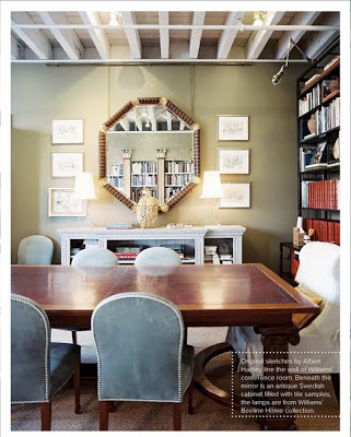
The current office has smaller and curvier chairs around the conference table above?
Same floors (above and below) but with complete different furnishing. It’s amazing how much light just a change of furniture can bring into a room.


A Perfect Gray
thanks so much for that title! cha-cha- cha- changes! professional or not, that's what we decor types are all about, isn't it…?
Karena
Julia, food for thought, you have inspired me!! I like the white, lighter brighter look!
xoxo
Karena
Art by Karena
Deepali Kalia Interior Design Blog Filling Spaces
goog lord..the first office picture…amazing
happy week~Deepali
Grove House Design
It is such a relief to know that even the great ones feel the need to revise from time to time. Bunny Williams is such an inspiration -thanks for sharing!
Splendid Willow
I wish I was as talented. Man, she is good!
Always good hearing from you. I might go to NY end of February. Are you going to be around?
Warm hugs,
Mon
designchic
I'm so in love with the lighter feel and that light fixture…spectacular!! Always love her style ~
La Maison Fou
Nice looking and I do like the changes, fresh never looked so organized and great!
A breath of fresh air is always well recieved.
l.