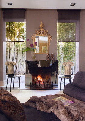
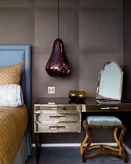
If I’m asked what’s the most difficult color to pull off, I would say Purple. It is a color with a lot of different shades, but when done right can be quite breath taking. As these images prove it. In the first image, purple is used in degradation with accents of black and gold, lush fabric and smoked glass fireplace frame (doesn’t that look amazing?). The gilded neo-classical mirror and the whimsy Fornasetti chairs brake with what could be monotonous. In the second image, probably my favorite way, purple is combined with two or three different colors. But, because they are all on the same scale there is a lot of harmony and no clash.


Splendid Sass
Julie,
Love love this room. They did it right here.
Have a great week.
Teresa
xoxo
Karena
Julia I adore plum, lavender, all of those gorgeous tones of color! Great imags!!
A Special Gift on my site just in time for spring!Come Enter!
xoxo
Karena
Art by Karena
quintessence
Great picks for a color I wouldn't normally think to use. I am however loving lavender lately for a neutral pop in both fashion and decor.
1001natt
Plum is my absolute favorite color and I LOVE this pictures!
Stine