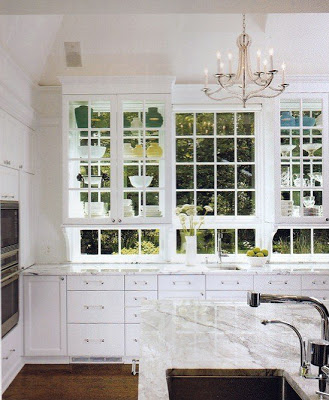
I keep on loving green; a color that’s in mother nature and it doesn’t tire me. When I first saw this kitchen designed by Stuart Cohen and Julie Hacker Architects, I thought this must be the smartest kitchen I’ve seen. The upper cabinets are completely see through becoming two things in one, an artful display that can be seen from inside and out and windows in themselves. I love the height of the chandelier, not interfering with this beautiful event.
Images credit: Cohen and Hacker, Tumblr via Inspired Design.


Bourbon&Pearls
Oh that's incredibly clever, I've never seen anything like that before, what a great use of a window
The enchanted home
Love it! Love the huge windows and "see through" glass cabinets, fabulous!
classiq
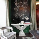
What a fantastic idea! Love it! Oh, and I really agree with you on the height of the chandelier, Julie. I feel the same about lamps, for example, having the right height so that they don't block the view to a beautiful painting on the wall behind. I pay very much attention to proportions when it comes to interior design. The two images match so perfectly. 🙂 Ada
The Devoted Classicist
Natural light is such a bonus in a kitchen, and white is hard to beat.
The French Maid
Wow! What a great idea! I have not seen this before…so nice to see something really NEW!
–Lee Ann
Mary Jo from TrustYourStyle
It's truly lovely! I love the modern feel it gives to the more traditional cupboards.
xo Mary Jo
quintessence
I'm loving green these days too!! What an incredibly clever way to bring green indoors!! Love it! And yes, so smart to hang the chandelier high!