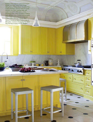
Waking up to a Kitchen with bright yellow cabinets is like being greeted with a “good morning sunshine” every single day. With such an impressive antique ornate coffered ceiling, a simple and delicate pendant is the smartest thing to do. If all the previous failed, for sure a black and white polka dotted floor will do. Enjoy!
If you have read Malcolm Gladwell’s book, Outliers: The Story of Success then you’re familiar with his theory about how all successful men and women besides having wonderful and enduring qualities have a continuous common factor among them which is an incredible amount of hours at practicing and getting perfect at what they love and what they are passionate about. Gladwell claims that in order to be an “Outlier” one should complete 10,000 hours doing what one wants to excel in. The book is way deeper and more explanatory and it goes into greater details about his theory and how everything makes totally sense, so if you haven’t read it, I strongly suggest that you do.
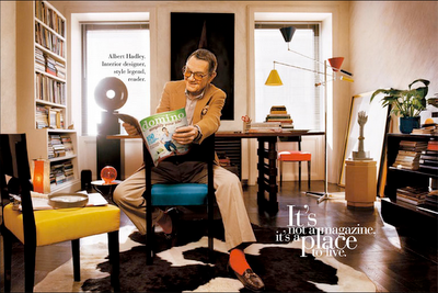
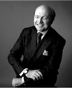
I can’t help connecting everything I read to design, so the first American designer in my list of Outliers In Interior Design that came to my mind was Albert Hadley and with him some members of what I call “The magic circle.” No I don’t mean Palates, you!, I mean all the successful designers who once worked for Albert Hadley and seem to have enduring success. I’m not going to go into detail as how I calculated the hours because it could be tedious but only the period from 1962 to 1999 during the time of Parish-Hadley partnership He seems to have had under his belt more than 72,224 hours; business hours only. That is not counting the times when a designer keeps working mentally and takes every detail of the work home. Isn’t that amazing!?
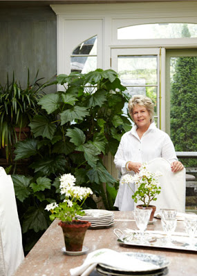
Bunny Williams who worked for Alber Hadley for 22 years. During that time she had only 42,944 hours. Amazing!
Miles Redd, even though he didn’t work directly for Mr. Hadley but he got some of the magic circle through Bunny. Miles opened his firm in 1998 and before that he worked for Bunny Williams for 5 years and before that for John Rosselli. That is approximately a total of 23 years. You do the math…
David Easton worked for Parish-Hadley from 1967 to 1972 to then found David Eston Interiors. He’s been working ever since. Yes, that many hours! Uhm… I wonder if blogging counts. ah.. I don’t think so. 🙁
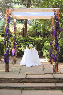
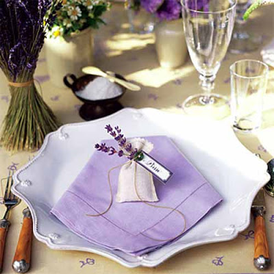
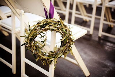
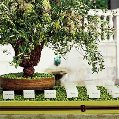
It’s been ages since I last posted a wedding decor inspiration here in this blog. Since purple is so in vogue right now, a purple and green wedding would fit just perfect. It is also a color combination that can be used for a striking decoration or for a table setting. Purple is that kind of color that could be intimidating but when paired with green, chartreuse or even gray could be quite unique.
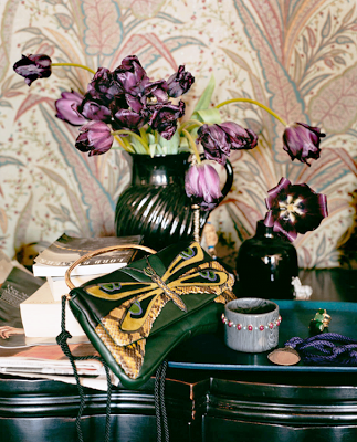
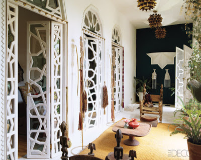
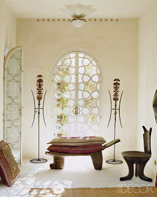
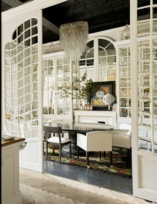
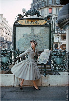
I was talking to my friend Cathy from Lerebours Antiques last Friday over dinner about Classic Architecture and she was telling me how much she loves early and late Neoclassical Architecture. I told her that I liked everything from Gothic to Art Deco- excluding Art and Crafts. I love the (concept of Art and Craft) but I don’t like the aesthetic outcome of it. Ah.. nope! I was surprised when I read Lonny on Saturday night and found their very interesting cover of Art Nouveau period and it made me think about how little influence is there now-a-days from that period. And then I remembered this very exotic home that was recently featured in Elle Decor and Lazaro Rosa Violan‘s amazing office doors which have a bit of Art Nouveau influence in a modern way and the results were stunning! Enjoy!
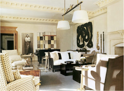
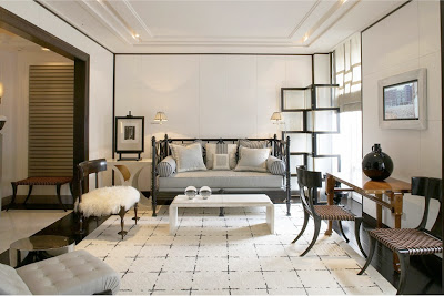
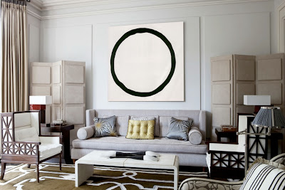
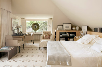
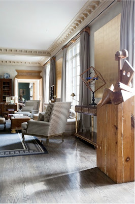
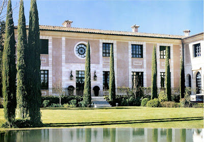
Thomas Urquijo, a Spanish Interior Designer or Interior Architect I should say, is one of those masters who knows how to mix periods and style in one of the most effortless ways I’ve seen. His Interior Architecture is completely classic and elegant but it feels totally livable. It doesn’t make me feel stiff at the thought of living in it.
Love this area for a small apartment living room. The architectural screen and the treatment on the walls brings personality to the room while the daybed and the kind of modern or transitional carpet makes the whole atmosphere feel friendly. The Klismos chairs make a direct reference to classic in a very light and chic way.
Thomas Urquijo seems to love regency and art deco style furniture, which I would say helps his rooms look transitional. I feel I can never get tired in these rooms.
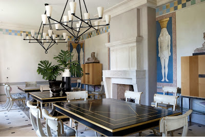
Here, in this amazing dining room, Thomas went completely regency. He painted Egyptian figures on the walls and used a more modern version of the Klismos chair. I adore the checkered border on the upper part of the walls. It’s amazing how a simple little detail can bring so much character into a room.
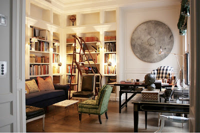
This room has me drooling…. I mean seriously drooling. I can not tell you how much I adore that ladder, does it look a bit Art Nouveauish to you? I have to have a Louis XVI chair upholstered in black leather one day. I know, I know… Check out the circle sculpture on the wall! Can you picture a square one…? nah… The gingham checkered fabric on the wing chair brings a touch of youth to the classic library.