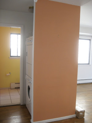
 In the back you can see the powder room and the insane and unnecessary
closet in the middle of everything not only taking precious space but
also displaying the washer and drier for everyone who came in and out of
the bathroom. Nuts, right?
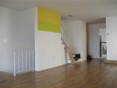
This is how our home before version looked like before we started remodeling it. Light, yellowish floors, two small closets on either side of the living room blocking the nice view, a less than attractive fireplace, a closed-in kitchen and completely bland bathrooms. Our labor of love was done in two separate times, kitchen, floors, closets were removed and painted before we moved in and the remodeling of the bathrooms were done two years after while living in it. Tomorrow I’ll show you the after pictures!
I covered this wall above with mirrors and framed it with two architectural columns.
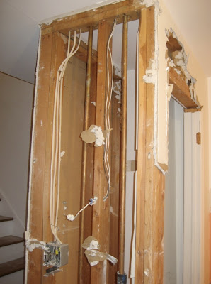
This closet across from the other one made a bit more sense since it was for coats but it didn’t make complete sense for me either so below you can see it fully gutted out. Now the entire entrance is open and I can see the main door from the stairs.
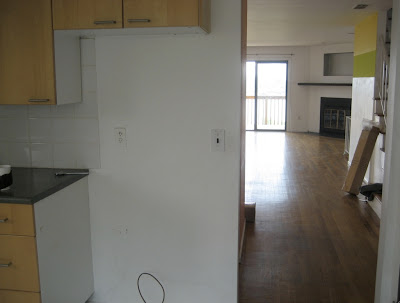
The kitchen was a closed in room. We took down the top half wall, added more lower cabinets and moved the fridge to another wall. All the way in the back you can see the unattractive fireplace which was also spruced up.
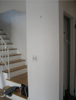
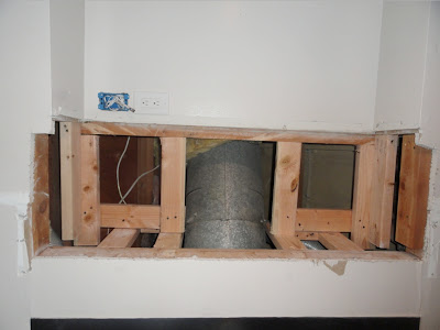
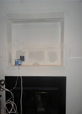
In order to use a bigger TV and to utilize the space more effectively, we opened up the space more and added another electric outlet for additional electronic equipment.
We added a shelf (not in the picture yet) to put the TV on top and cable box, router underneath.




Our French Inspired Home
Can't wait to see what it looks like now! Have a great Monday.
Ownby Design
Looking forward to the finishing touches!!! Pics please. 🙂
classiq
That closet displaying the washer was really insane. I can't wait to see the after photos. I can imagine the huge difference. 🙂
Ada