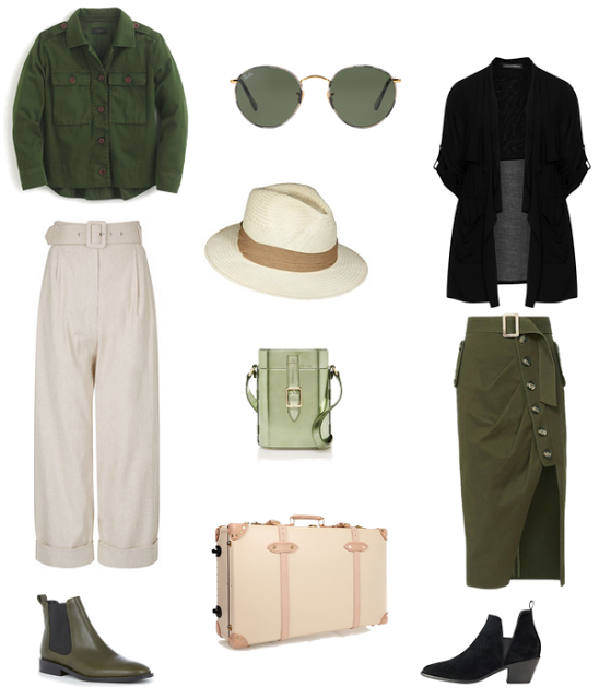
Ever since I can remember, going on a safari has been in my bucket list. For some reason it feels like a far place to go. While living in Munich we contemplated going to South Africa but even that felt a bit of a stretch when it comes to travel time. It sounds funny when we used to regularly take over 13 hours flight while living in Brazil. Whenever we decide to stop making up excuses, I would definitely take this awesome looking pants, pair them with this top and these green booties; would not forget my hat and a cross body bag. For a more fashionable day I would opt for this modern-take-on-safari skirt, combined with this safari style jacket
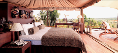
and these comfortable but stylish booties. I would carry everything in this Globe trotter suitcase and go here. Bon voyage.
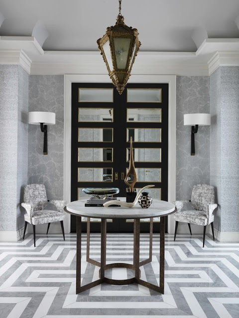
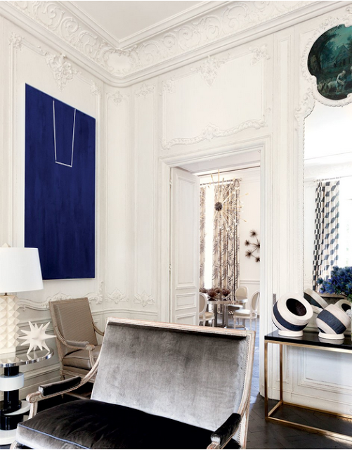
Jean Louis Deniot design
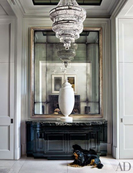
The color black in Interiors can elevate the most simple space to a more elegant and austere one. There is probably no other color as classic as black and it never goes out of style especially when used in contrast with lighter colors. The competence of the color black has been forever a favorite of many well-renowned designers and it has been a permanent and constant choice in interiors as well as in fashion. No wonder black is well known as Cristobal Balenciaga’s preferred color as it’s demonstrated by the exhibition ‘Balenciaga, L’Ouvre ou Noir’ (All in Black) taking place at Palais Galliera in Paris now. Its neutrality provides the flexibility of being paired with almost any other hue in the rainbow. I love it in the first image below where the paneling is painted a light gray. Either employed as a simple accent such as a decorative object or for covering all the walls in a room the effect of black in interiors is strictly elegant and timeless.
Entryway via Architectural Digest. Can you picture a colorful sideboard here instead? Neither can I.
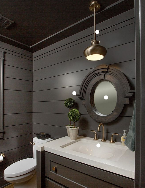
Dark-painted shiplap in this powder room gives it a cozy feeling.
original or you decide to use plain, straight wood boards and nail it next to each other the final visual effect is pretty much the same. Actually the latter one could be also very eco-friendly if you decide to use reclaimed wood.
I thought it was about time for a post about 2017 Home Decor Trends since it is already April, yes time is flying and so are some excess in design that are saying “boy bye”. This list is solely based on my perspective, a result of my own market research, so let’s get to it.
6 Home Decor Trends You Will See in 2017
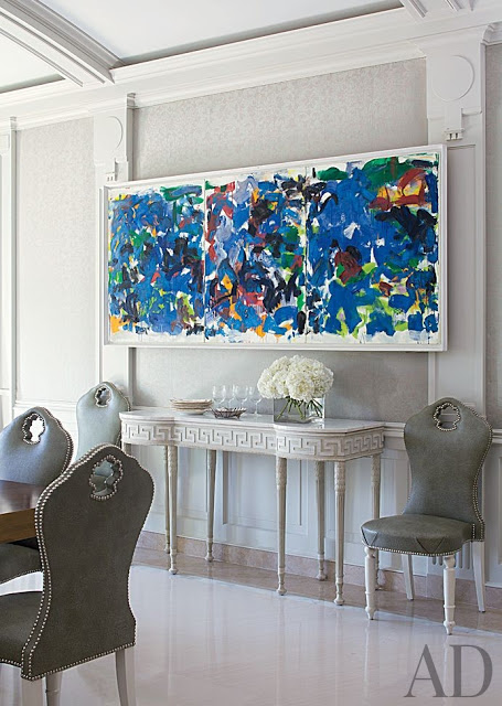
A Joan Michell painting hangs in a dining room designed by Aman and Carson via Architectural Digest.
Over the weekend my husband and I took a short ride to Cleveland where we had a great time. Besides getting to know a little bit about the city, we paid a visit to the Cleveland Museum of Art, enjoying the temporary exhibit Basquiat: The Unknown Notebooks. So I guess this is a result of a major inspiration from it. The must see exhibition runs through April 23rd.
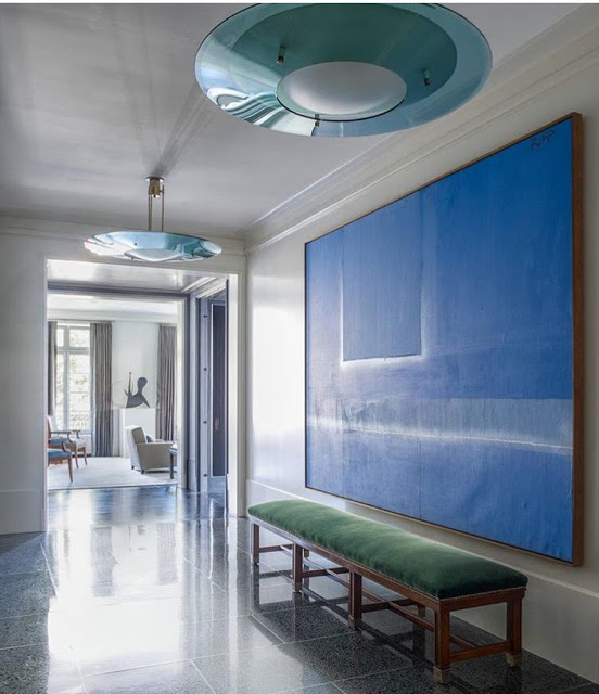
A Robert Motherwell painting. Design by Thad Hayes
Lauren Santo Domingo Paris Apartment. Photo by Norman Jean Roy, Vogue, September 2012. I posted about this gorgeous home here.
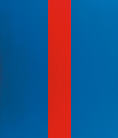
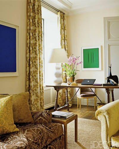
Ellsworth Kelly
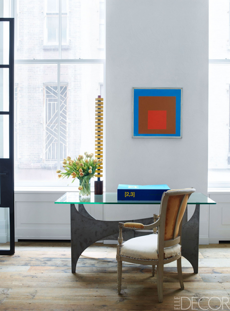
Josef Albers painting in Kevin Roberts and Timothy Haynes home.
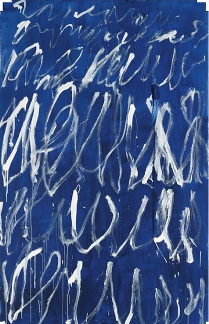
Cy Twombly
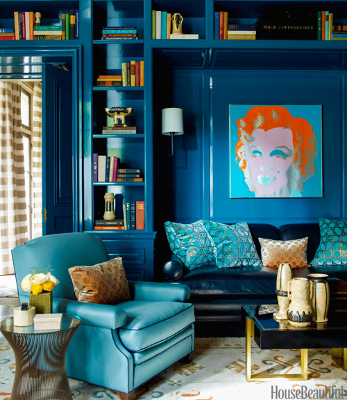
A Steven Gambrel Design with an Andy Warhol silkscreen print.
James Nares
Aerin Lauder home designed by Jacques Grange. I have posted extensively about this amazing designer. You can read about his home here.
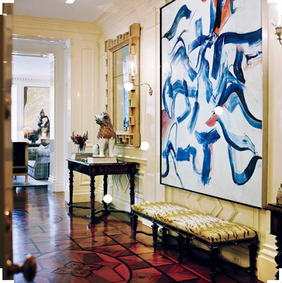
A Willem de Kooning in Valentino’s New York City apartment designed by Jaques Grange via Vanity Fair. To see another Manhattan apartment designed by Grange click here.

