Month: April 2017

Transitional design is like meeting traditional and modern interior design halfway.  It integrates all the right elements of both styles.  It’s a midpoint between traditional and contemporary styles.  While Traditional Style can sometimes feel too inflexible and Modern Style too cold, a transitional design style balances harmoniously creating spaces that not only feel timeless but chic as well.  Transitional living spaces are created by keeping furniture lines simple without extra ornamentation, more straight lines, using neutral tones and combining all with modern art.   Neutral tones or neutral colors can go from varying shades of beige tones to a different range of greys but, that doesn’t mean that only earthy tones can be used.  Colors derived from nature undertones can also fall in a similar category, such as greens and blues.  The overall feeling in a transitional style room is harmonious, comfortable and it appeals to most people’s taste.  It induces grace and rapport.  In essence, this style of decorating creates cohesive spaces that stand the test of time.  And who doesn’t want that?  Transitional interiors can perfectly combine a feminine and masculine approach seamlessly making the style very appealing to a young family.   Because it’s a style that is supposed to go into the future without any regret, the rooms stay away from too many accessories as well as trends.  Keep scrolling down to see examples of transitional style living room design.  As a Columbus based Interior Designer,  I’m always looking for inspirations and decorating ideas.

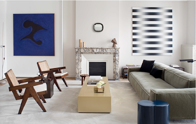
transitional design, transitional style living room, Pierre Jeanneret chairs, modern art and clean lines sofa

A transitional living room designed by Stephane Parmentier.   The Interior Designer used straight lines with more neutral color fabrics.  The color palette in this living room is soothing but sophisticated.  Pay attention to the placement of the art, and you notice a more refreshing way of symmetry.  The chairs are by Pierre Jeanneret, an enduring French modern classic.  Love this clean-lined room.

Read More…

How do you wear your Romantic ruffle blouse; Flowy and soft tops can go with basically everything from formal pants to even shorts or under a blazer for a casual chic evening outing.  Here I’m rounding up a selection of beautiful charming blouses to hopefully make your indecisive-days-of-what-to-wear easier.   Many times I open my closet and to my perception there is nothing for me to wear. I realized that more than that is the fact that I’m a bit lazy when it comes to spending time in front of my closet thinking, planning, and putting an outfit together.   In days like those, the first thing that comes to my mind is a dressy, perhaps romantic top with jeans and booties.  Happy Weekend.

 A Roundup of Romantic Blouses

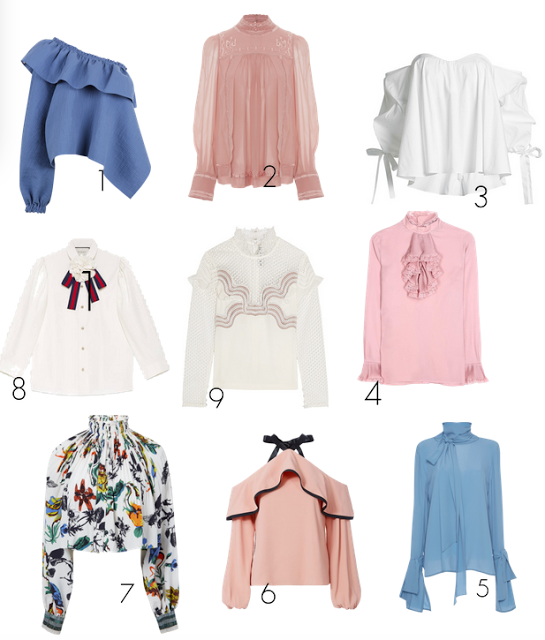
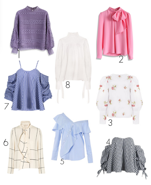
bow blouses, flower tops, flowy blouses

1 One shoulder flowy top, 2 Pink Neck blouse, 3 White off the shoulder one, 4 Silk blouse, 5 Long Sleeves, 6 Cold Shoulder,  7 Floral, 8 Cotton one, 9 Lace and Crepe top,

A Roundup of affordable Romantic Tops


Read More…

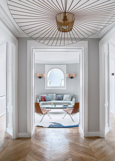
entry way with chevron floors, grey walls and vertigo pendant by constance guisset

In this entryway, the vertigo pendant lamp seems to welcome guests.

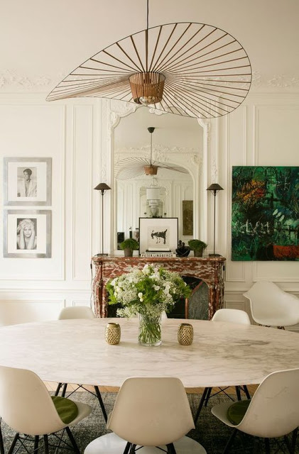
Every so often comes the case when a designer creates a classic.  Vertigo Pendant by Constance Guisset is one of those and it appears to have been around for a longer time.  It’s the kind of sculptural lighting that recalls a timeless style although it is a new design.  Its lines are visually strong, feel subtle and organic and I can only imagine how beautiful reflections it
creates on the walls and ceiling when lit up night time.  The pendant supposedly moves when the breeze touches it conveying a sense of freedom and rhythm. This is the kind of lighting fixture that can seamlessly be incorporated in any kind of style, however I’ve
noticed the it looks more cohesive when paired with furniture of neutral colors and pale walls.  Better yet if the walls have some molding on them.  The Vertigo Pendant
which is very light weigh, comes in two different sizes and in different finishing, has slowly become an Interior Designer favorite.  I like it more when it’s fixed to the ceiling rather
than hanging giving the pendant the appearance of an upside down hat.  A bit poetic, a bit fun, a bit young. In Europe you can buy it at Petite Friture.  In the US it is available at MoMa, 1stdibs and Finishing Design Shop.

dining room with modern chairs and vertigo pendant

In this room, the lamp adds to the beautiful composition of modern and old.

Read More…

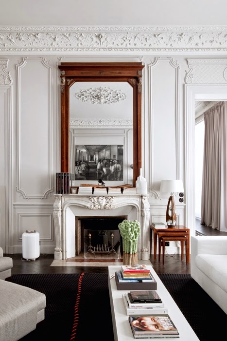
interior decorator writes about a classic and modern parisian apartment

I love to see classic interior structures decorated with more modern furniture, as I stated here.  The contrast is beyond exited and chic.  This Modern Parisian Apartment is gracefully decorated between classic and the modern.   The quintessential Parisian apartment with Haussmann Architectural Details is furnished with fabulous furniture from different
periods with common clean lines.  The apartment is designed by double g.  The walls with ornate moldings and boiseries were kept white – who needs a color-splash when you have ornate crown moldings like these!

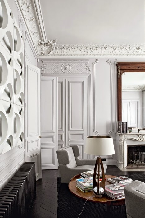
Interior designer tour a parisian apartment

Keeping the furniture in neutral colors bring balance and tranquility to a very ornate room.  Keeping the wall in white adds to this.

Read More…

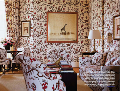
Interpreting Classic Style in Home Decor:  Traditional ainterior Design

Interpreting Classic Style in Home Decor, Traditional Interior Design

 The Paris library of Lee Radziwill has a very classic decor which makes it look regal and sophisticated.

While I was driving around with my husband a couple of weeks ago admiring classic as well as modern architecture, while disliking others, made me wonder why some style or home decor become outdated so quickly?  Which brought me to the conclusion that our eyes love and accept what we recognize, understand and make us feel comfortable.  Whether modern or traditional design, as long as they enjoy classic elements, are more appealing and pleasing due to the fact that we can relate to them.  Hence this article about Interpreting Classic Style in Home Decor.  As much as it is important to be unique and different, it is equally important to not stand too far from the classic or traditional characteristics in order for our home not become antiquated and unappealing too quickly.

Elle Decor has a very interesting article about Classic elements every traditional home should have.  The article doesn’t specify choice of color when it comes to a more classic decor, however the home chosen as an example is not in whites or neutral.   Interestingly though, lately I see a pattern where people exclusively attribute only neutral palettes to classic style.   I understand why some people may tend to associate only neutral colors with traditional design.  Neutrals are soothing and they always match but, ever since the Baroque times, classic style rooms have been painted in rich saturated colors.  Classic style can also be found in modern lines such as those found in Mid-Century modern furniture and architecture.  New York Times wrote a very interesting article about  Why mid-century design won’t die?

Interpreting Classic Style in Home Decor

10 Characteristics and Elements of Traditional Interior Design

Read More…