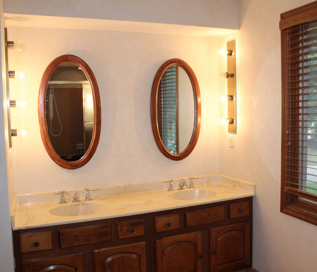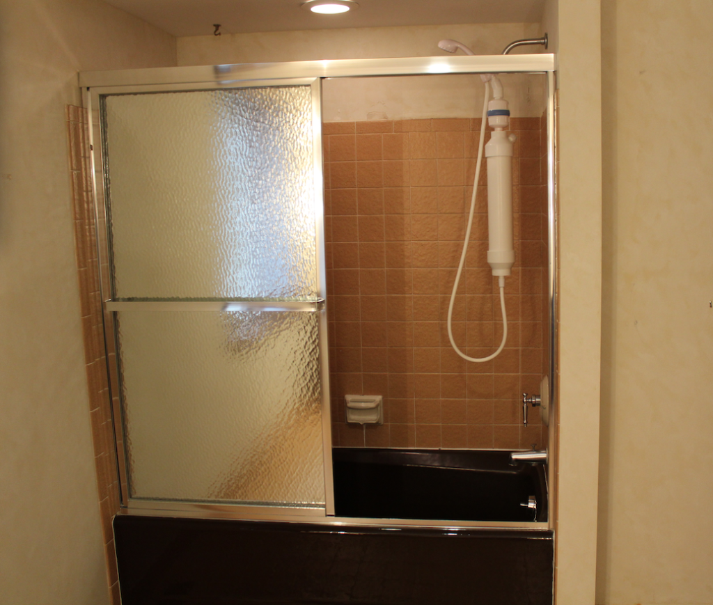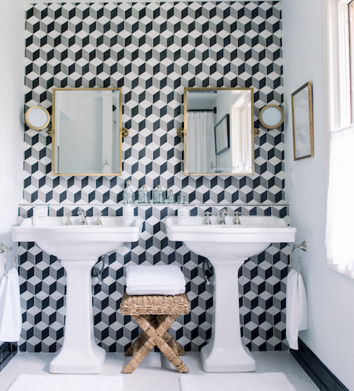
I finally can act on my promise of sharing with you some of the improvements we’ve done in the house. I wanted to create for our son a modern bathroom which was also timeless, in which he will eventually grow without getting tired of it. This house was built in the early 70’s, so when we bought it, it was stuck in that period. Lucky for us, the previous owners didn’t update it. Everything from lousy wood paneling, even worse looking wallpaper in many of the rooms, red tile floors, small and crowded kitchen was what enchanted me. No, I’m not losing it, I’m just an Interior Designer who loves to make spaces purely personal, and who also likes challenges. Where others see obstacles, I see endless possibilities.
The construction of the house is a very good one, and everything the previous owners chose in their home was in the respective time, of good quality as well, but they never updated anything. To their defense, at least there was no linoleum flooring. I want to warn you that the slideshow below has before pictures. They may be hurtful to look at, but we all love a good before and after.
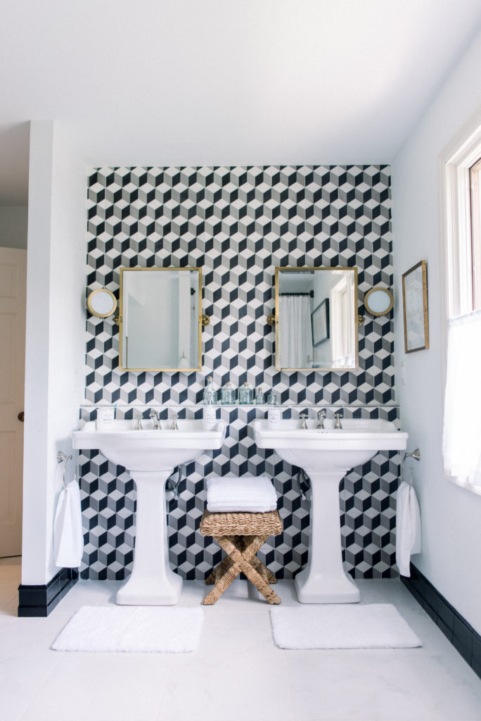
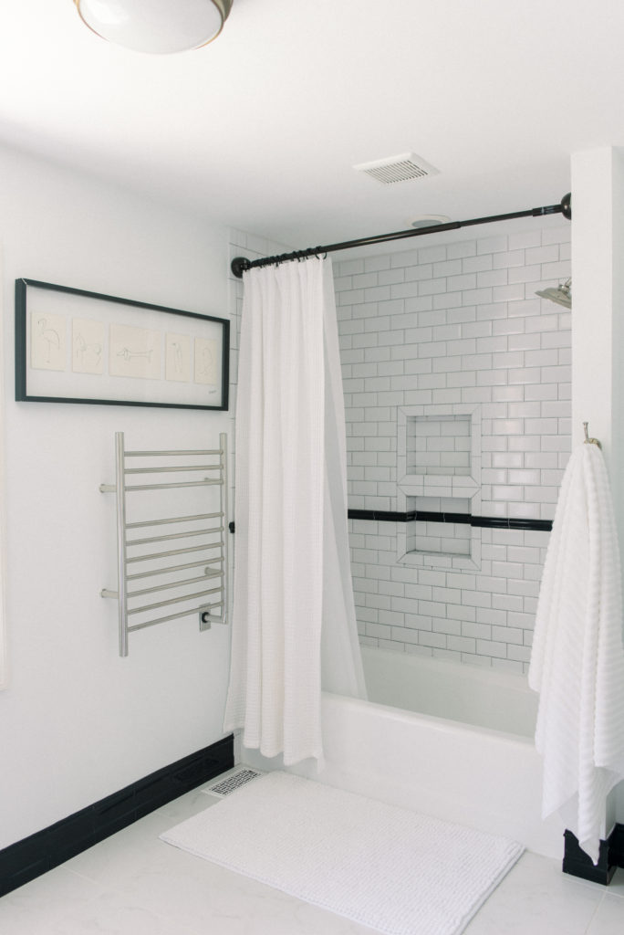
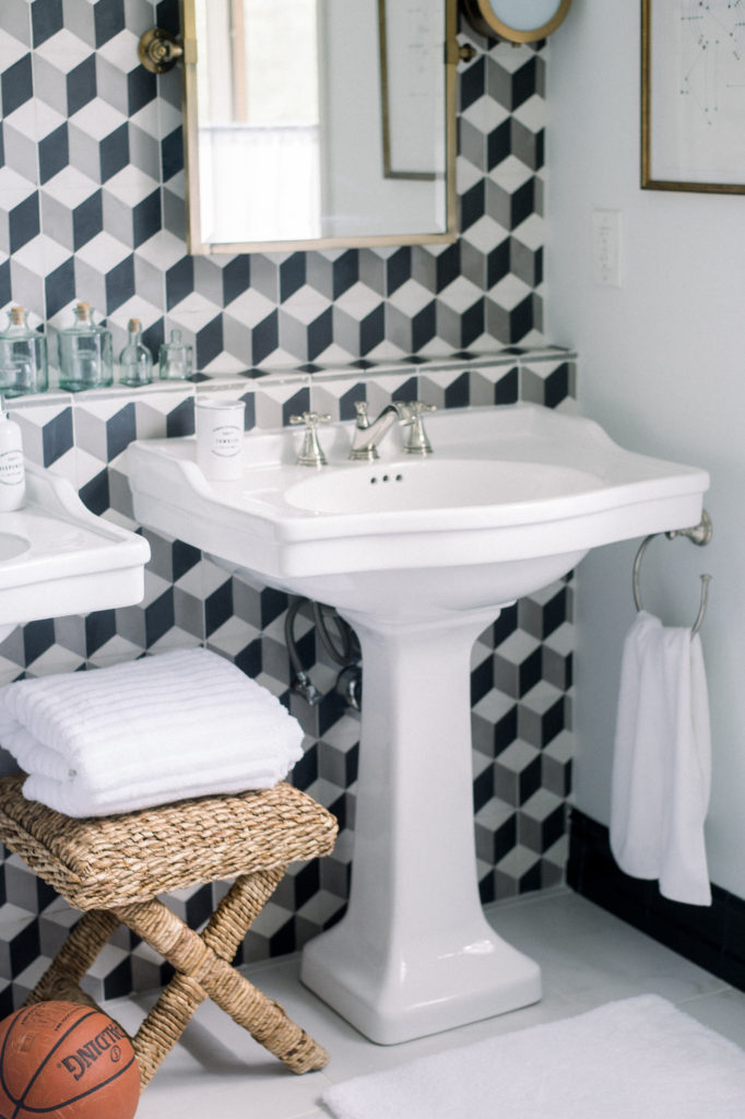
Since I’m assuming at the moment that this house is not our forever home, I decided not to do anything of structural nature that was bold and colorful. Instead, I went for a timeless modern bathroom look that will appeal to any future homeowner. It’s a good idea not to out-price your home. Nonetheless, the design needed to be fun, after all, it’s a kid’s bathroom, timeless and just bold enough. To accomplish that look, I went all black and white here, and chose graphic cement tiles for a statement wall and black ceramic baseboard. I love contrasting baseboards and crown molding just as much as Steven Grambrel does.
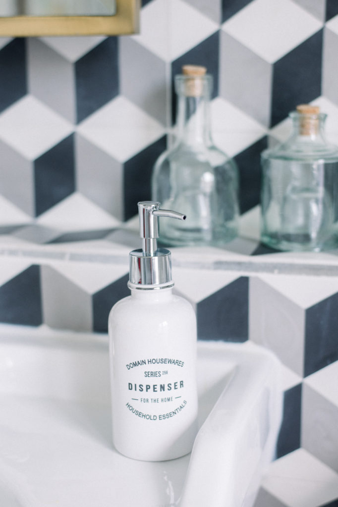
I chose two ceramic pedestal sinks since this is a Jack and Jill bathroom after all. For some softness effect and also because I love it, I chose brass mirrors above the pedestal sinks, brass sconces, and a brass overhead light fixture. I kept the faucets all in the same polished nickel finish contrasting with the brass. It’s perfectly ok to mix different metal finishes wherever you want. I designed the statement wall with a ledge for practical reasons and left the encaustic tiles rough along the edge for an old world look. I decided on beveled white subway tiles for the shower to bring a bit of New York City to the bathroom. I incorporated a towel warmer as it’s one of my top recommendations when remodeling a bathroom. It has some many benefits that it’s worth the extra effort.
Photos by Henry Photography.

