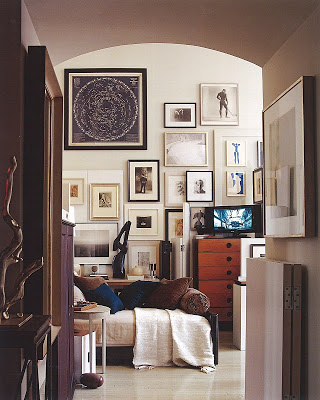
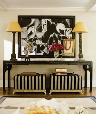
I can’t think of a better way to make a wall look more beautiful than with a very well displayed gallery wall. From more conservative ones, same frame and hung with symmetry in mind, to more asymmetrical ones framed in different types of frames, a gallery wall always looks gorgeous and makes a room look bigger and taller. Enjoy!
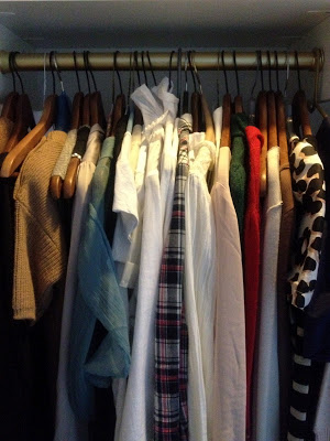
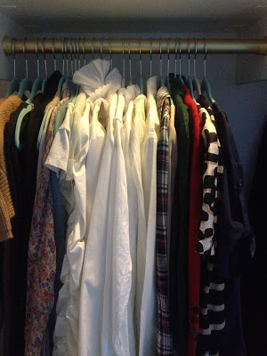
I had our closets custom made a year ago to make our morning routine a lot easier and it makes a big difference. Before redoing them it used to take me forever to decide what to wear and I think it was because I couldn’t see all the pieces of clothes I had. Recently I paid a visit to TJ Max and came across these very thin velvet hangers called Closet Complete a lot more affordable than other similar ones and got a bunch to replace my original wooden ones. With the wooden hangers some lightweight blouses would slip off but now these velvet-covered ones hold them so well and the best part is that because they take a lot less space it gives me more room. You can see the difference in the two pictures of how much space is empty now that I switched the hangers; how to make more space in your closet. What girl doesn’t need that? A simple action as changing hangers can make big difference on how you start about your day. The only negative thing bout having more space in your closet is that you may want to buy more clothes
In our previous home a few of my clothes got molded and two of my bags with the leather all cracked up and peeled off. All consequences of closet-enemy-number-one, humidity. Not too nice. This whole unfortunate experience made me think that yes, walking closets are very convenient and beautiful but as is any area of interior design the most important part of a closet is the planning. Good insulation, proper ventilation, enough room between clothes and last but not least lighting! It is a good thing to think about if you are currently building or remodeling your home. Enjoy!
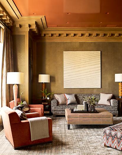
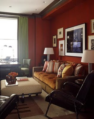
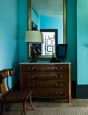
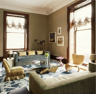
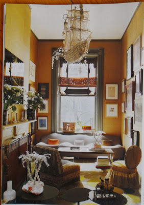
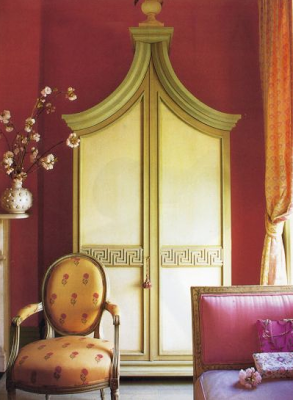
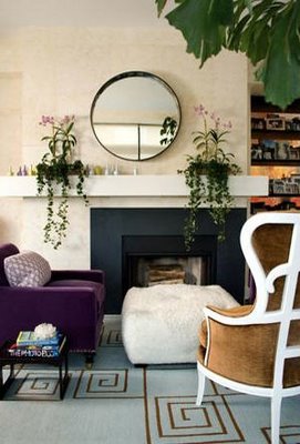
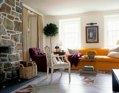
Peach with magenta or pink with mango are colors that not always come to mind when decorating. Leave it to Muriel Brandolini, Jeffrey Bilhuber and Steven Gambrel to teach us how. Muriel Brandolini does it in a very subtle way, everything kind of blends in. Her colors do not have much to do with nature as much with her own creations. Jeffrey Bilhuber on the other hand does it in a more contrasting way. Steven Gambrel selection of blues is not any kind of blue and the outcome is always uber-sophisticated. They are all master at doing it. I love their result.
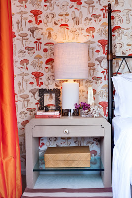
There was a little bit of misunderstanding with yesterday’s post. Apparently some lovely people thought that the first image was part of my home, it’s not. I found the image at New York Social Diary. The post was intended to inspire a different way to approach Christmas Decoration. I apologize for the confusion. For that reason I decided to post a few images of our home, which I don’t do much because we all know that magazines would not be interested in featuring somehing that’s been already published. This past Saturday the photographer Marco Ricca was here and took many lovely pictures of two of our bathrooms, the guestroom and Lucas’ room. For the guestroom above I wanted to create a magical space that was cozy, inviting and dreamy. So my first thought was the movie Amelie. Since I love French movies for their lightness and happiness underlined I designed our guestroom inspired on Amelie, hence the whimsical and unique wallpaper and the color scheme. The wallpaper is Champignons by Brunschwig and Fils, the side tables are designed by a Karl Springer apprentice. I don’t remember his name. The handle is one sculptural gorgeous thing but you can’t appreciate it much unless you click on the picture an zoom in.
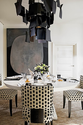
To many people the thought of decorating a home entirely in black and white may sound a little bit too formal or too sober. Colors are too comforting and too welcoming, even if the interior is done in pastel colors. But there are rooms that seem to pull it off surprisingly well, and the common factor seems to be one or two whimsical touches. This dining room above designed by Alberto Pinto, for instance, has a very playful chandelier and chairs upholstered in polka dots. The table setting is also very whimsical.
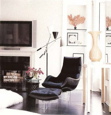
This living area above is also very light in ambiance with lucite based curvy modern chairs and a shag rug.
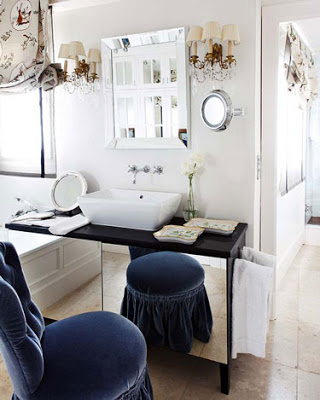
Whims everywhere in this bathroom, from the shade to the skirted chair/stool. The sconces have their own touch too.
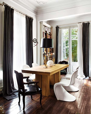
Mix and match chairs in this room include casual Panton chairs and Louis XV style chairs.
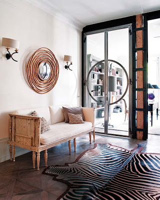
The space above has like a very nice light reflection that gives it a hint of pink. The zebra rug, the round mirror and the sconces pull everything off.
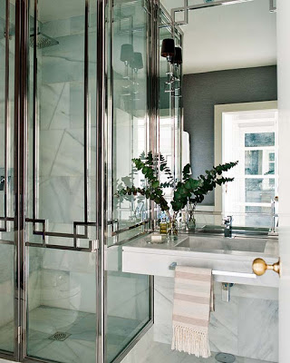
This bathroom is quite spectacular. What doors! Love the size of the sconces and the brass door handle.
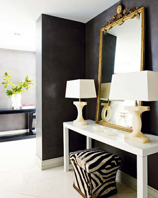
Here again, the zebra stool and the shape of the lamps brake the space from being too sober.

