Category: Home Decor

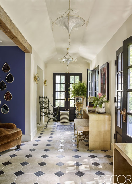
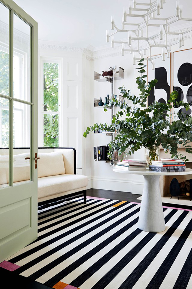
black and white floors, black and white striped rug in entryway

One of my preferred choices when it comes to statement flooring is a black and white floor.  From marble tile, painted hardwood floors, black and white tiles, there is a lot of options for black and white floors.  Quite often, when trying to bring impact to our home decor we focus on walls and ignore the floor when the solution could be as easy as adding an enduring black and white area rug.  Changing or improving your floor doesn’t always require a permanent change.   Consequently, the classic combination of black and white can either be interpreted in a modern rug or in a more permanent solution as the timeless checkerboard.

A hallway or entryway with a black and white floor is a design that never gets old, and it serves beautifully in either traditional or modern spaces.  Another benefit is the ability to enhance art, sculpture and wall moldings.  I compiled a few of my favorite spaces with black and white flooring for you to peruse and get inspired by, from a powder room that can transport your guests to a space where they can dream to a kitchen that is as unique as it could be.
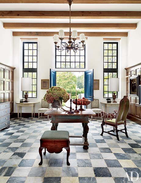
black and white floors, Bobby McAlpine checkered floor kitchenA classic space designed by Bobby McAlpine with black and white checkered marble floor.

Read More…

A Sophisticated Ranch designed by Ernest de la Torre, Ranch interior design entryway via Belle vivir blog

Usually Ranch and sophisticated are two words we don’t find in the same sentence.  However Interior Design well planned and executed can do wonders as it’s proved in this Upstate New York ranch designed by Ernest de la Torre.  The home the designer renovated
from top to bottom for his family is full of designers furniture an element more associated with urban dwellers and a collection of art that is more than inspiring.  Ernest de la Torre shares the Hudson River ranch with his husband, Kris Haberman, and their son, Parker.  The couple lived eight years in the house before undertaking the renovation.  The combination of rusticity and modern elements make this ranch a perfect home for any self-proclaimed urbanite.
Read More…

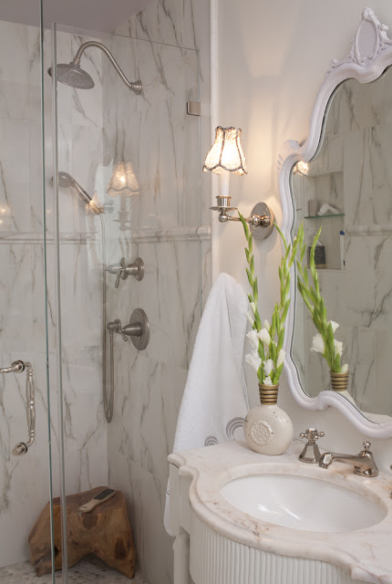
renovation tips for bathrooms Julie Paulino Design marble shower
When we started remodeling our home I knew we were not going to live here forever, I also knew what many people knew, that the time of the housing boon was over.  Knowing that, my choices on materials and structural changes needed to be more cautious, but I didn’t want to sacrifice style or comfort.  So I kept the kitchen and bathrooms as traditional and neutral as possible, something that would appeal to most people, in case one day we decided to sell this house.  For our master bathroom I mixed “real and steal” materials: marble mosaic in calacatta gold for the floor, chair rail (to end the tiles that I extended 12″ up the wall, below) and the pencil border that frames the walk-in shower.  The shower walls are in porcelain that look exactly like calacatta gold marble.  It’s funny the tile installer didn’t know it wasn’t marble until he saw the back of it.  The vanity is custom made.The master bathroom is on the small side so I installed a programmable tile warmer, a luxury feature that will compensate for the lack of space. Anyone who has ever remodeled a home knows that faucets can be expensive.  For the shower faucets I simply left out unnecessary things such as volume control handles.   The main shower handle does the volume control already so why buy an extra one?  I wanted to create a luxury experience for my shower with more than one water source without having to pay top money for it.  I got the big overhead shower at Lowe’s where the handheld shower is a combination of one of those handles that come with the shower I just replaced the hose for one that you can connect separately and got the set of handles with its respective valves at a trade showroom.  This way I was able to have two separate shower sources with two separate faucets.
Read More…

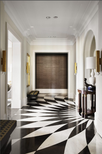
Pablo Paniagua entryway Design via Belle Vivir

When I came across this modern home designed by  Pablo Paniagua, the custom black and white geometric floors stopped me on my tracks.  If not for the visual impact, then for what it does to the space.  The way the elongated diamond-shaped pieces of marble are placed forming a big half fan, creates a central focal point while consequently elevating the entire space.  What a clever way to enhance the architecture of an entryway.  Pablo Paniagua’s
modern style in Interiors has been a blogger-favorite for a while as you can see in this house
through which the Madrid based designer became more well known among Interior Design Blogs.  While I found this house in his online portfolio, there is not much information about
it.  Although it’s all there, the modern and classic details intermingle with jewel tones here and there.  Enjoy!

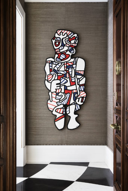
Pablo Paniagua entryway Design via Belle Vivir

Love the modern art and the studded nailhead trim on the walls

Read More…

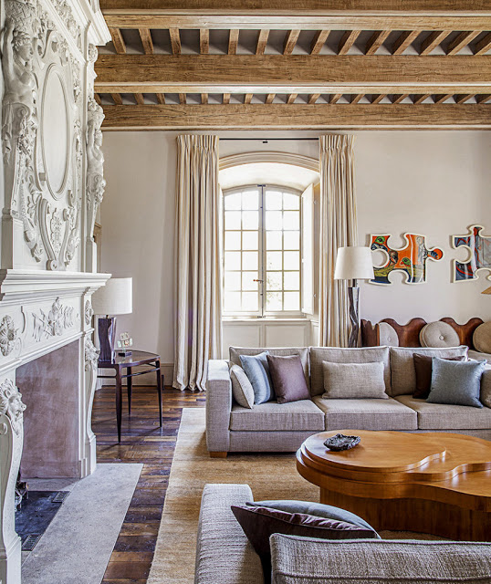
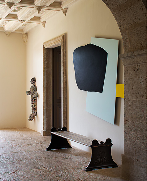
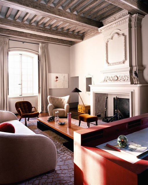
Pierre Yovanovitch Chateau in Provence Living room Belle Vivir Blog

Pierre Yovanovitch is an exceptional Interior Designer I have posted about, many times before.  In one of the posts was a sneak peek of his Chateau Fabrègues in Provence, where
his austere and minimalist, modernistic aesthetics are set inside a 17th-century old property.  Recently The WSJ Magazine featured the entire Chateau giving us a complete view of the property.  The eight year restoration project which started in 2009 when Yovanovitch purchased the estate, included the restoration of a handful of buildings on the deteriorated 990 acre property.  One of the buildings was the guesthouse La Ferme, a three floor building that was completely redone inside, taking three years to complete.  The landscape was designed by Louis Benech whose Gardens are appreciated in six continents.

While searching about this black and white kitchen below, I came across the sitting area of another kitchen that looked as they belonged together, sort of like a Dream Kitchen Design.
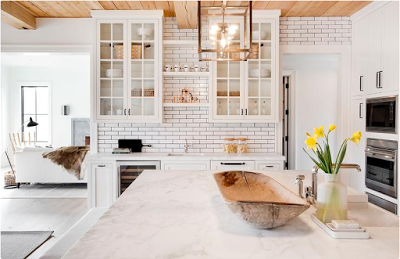
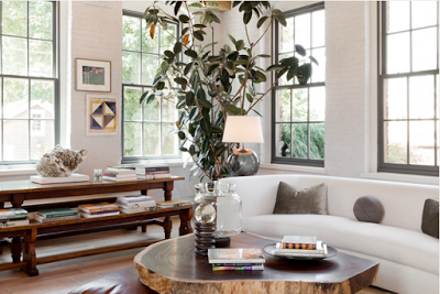
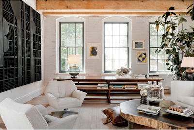
black and white kitchen, design, beam ceiling, black stove and hood and glass upper cabinetsThe black and white kitchen with ceiling-high subway tiles and dark grout was designed by  Tamara Magel while the would-be other side of the “Dream Kitchen” with a more neutral, earthy tones was designed by Huniford.  Their aesthetics and atmospheres are very similar to each other, especially when the exposed beam ceiling is a shared interior architectural detail.  The shared color in both kitchens is white, especially in the first two images where white is on almost every surface except for the beam ceiling and the black range hood.  This is a very relaxing and clean kitchen, however I believe that the tones in the last two images are a bit more soothing and warmer due to the use of earthy tones such as grey, browns, black and the touch of nature in the form of indoor plants.  Such details make a difference when it comes to creating an atmosphere in interiors.

Black and white kitchen design marble island, whitewashed floors

The choice of glass doors for the upper cabinets give this kitchen an open feeling.  It also softens up the exposed beam ceiling.

Black and white kitchen breakfst room design with earthy tones

I especially love the windows in this kitchen sitting area.  The details of curved edges soften up the brick walls and metal windows.

Black and white kitchen breakfast room design with beam ceiling

Lovely warm and modern inviting sitting space.

Two top images via Tamara Magel. last two images via Rikki Snyder.


Read More…