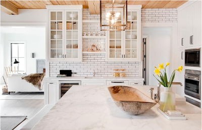
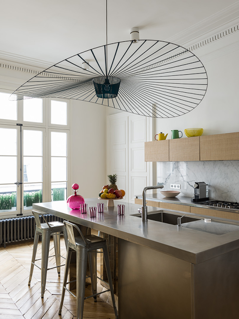
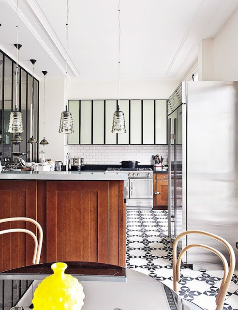
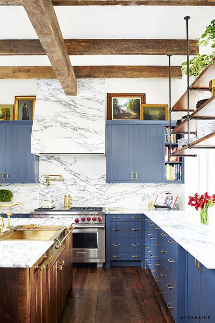
While searching about this black and white kitchen below, I came across the sitting area of another kitchen that looked as they belonged together, sort of like a Dream Kitchen Design.
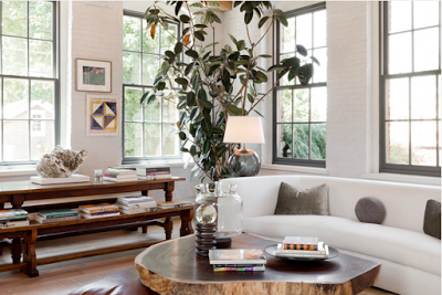
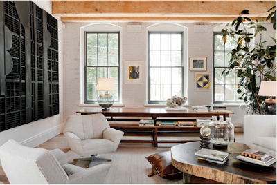
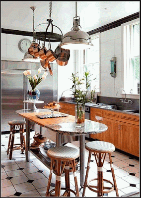
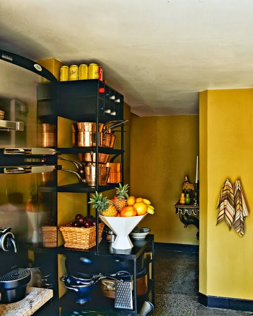
 The black and white kitchen with ceiling-high subway tiles and dark grout was designed by Tamara Magel while the would-be other side of the “Dream Kitchen” with a more neutral, earthy tones was designed by Huniford. Their aesthetics and atmospheres are very similar to each other, especially when the exposed beam ceiling is a shared interior architectural detail. The shared color in both kitchens is white, especially in the first two images where white is on almost every surface except for the beam ceiling and the black range hood. This is a very relaxing and clean kitchen, however I believe that the tones in the last two images are a bit more soothing and warmer due to the use of earthy tones such as grey, browns, black and the touch of nature in the form of indoor plants. Such details make a difference when it comes to creating an atmosphere in interiors.
The choice of glass doors for the upper cabinets give this kitchen an open feeling. It also softens up the exposed beam ceiling.
I especially love the windows in this kitchen sitting area. The details of curved edges soften up the brick walls and metal windows.
Lovely warm and modern inviting sitting space.
Two top images via Tamara Magel. last two images via Rikki Snyder.

