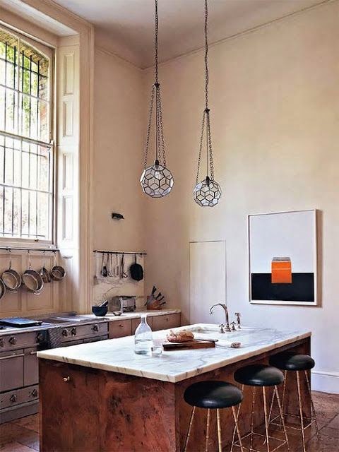
Category: Kitchen Design

When some people think of unique kitchens their first response is one of skepticism.  Unconventional kitchens are usually expected to be anything but beautiful.  In the worst cases, the excess of inventive details and mixtures of ideas become to feel so unfamiliar that it yields a feeling far from pleasant.  These unorthodox kitchens are not only unique but also beautiful.  There is a way to have it both ways when it comes to being unique in designing any room in your home.  My philosophy is that whatever it is you are designing should depart from the classics.

As in our kitchen, for example, I combined a modern classic element like stainless steel cabinets with more classic cabinets to juxtapose the sleek and the matte, the always-look-as-new feel of the stainless steel with the traditional painted cabinets in the rest of the kitchen.  Francois Catroux still has the very innovative stainless steel fireplace mantel since the late 60’s in his Paris apartment.  This latter innovation is perhaps what set him apart from the rest.  It pays to be unique and innovative but it is more important to do it in a way that makes you happy. Use in your home what you love and make you happy and go from there.  How can the world be innovative and exited if everyone designs in the same fashion or even wear the same clothes?  Below, some of the most recent unique and unconventional kitchens I’ve seen.
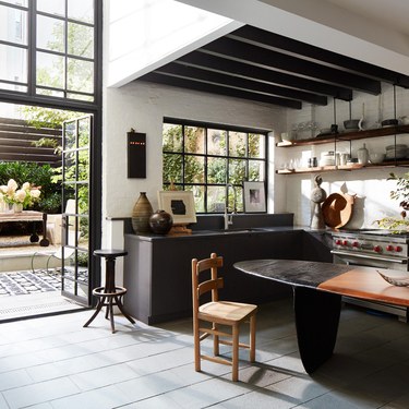
unique kitchens, unconventional kitchens, monique-gibson-kitchen-bellevivir

Love everything in this unique kitchen by Monique Gibson, currently featured in Architectural Digest.  This is Monique’s kitchen in New York City where she also works.  The table made by an Israeli furniture maker functions as a desk/meeting table/ kitchen table.  Now that’s clever.
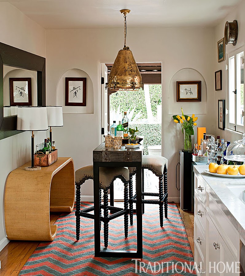
unique kitchens, unconventional kitchens, ryan white kitchen belle vivir

A small kitchen that would take anyone by surprise.  It looks more like an entry to a small apartment than an actual kitchen.  In a small space or an open concept floor plan is a good idea to treat the kitchen as part of the rest of the home decor.

Read More…

We all agree that the kitchen is the most important room in a home… the heart of the home.  It’s the space where we cook our best and worst meals and where we create our best memories together.  It’s also the room where most of the money in a remodeling goes to.  So much to think about when remodeling this room, functionality, flow, durability and ultimately design.  A gray kitchen can greatly help or enhance the latter since gray is perhaps one of the most forgiving and sophisticated color options available.  Having a functional kitchen is the priority but taking time on deciding the color of your cabinets is paramount if you are deciding to live for a long time in your home.  Gray is warmer than the color white and easier to live with than dark bold hues.
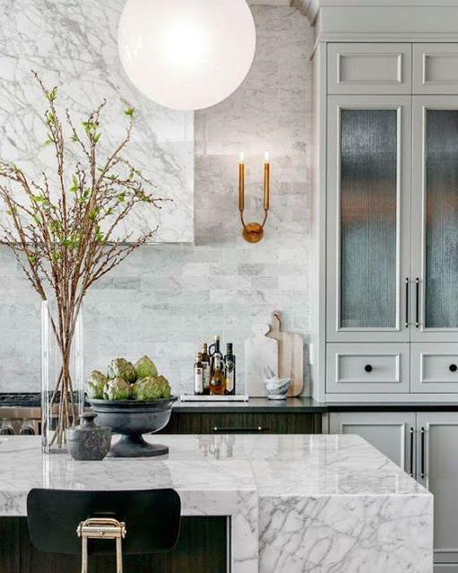
gray kitchen functional kitchen with marble covered vent via belle vivir blog

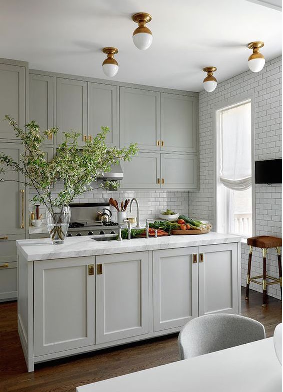
A beautiful juxtaposition between the traditional light gray cabinets and the clean line of the carrara marble island and range hood.   The brass simple scones and reeded glass on the cabinets lend elegance to the design.

gray kitchen, functional kitchen with white subway tiles via belle vivir blog

A small gray kitchen with a more down to earth and approachable design.  Floor to ceiling traditional white subway tiles and brass flush mount ceiling lights give a more custom look to the overall design.

Read More…

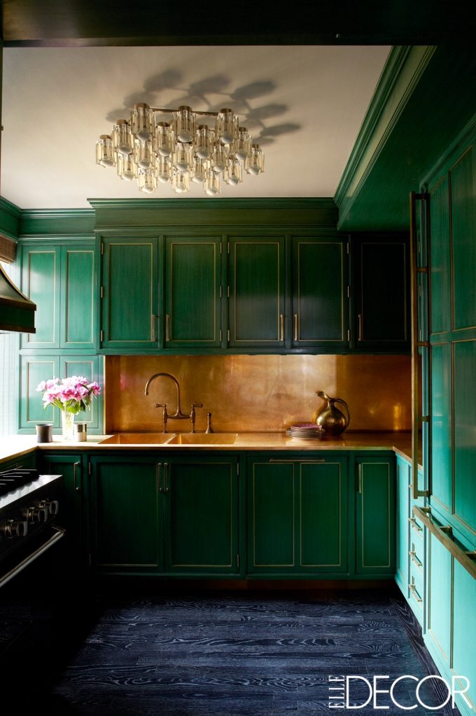
From bold color saturated kitchens to more subtle ones, these kitchens will certainly brighten anyone’s morning.  There is something welcoming and energizing about colorful kitchens that makes us cheerful.  Whether you decide to go full course and paint the kitchen cabinets in a bold color or just add a few colorful accessories, the sky is the limit… Small and clever moves such as painting the island, adding colorful stools or painting the floor are only but a few of the options there to bring color into our kitchen.  Of course you can always go the Kelly Wearstler‘s way and paint all the cabinets in one bright green, add a splash of brass or gilded backsplash…. or you can keep the color designated to the island and make it a focal point as Commune did in the kitchen below.

For more traditional kitchens, a bold printed upholstered chair or banquet will also add some jazz to the ambiance.   Breakfast nooks are great spaces to experiment with color.  As you can see small details can bring vibrancy to any kitchen.  Usually, the smaller the space the bolder you can go.  Take the small green kitchen designed by Miles Redd where he painted the entire kitchen in a high lacquered green.

Graphic tiles are also very handy to add a jolt of energy as you can see in the kitchen below by David Netto.  David added graphic tiles all the way to the ceiling for a pop of color.

Colorful kitchens, Green

Kelly Wearstler is no shy when it comes to color and bold statement.  The kitchen she designed for Cameron Diaz in Manhattan has brass accents that help to make the space brighter.

Read More…

Stephen Sills Hi Low Farm Kitchen

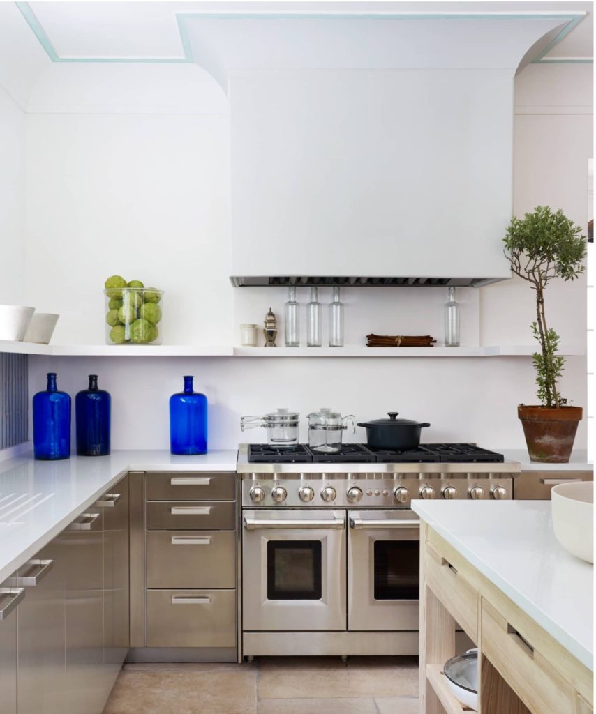
Stephen Sills Hi Low farm kitchen strikes the right balance between minimalist and transitional.  His kitchen is located in Bedford, New York.  After an extensive renovation that included an addition in his Farm Hi-Low, yes I believe that’s the name, the kitchen is the place where everyone visiting ends up.  “I love kitchens but it’s very contradicting, because I normally don’t like anything utilitarian”  Sills says.  Stephen Sills has had the estate for a long time but he only took on the addition and renovation project last year… The kitchen is as stylish as it is functional with no need for excess with a mixture of raw and sleek with the raw side found in the limestone floors, raw-cypress islands and distressed terra-cotta tiles.  The sleek opposite side is in the matte stainless steel cabinetry, white quartz counter top and simple few accessories.  Humble natural materials mingle with man made polished ones… “No matter how many people are here,” Sills adds, “everyone wants to pile into the kitchen”.

Read More…

We finally bought our home here in Dublin and the exciting stage is about to start soon.  Boy, I can’t  wait… The house as it is now is a complete disaster, which makes me somehow weirdly happy.  Every single surface, space and room needs to be redone, replaced or updated from floor to ceiling and windows… you name it.  So it’s safe to say that we won’t be moving anytime soon.  And you may be asking yourself what do all this have to do with two tone kitchens… Well if you know America’s obsession with white kitchens… I thought it would be a good idea to try to do something different while still beautiful.  And also because I just realized how much I’ve loved two tone kitchens for like ever…

I also realized that I favor kitchens that don’t necessarily look too much like traditional kitchens, if you know what I mean… absence of upper cabinets, furniture like islands and a more lounging atmosphere in general, etc….

Now don’t you fret… by two tone kitchens I mean a contrasting color on either lower cabinets, upper cabinets or island and it usually works out very well.

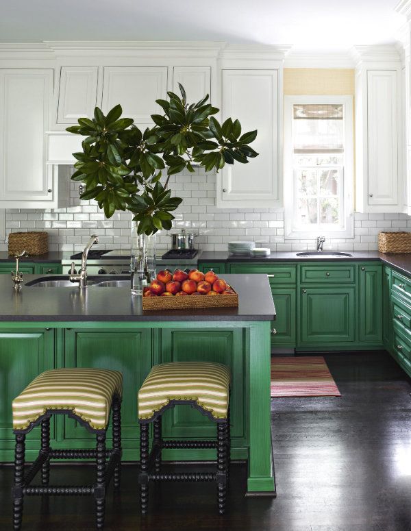
two tone kitchens green and white

Not for everyone but contrasting colors in this kitchen are surely rewarding and unique.  Green and white…

Read More…

If you have not seen at least one of the refined rooms designed by Rose Uniacke then you’ve been living under a rock. Her perfect balance between the raw and the refined has fashioned her a very acclaimed interior designer.  Uniacke studied philosophy and worked for a furniture-restoration workshop where she learned about antiques. The latter experience and the influence of her mother, an antiques dealer as well, honed her style and knowledge of antiques and she became an antiques dealer herself.  Good antiques, the right clients and her great sense of style, light and proportions marked the path for her renowned Interior Design firm. I posted about her kitchen a few years ago. The kitchen with high ceilings, the right amount of light and absence of upper cabinets was already beautifully understated but as many other designers do, Uniacke also keeps updating and changing things around her house. In February of this year Vogue magazine showed her London home in which the kitchen has a completely different look. I can’t think of a better place to experiment than our own homes… Rose actually renovated her entire house and converted the basement into a swimming pool, and a hamam… The house also has one of the most beautiful conservatories I’ve seen. The glass-roofed conservatory is the first room you see upon entering the house…marking the serenity found throughout the house…

rose uniacke kitchen before belle vivir
In the previous kitchen there was an island, a more industrial stove and different overhead lighting.  In the latest version, the island was removed, the lighting was replaced and the stove is more modern.  Other details like the shelving and paintings were also changed…

Read More…