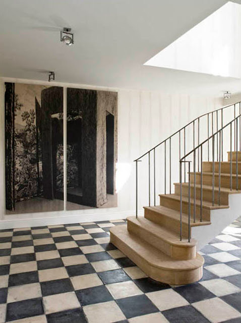
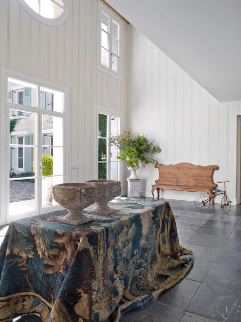
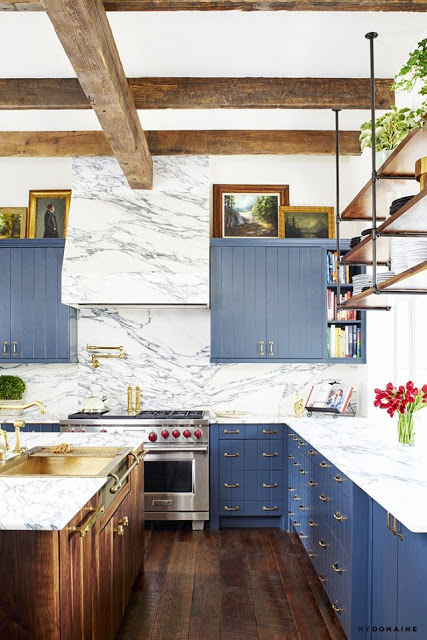
I think Country interiors are underrated and overlooked while more polished decor take center stage. One reason could be because country or rustic interiors look and feel better in person and pictures don’t do them justice. Elements such as honed finish stones, matte finish woods creates a cozy environment that invites to stay and even walk barefoot. And, when it comes to beautiful country decor no other place does it better than a European country side. Case in point, his country home designed by Isabel Lopez Quesada located in Zegovia, Spain. I posted about this kitchen designed by her a while ago and was trilled when recently found more images of the rest of the house and who can’t forget that popular shot of Isabel’s home library?
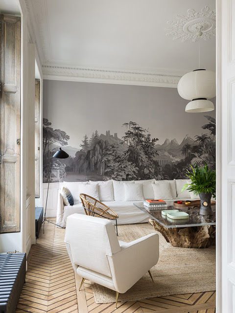
The old French technique of wall mural paint, where the final effect is a monochromatic tone in different shades of grey, dark and light, is as old as it gets. Reinvented or discovered during the Renaissance as a form of a more affordable painting technique, perhaps also due to limited color options that were available for painting, it’s been reinvented in forms of wallpaper, posters and panel screens. Its monochromatic tone makes it a perfect background for all kinds of decor style, from modern to traditional. I love it with a dash of color furniture for a more contrasting and modern effect and when enhanced with a touch of brass it is simply harmoniously gorgeous.
A Paris apartment by Studio Razavi Architecture
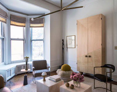
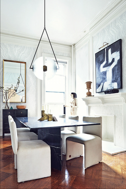
What is design if it’s not a reflection of our own life, travels, and taste. This Brooklyn apartment owned by Apparatus Studio founders, Gabriel Hendifar and partner Jeremy Anderson speaks about just that. Most likely you have seen their amazing lighting creations in numerous cases and may have even caused you to gasp. Born from playful experimentation with vintage lighting components apparatus is a new york based design studio. The couple launched the Brooklyn-based studio in 2012, quickly becoming recognizable and coveted worldwide. Their lighting fixtures can be seen in hot spots from New York City to London. The apartment decor is modernist, sculptural and an incubation of all mighty geometry.
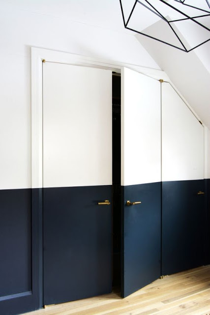
European Design is very different from American Design. It’s simpler yet stylized, restrained and unpretentious. European interiors is more about how the furniture complements the already elaborate Interior Architecture. And when the interior background is modern enough, they find ways to enhance them in unassuming ways. One simple but powerful way to add architecture to a modern room is by adding a different color paint to half of the walls in a room, haf painted wall. This half and half painting interior design detail can be done by painting the room walls in light color and then adding a dark color on the half bottom side of the walls in a straigh line. As the images here show, the dividing line can be added at any height you wish. This is a perfect way to slowly bring dark hue inside our homes when we are too afraid of putting it in the entire room. It’s also a smart way to add a focal point to any room.
7 Half Painted Wall Ideas
upper, but the neighborhoods in Dublin are mainly new developments where there are not many fixer uppers. The homes are also fairly cookie cutter and the layouts are really
embarrassing, and lastly I don’t want to go through the long process of building a new home with our home-base in the East coast where I hope we end up not too far in our future. There are two things I won’t compromise on when it comes to choosing a home. First one is
trees, where I want a home on an old school setting therefore I would like to stay away from new developments. Second I want a bit of distance between mine and my neighbors homes although this last one seems a bit tight. While perusing homes for sale on
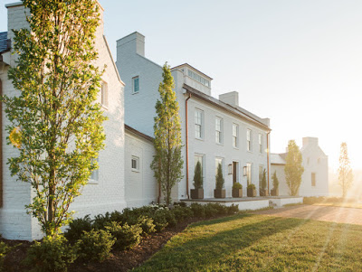
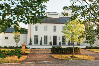
Zillow and Trulia I came across a very classic builder called Kevin Knight and Company. They are located in Powell, Ohio and their homes are breath taking. This is what it says in their site. “We pull inspiration from the land, including the raw elements that are painstakingly extracted from it. We marvel in nature’s fragile balancing act, respecting her constant ebb and flow, which often influences our decisions about architectural placement and form. Natural materials, from slate and stone to hardwoods and flora, are intentionally employed to bring the outside in, while we incorporate new ways to integrate indoor luxuries to open air environments.” Sounds like the real deal to me.

