We interior designers often have the perfect home set up in our minds. One that frequently includes high ceilings, amazing views, and smart architecture. However, finding a structure that meet these requirements, in the right location, and at the right price can be a challenge. Of course, if you find yourself in such a situation you always have the option to build your own home, a topic you can find out more about in my post below.
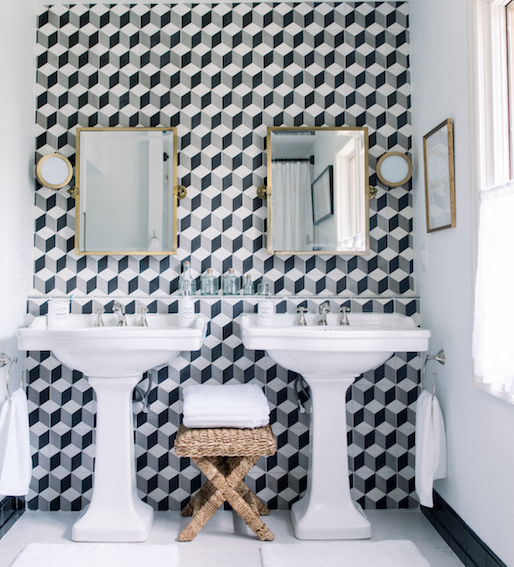
I finally can act on my promise of sharing with you some of the improvements we’ve done in the house. I wanted to create for our son a modern bathroom which was also timeless, in which he will eventually grow without getting tired of it. This house was built in the early 70’s, so when we bought it, it was stuck in that period. Lucky for us, the previous owners didn’t update it. Everything from lousy wood paneling, even worse looking wallpaper in many of the rooms, red tile floors, small and crowded kitchen was what enchanted me. No, I’m not losing it, I’m just an Interior Designer who loves to make spaces purely personal, and who also likes challenges. Where others see obstacles, I see endless possibilities.
The construction of the house is a very good one, and everything the previous owners chose in their home was in the respective time, of good quality as well, but they never updated anything. To their defense, at least there was no linoleum flooring. I want to warn you that the slideshow below has before pictures. They may be hurtful to look at, but we all love a good before and after.
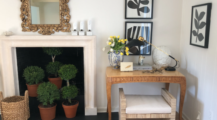
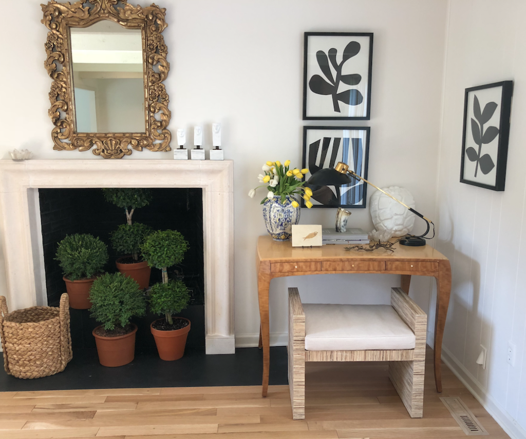
Last week I had a photoshoot at our house for a local publication. I wanted to photograph the area around our fireplace, but alas, it’s summer so turning on the fire was out of the question. After a couple of days brainstorming about how to make a black hole, a big one, in this case, look good enough for a photoshoot, a lightbulb went on, and a picture of myrtle potted topiaries and boxwood topiaries inside the fireplace came spinning into my head. The result was more than satisfying, transforming an empty rather cold space into a warm and charming one. Myrtle topiaries can add that understated elegance to any area adding that soothing character to a home or garden.
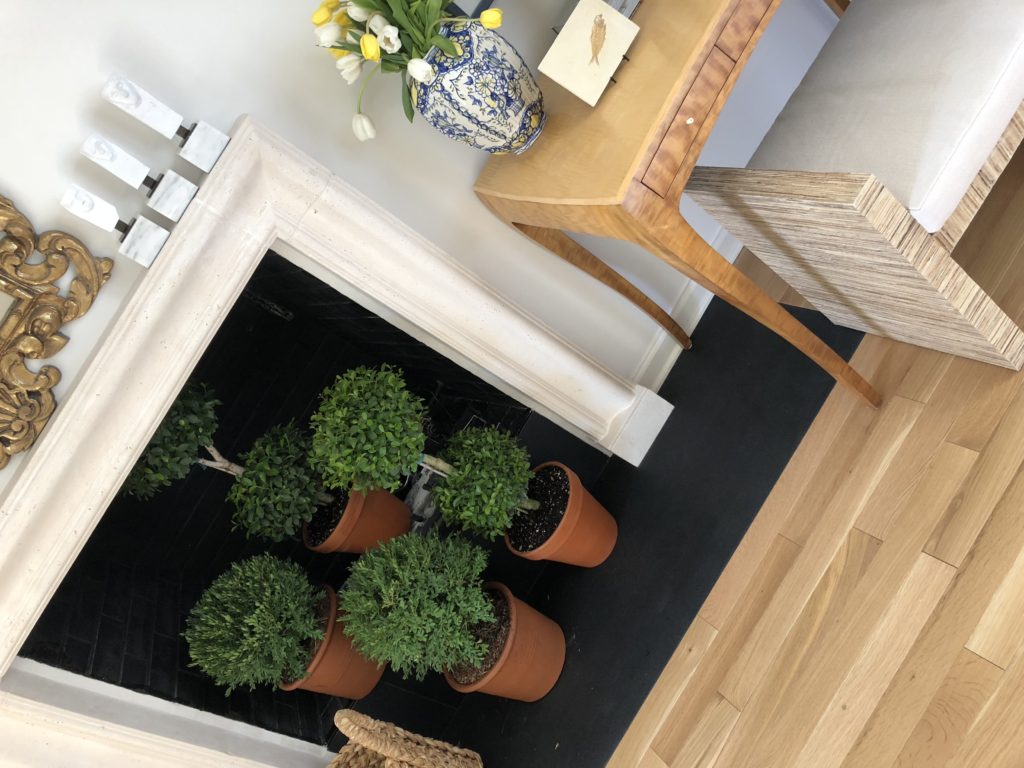
Initially, I thought of using a few flower arrangements, but they would have gotten lost or distracted the entire ensemble. I was lucky to find what I was looking for, two tall double topiaries and two small rounded boxwoods to create different heights. The two double balls are Myrtle topiaries that can live inside and hopefully last year round if we take good care of them. The smaller rounded boxwoods are evergreen that later on, we’ll transplant outside. The dense evergreen leaves are meant to withstand cold weather, and they are a favorite for shaping into different shapes of topiaries since ancient times. Below, a few options of potted topiaries to bring a bit of garden inside your home.
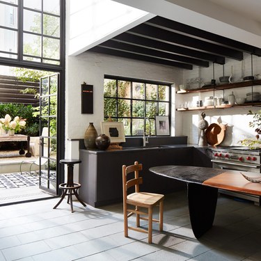
When some people think of unique kitchens their first response is one of skepticism. Unconventional kitchens are usually expected to be anything but beautiful. In the worst cases, the excess of inventive details and mixtures of ideas become to feel so unfamiliar that it yields a feeling far from pleasant. These unorthodox kitchens are not only unique but also beautiful. There is a way to have it both ways when it comes to being unique in designing any room in your home. My philosophy is that whatever it is you are designing should depart from the classics.
As in our kitchen, for example, I combined a modern classic element like stainless steel cabinets with more classic cabinets to juxtapose the sleek and the matte, the always-look-as-new feel of the stainless steel with the traditional painted cabinets in the rest of the kitchen. Francois Catroux still has the very innovative stainless steel fireplace mantel since the late 60’s in his Paris apartment. This latter innovation is perhaps what set him apart from the rest. It pays to be unique and innovative but it is more important to do it in a way that makes you happy. Use in your home what you love and make you happy and go from there. How can the world be innovative and exited if everyone designs in the same fashion or even wear the same clothes? Below, some of the most recent unique and unconventional kitchens I’ve seen.
Love everything in this unique kitchen by Monique Gibson, currently featured in Architectural Digest. This is Monique’s kitchen in New York City where she also works. The table made by an Israeli furniture maker functions as a desk/meeting table/ kitchen table. Now that’s clever.
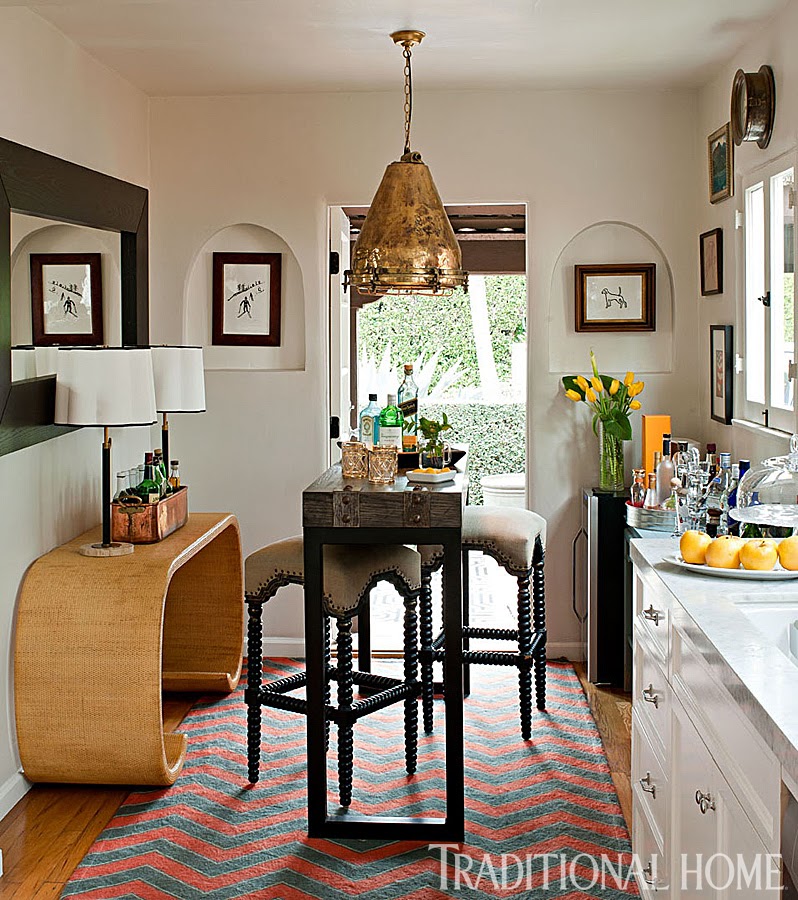
A small kitchen that would take anyone by surprise. It looks more like an entry to a small apartment than an actual kitchen. In a small space or an open concept floor plan is a good idea to treat the kitchen as part of the rest of the home decor.
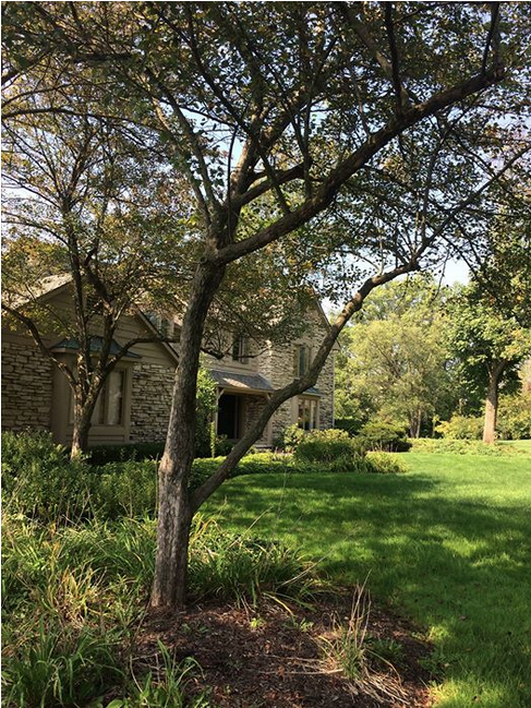
We recently purchased a house in a complete outdated condition inside, which mean the house is in a perfect Interior-Designer-State-Of-Mind… What we like more about it is the stone structure that resembles a lot the stone homes around Provence, France. The house is located in a very strict area where everything done to the exterior needs to be of natural material so no plastic windows and no plastic siding. I’m happy and ok with that, although the rules sometimes go too far as to limit us when it comes to choosing the type of windows. For instance I would love to replace a few for steel casement windows but that wont’ be possible. However, we are very exited with our remodeling which I might share in this blog, only if I can figure out a way to do that exclusively with subscribers. I need to see how can that be possible… Never done it before. The process of the house will not be public, thus only shared with those that sign up for follow ups from this specific post… I still need to come up with a name for the house but for now we’ll call it La Belle House…
I’m very happy and excited to share this endeavour with you…I hope you join us. Looking forward…
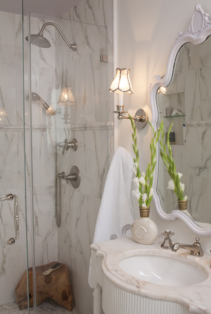
When we started remodeling our home I knew we were not going to live here forever, I also knew what many people knew, that the time of the housing boon was over. Knowing that, my choices on materials and structural changes needed to be more cautious, but I didn’t want to sacrifice style or comfort. So I kept the kitchen and bathrooms as traditional and neutral as possible, something that would appeal to most people, in case one day we decided to sell this house. For our master bathroom I mixed “real and steal” materials: marble mosaic in calacatta gold for the floor, chair rail (to end the tiles that I extended 12″ up the wall, below) and the pencil border that frames the walk-in shower. The shower walls are in porcelain that look exactly like calacatta gold marble. It’s funny the tile installer didn’t know it wasn’t marble until he saw the back of it. The vanity is custom made.The master bathroom is on the small side so I installed a programmable tile warmer, a luxury feature that will compensate for the lack of space. Anyone who has ever remodeled a home knows that faucets can be expensive. For the shower faucets I simply left out unnecessary things such as volume control handles. The main shower handle does the volume control already so why buy an extra one? I wanted to create a luxury experience for my shower with more than one water source without having to pay top money for it. I got the big overhead shower at Lowe’s where the handheld shower is a combination of one of those handles that come with the shower I just replaced the hose for one that you can connect separately and got the set of handles with its respective valves at a trade showroom. This way I was able to have two separate shower sources with two separate faucets.
Read More…