Category: Julie Paulino Design

I feel I’ve been absent from my lovely blog for ages.  Our little one has been under the weather and I’ve been paying attention to nothing else.  Thankfully today he’s feeling much better and I have time to share with you what I have taken with me, not literally, these things
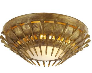
were shipped, to Sao Paulo.  I’m very pleased with the things I got in such a short notice.  The only surprise was that the rug I bought intentionally for the living room came a bit lighter than I anticipated.  Thankfully I know that after some time under the sun, it will turn that lovely wheat color I’m looking for.  One of my favorite things was the overhead light fixture.  I was looking for pieces that would represent a little bit of Sao Paulo architecture which is by most, Brutalist Architecture.   When I opened the box of the Lawrence Flush Mount from Circa
Lighting, I ended up gasping for air.  When I got it I had no idea it was going to be this beautiful.  It is really pretty!

Julie Paulino Design via belle vivir interior design blog

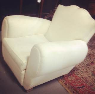
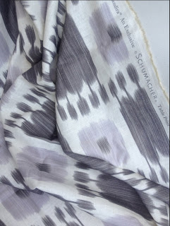
I was lucky finding great pieces at auction for great price.  I found a pair of oversized French 1940’s lounge chair which I got at an auction for a very good price.  They were lucky to come across my fantastic upholsterer in the US who was able to upholster them in just two days and got them delivered just one hour before the guys finished packing our truck.  Talking about luck, ha!  I used the beautiful ikat Schumacher fabric below.

Julie Paulino Design via belle vivir interior design blog

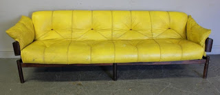
This handsome mid-century Brazilian sofa was sitting in the back of an Auction.  Begging to be returned back home and I did just that.  He’ll soon be back home in its birth country.  This one may go in my office.

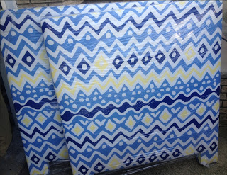
And finally the awesome headboard for our little one’s bedroom.  The fabric is Cap Ferrat by Alan Campbell, Quadrille.  I can’t wait to see his bedroom!

Julie Paulino Design via belle vivir interior design blog

Read More…

our home after- julie paulino design

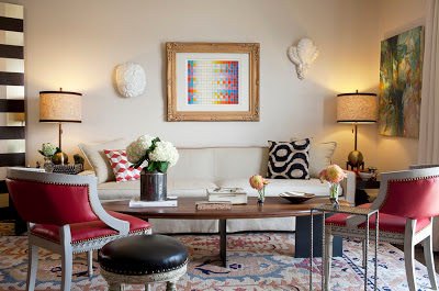
Our home after is a result of all I believe in and stand for.  Uniqueness, individuality and comfort.  A mind of ones own.  It’s a home that reflects our lifestyle as much as possible.  It’s rooted in the classics but in a relaxed and young sophisticated way with modern and transitional elements.  I strive to be creative and unique so this home does not look like any other home because then it wouldn’t be our own.  I like to incorporate modern pieces and/or modernized classic ones because that’s what I consider chic.  A home with some modern and/or relaxed mood.  I actualized the classic fauteuil arm chairs by upholstering them in red leather and embellished with brass nail heads.  I did the same with the black stool.  I fell in love with the coffee table thanks to its sculptural lines, another design element I constantly praise about in this blog.  It weights like a forced marriage because its legs are solid steel. Every time I look at it, good memories come up to my mind remembering how my father-in-law and I carried it inside the house.  I’m just glad no one called the police on us suspecting we were carrying a dead body.  I bought the lamps at Gilt Home, excellent delivery time by the way, I added a trim of velvet to the shades to enhance them further.  The abstract painting is a bartered piece, really! The sofa is Paul McCobb with a slip cover and the oushak rug is from ABC.  The painting above the sofa is an Agam, bought at The Antique Garage.  I hope you enjoy a tour of our home after…

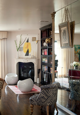
our home after- julie paulino design living room

The fireplace behind the watercolor painting is the TV enclosed in the wall.  The bookcase is from ABC, the drop shaped stools are form Brookstone.  The brass swing arm sconces are from Shades of Light.

Read More…

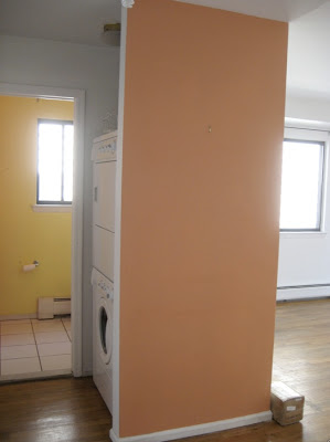
In the back you can see the powder room and the insane and unnecessary
closet in the middle of everything not only taking precious space but
also displaying the washer and drier for everyone who came in and out of
the bathroom.  Nuts, right?

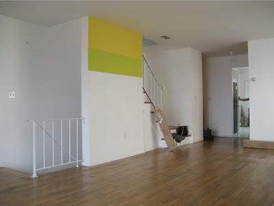
This is how our home before version looked like before we started remodeling it.  Light, yellowish floors, two small closets on either side of the living room blocking the nice view, a less than attractive fireplace, a closed-in kitchen and completely bland bathrooms.  Our labor of love was done in two separate times, kitchen, floors, closets were removed and painted before we moved in and the remodeling of the bathrooms were done two years after while living in it.  Tomorrow I’ll show you the after pictures!

I covered this wall above with mirrors and framed it with two architectural columns.

Read More…

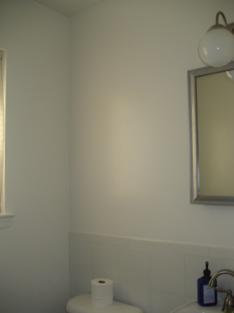
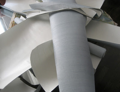
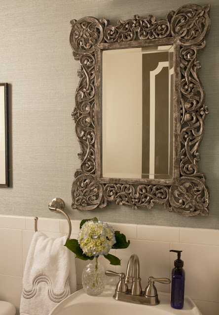
Our powder room was the only bathroom that didn’t get gutted and redone. It would’ve been a lot of fun. This is usually the place where designers choose to go wildest. Maybe in the future we’ll do. Although I have to admit that’s far from happening. The only thing that came down was a ridiculous vanity cabinet, I don’t thing we need a medicine cabinet in our powder room? To our timing all this bathroom needed was wallpaper, in this case the remnants from Lucas’s bedroom. Didn’t I get lazy here? That’s the beauty about seagrass wallpaper; it is highly forgiving due to lack of a pattern, and the natural texture of the grains fit flawlessly together and it also hides many imperfections on the walls.   Since I’m a little bit useless when it comes to DIYing, I hired a professional to do this, even when he was dealing with remnants- which is exactly the reason why I did it. The wallpaper was installed in thee of the walls and the one across from the mirror and toilet has a gallery wall from floor to ceiling. The result is totally flawless, even I can’t tell where the seams are. Go ahead don’t throw away those remnants!  Below, how to transform a powder room with wallpaper remnants.

how to transform a powder room with wallpaper remnants via belle vivir interior design blog


how to transform a powder room with wallpaper remnants via belle vivir interior design blog


how to transform a powder room with wallpaper remnants via belle vivir interior design blog

This is the after shot.  The mirror is from Anthropologie and the towel is Pratesi, bought at a sale.

Read More…

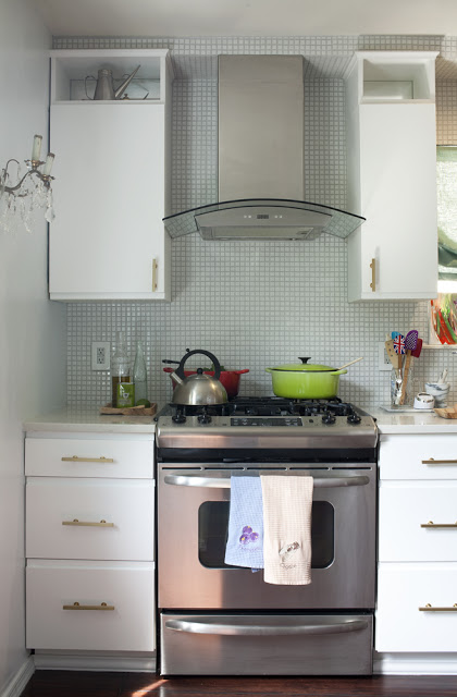
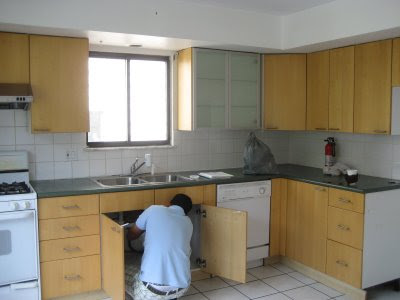
While thinking about what to post today, my kitchen renovation before and after came to my mind.  Since we’re soon moving to another country (Sao Paulo) I feel it would be great to show how I renovated our kitchen. The second picture below shows how our kitchen was before.  Very unattractive!  We teared down everything, from the cabinets to the walls, got rid of that double tray ceiling and redid the floor.  My vision was to create something charming instead of modern because this house was built around the 80’s when there was absolutely no reference whatsoever to any period architecture.  So I decided it would look like something between old and au courant.  I hope you enjoy my kitchen before and after Julie Paulino Design.

kitchen renovation before and after, julie paulino design, kitchen before and after

I love the subtle shimmery of the mosaic.  I added mirror on the back of the upper cabinets to create light reflection.

kitchen renovation before and after, julie paulino design, kitchen before and after


Read More…

how to enhance your main door via belle vivir interior design blog

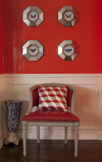
 My small foyer Photographed by Robert Levi

I wanted to show you this picture above first so you can see the wall color through a professional lens.  This is the continuation of the left wall below.  Although the pictures below doesn’t do it justice… It really looks much better in person and I wanted to share with you one way about how to enhance your main door.  I was looking for a color dramatic and impressive and I found those qualities in this striking red.

Read More…