Tag: American Interior Design

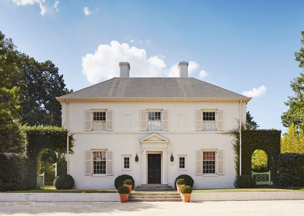
Caroline Gidiere's Alabama Home Veranda facade

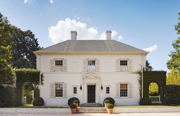
Caroline Gidiere‘s Alabama home must have appeared in everyone’s Instagram feed by now. The interior of the home was the first ere design job of Caroline and it proves that taste when combined with good proportions and good planning always work. Originally Gidiere was looking to renovate an old house but the circumstances of the previous old home weren’t salvable so she collaborated on a new construction with Architect James F. Carter. The Interior design was inspired by Caroline’s favorite designers, Miles Redd, Daniel Romualdez, David Netto, Frances Elkins, and Renzo Mongiardino.

The brick Georgian home located in Birmingham, Alabama was inspired by George Wythe house in Colonial Williamsburg “I wanted to do a riff on the George Wythe house,” Caroline told Veranda. The house is relatively new, it was built less than a decade but the feel of it is as if it’s been there for much longer than that. You read the entire article at Veranda.

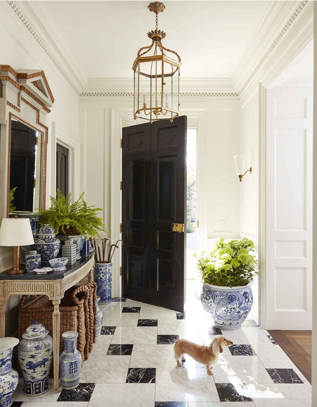
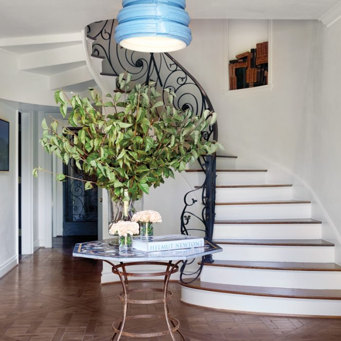
Caroline Gidiere's Alabama Home Veranda entryway/foyer
The foyer with a black and white floor of the same design I have in my entryway.
Read More…
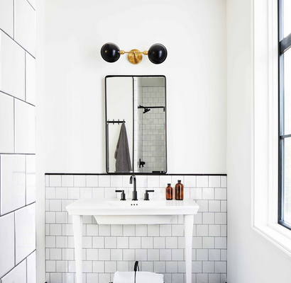
colorful modern home decor, black and white graphic tiles bathroom

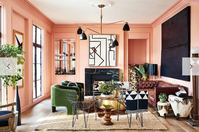
I love it when I come across a home that is colorful, modern, and timeless at the same time.  Nowadays, when everything seems to be in black and white, it’s refreshing to see that there are still designers who dare to take a chance.  I love neutrals because they can’t go wrong; however, a colorful home is always uplifting.  Architect Carmel Greer created a home that is as personalized as it’s inviting.  Pink living room with contrasting upholstery, who doesn’t like pink? She kept the bathrooms and kitchen neutral and fresh while sprinkled the open spaces with modern and colorful art.

colorful modern home decor, pink living room

Often Designers and Architects use their own home as a laboratory by implementing design choices that clients usually reject.  Carmel told ED that she put in her own house things that clients haven’t really loved.  I’m sure that many clients, after seeing the result will change their minds.

Read More…

I always wanted to be an Architect.  As a matter of fact, I registered under architectural studies in Collage.  For reasons I can’t even understand today, I decided to switch careers and went into international business and eventually interior design instead.  My dream was to design, build, and oversee constructions of buildings.  The most magical thing about design is that it allows us to build the life we always dreamt of.  This latter, award-winning architect Gil Schafer does effortlessly.  He designs new homes that look as if they were old, but classic and well-designed old houses.

“I design houses to be comfortable, gracious, and understated, and to stand the test of time,” architect Gil Schafer told AD.  Good design runs in his family, Gil Schafer is the grandson and great, great-grandson of architects, so Gil grew up experiencing first hand what a well-built, thoughtfully-designed home feels like and what it takes to build it.  He’s been designing beautiful homes for the past thirty years.  Following undergraduate studies in Growth & Structure of Cities at Haverford College and its sister institution Bryn Mawr, Gil graduated from Yale School of Architecture with a Master’s Degree in 1988. While at Yale, Gil studied under several noted practitioners including Thomas Beeby, Robert Venturi, Josef Kleihues, Frank Gehry, and Benard Tschumi and was the recipient of the H. I. Feldman Prize, Yale’s highest honor for studio work, in his final semester.  Gil Schafer served as the President and then Chairman of the Institute of Classical Architecture & Art from 1999-2006 as well as in many other nonprofit boards.
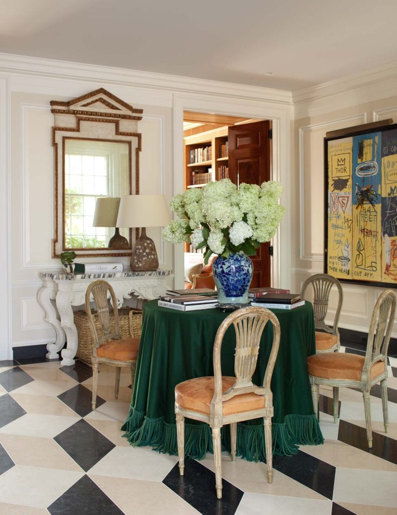
Gil Schafer, David Netto interiors, nashville-interior17

This Nashville home was restored by Gil and decorated by David Netto.  This entryway has everything I believe in, classic architecture, a beautiful graphic floor that adds a modern touch, ornate furniture and modern expressionist art by Jean-Michel Basquiat.  I love everything in this entryway.

Read More…
soutern living idea home, kitchen stove

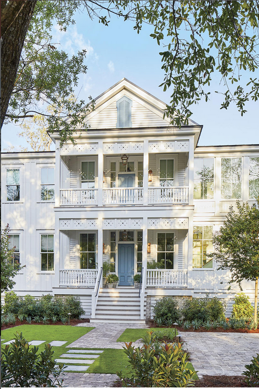
soutern living idea home, facade

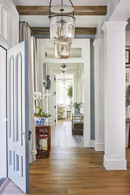
This year’s Southern Living Magazine Idea House was built from the ground up in the Crane Island, Florida, 14 miles from Fernandina Beach.  The house is absolutely gorgeous, Interiors designed by Heather Chadduck Hillegas, Architecture by Historical Concepts’ Jim Strickland and Clay Rokicki, and construction by Riverside Custom Homes.  The decoration inside is elegant and classic but entirely livable with an emphasis on All American beauty.  I can move into this house and not change a thing.

It took me more than usual to upload all these images, but they are all so worthy that I wanted to make sure I wouldn’t leave one out.  The house has a resemblance to the Something’s Gotta Give’s house, but with a bit more on the classic modern side, with lots of browns, dark blue, ceiling beams, classic or antique furniture throughout and printed fabrics and wallpaper.  Read more about it at Southern Living Magazine.

soutern living idea home, door

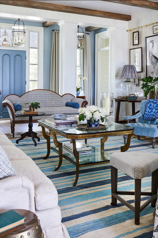
soutern living idea home, blue and white living room

The living room with a blue and white palette.

Read More…

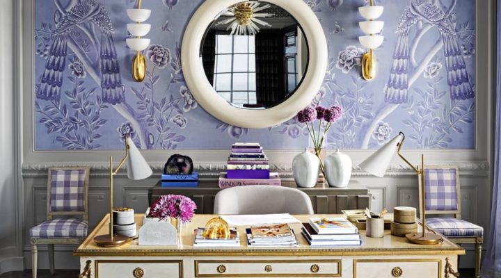
Mary McDonald design, chinoiserie purple and white office

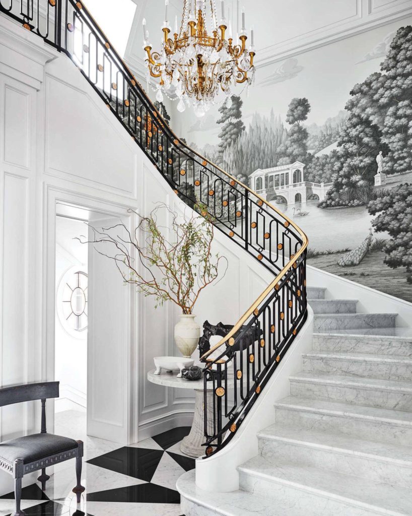
Mary McDonald’s style is synonymous to glamour, grandeur, over the top, and architectural design.  The 17,000-square-foot home she recently designed, distilled every one of those attributes mentioned above, from a very bold home library with custom wall paint to an impressive marble clad entryway.  The home, located in Corona del Mar, California belongs to Jerrod Blandino and Jeremy Johnson couple behind the California-based cosmetics brand Too Faced.

If you ever watched the Bravo TV show Million Dollar Decorators, you may remember Mary McDonald’s exuberant design as she was one of the Interior Designers in the show.  One of McDonald ’s consistent design elements is symmetry which she implements even in the least conventional forms, for instance in every one of Mary McDonald’s office desks; you’ll find a pair of table lamps, never one.  Another design element that Mary often favors is the use of a three-color pallete, a yellow, grey and black bedroom, a pink, black and beige room and so forth.

Mary McDonald design, black and white entryway

A custom de Gournay wallpaper with a pastoral landscape.

Read More…