Tag: black and white interiors

I love color… colors are rich, they make us happy, and it’s everywhere in nature. Having said that, I sometimes crave neutral, black, and white spaces for a sense of repose and serenity. There is really no reason for debate: color, as well as style, finds its place every time. A modern home with a modern clean line interior architecture seems to find a better match in a neutral palette while a more traditional interior looks great with color.

neutral interiors

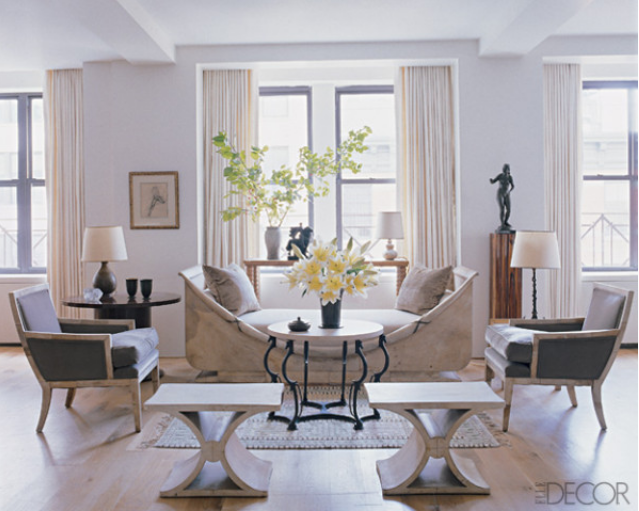
This neutral from via Elle Decor has perfect nature stem color, grays, beiges, browns, and white. Although the daybed is striking, I can see it more in a transitional/office lobby space.

Read More…

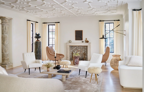
Nowadays there is a lot of love for neutral decor. Neutral interiors pop up daily and constantly in every Instagram feed. But not all neutral decor are created equal. This 1925 Tudor home designed by Nate Berkus and Jeremiah Brent proves a soft neutral palette can be warm and modern at the same time. The design couple transformed the formal, dark Tudor home into an open, bright and more modern one.

Nate Berkus and Jeremiah Brent, neutral decor living room

A neutral living room is brought to life with a mixture of materials and texture. A travertine cocktail table juxtaposes with linen-covered chairs and sofas.

Read More…

Darryl Carter is an Interior Designer who knows how to juxtapose classic furniture with modern details like a professional. His interiors are always restrained but beautiful, spare but welcoming. He keeps his color palette in the neutrals while incorporating modern art and details that make his interiors exciting and up to date.
Darryl Carter, Christmas

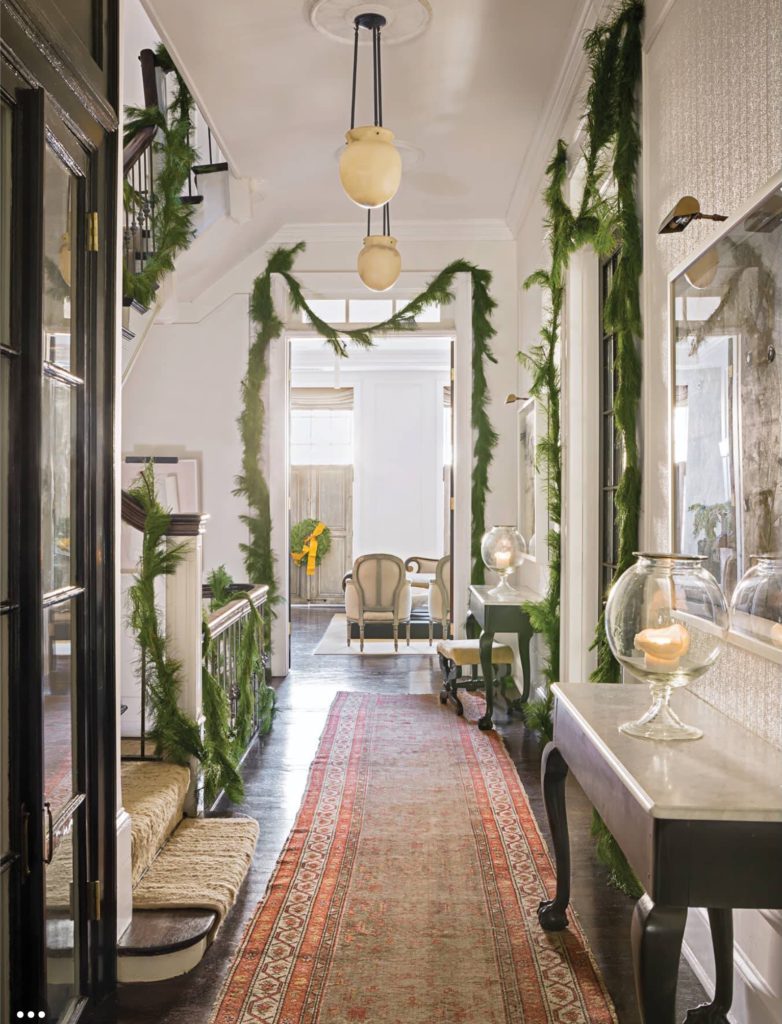
For the Christmas decor in his townhouse in Washington, DC Carter enlisted the Gardener Sidra Forman.  Forman kept things understatedly elegant by decorating the doorways and stair rails with simple green garland.  Sidra skipped the Christmas light and instead embellished the three and the many wreaths throughout the house with yellow burlap ribbons.  Love the modern way the ribbons were wrapped around the garlands.

Read More…

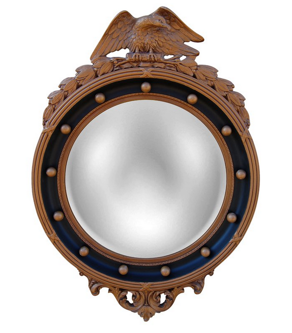
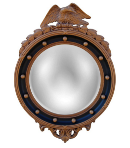
I love a good sale, who doesn’t… As a matter of fact I enjoy buying my clothes on sale more than on regular price.  I think that I’m becoming very frugal, curiously enough this new practice of mine doesn’t always cross over to home decor purchases.  However I’m always in the look-out for beautiful accessories on sale, also for furniture or for fabrics or anything in between.  For the special deals of the week I found these beautiful and elegant neutral-tone home accessories on sale that I couldn’t help sharing them.  It’s true that you can’t go wrong with a neutral tone decor.  There is something so special and remarkable about the mixture of browns with blacks, brass and beige contrasting with textures of rattan, plaster, sisal and hemp fabrics…  The overall effect often found in a neutral decor is dramatic to the eyes yet soothing to the senses.  The first one in the list being an Eagle Convex mirror.  In case you didn’t notice, we love a Convex mirror.

neutral decor special deals of the week via belle vivir interior design blog


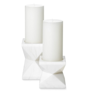
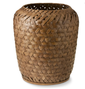
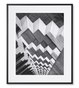
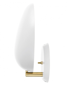
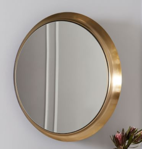
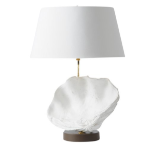
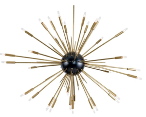
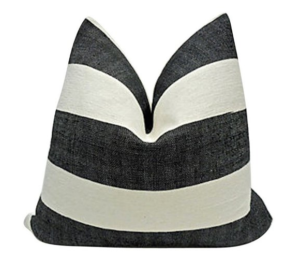
Alabaster Pillar holders in two different sizes.  This rattan basket also comes in two different sizes. The strong and abstract lines in this black and white Skyscraper photograph is pretty modern and classic at the same time.  Regency Eagle convex mirror is always a good idea for when you are looking for a way to incorporate a classic elegant object in your home.  And of course the clean modern sconces to contrast with any other strong traditional element. Recessed wall mirror in antique brass finish for a touch of glam that never fails to impress.  A shell lamp in case you have  beach house or you just want to bring the beach feeling inside instead.  This chandelier has been in too many a dressing room, but perhaps it would go well in a hallway…  And finally a Moroccan hemp pillow in graphic black and white stripes.

Read More…

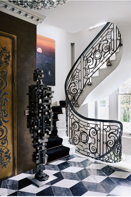
When designing a home around contemporary art, especially if the art is an impressive one, the house should rise to the occasion in more ways than one.  In this case the owner of this Victorian house in London owned a dramatic collection of contemporary art so instead of creating a home that recedes to the background, Architect and designer Shalini Misra created a home with drama just enough to not shy away from the art and with character enough to serve as blending element.  The result is a balanced combination of drama and glamour.
designing a home around contemporary art by Shalini Misra via belle vivir blog

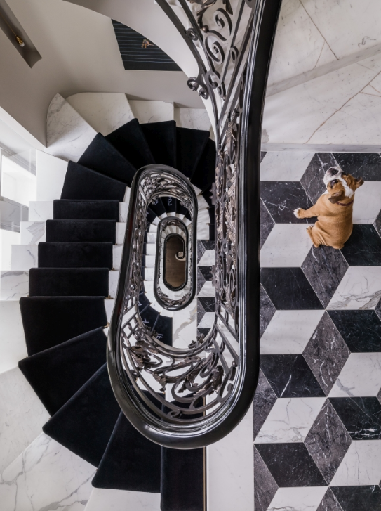
A mixture of black and white play a protagonist role in the Interior Architecture.  The contrasting colors are beautifully used.  We can see them on ornate stair railing and on the Rhombus pattern tiles on the raised ground floor.  The transformation of the Interior Architecture was pretty impressive and left only to professionals.  Since the house needed to be enlarged to accommodate the owner’s art collection, doorways were widened to facilitate the view of the art.   The basement was dug deep to create an extra 418 square meters for a swimming pool, gym and spare rooms.  As well as the staircase was relocated to move clockwise between all floors.  This last move was inspired by Vastu Shatra principles- a traditional Hindu system of architecture meant to bring harmony into the home.
designing a home around contemporary art via belle vivir blog

How amazing is this impressive view of the staircase.  Beautiful white marble, velvety stair runner and ornate railing combined with an edgy but still traditional rhombus floor.  It’s a somewhat over the top interior design.  Though a kind you can live with thanks to the classic references and neutral tones.  I say, I’ll take it.

Read More…
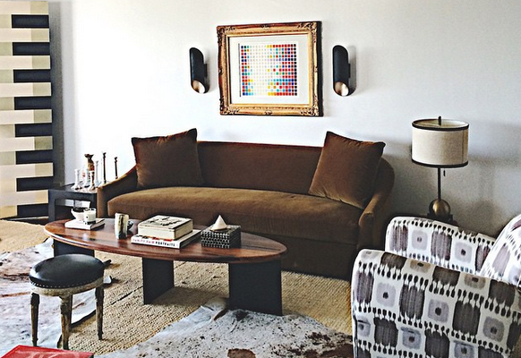
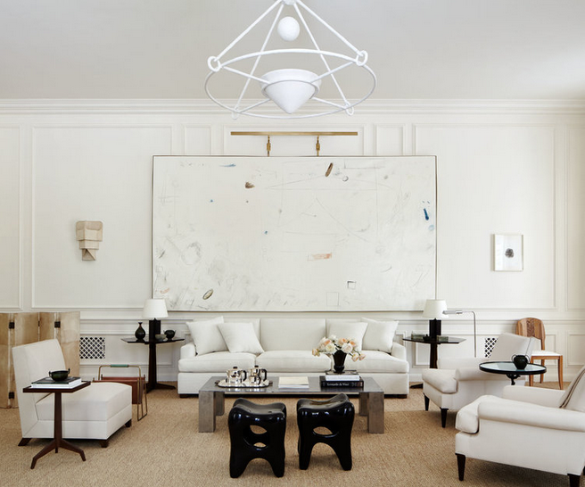
This harmonious living room was designed by Alyssa Kapito for this year’s Holiday House in New York City.  The yearly Show House benefits the Breast Cancer Research Foundation by giving 91 cents of every dollar to the cause.  The Show House showcases the work of 22 Interior Designers whose creations must be inspired by a theme or special occasion.  This neutral living room was one of the many beautiful rooms created by many talented Interior Designers.  The living room specially stood out to me because of the strong contrast that the black objects and furniture create.  You know how I feel about the use of black elements in interiors.  Alyssa Kapito went completely neutral with the decor of her space.  The difference in texture and wood tones add a lot of interest to the understated living room.  The space looks simple but the room had a lot of important pieces such as a portrait be Alberto Giacometti above the fireplace mantel, two chairs by Gustav Axel Berg by the desk.  The over sized abstract painting above the sofa is by William McClure.  I think the painting is spectacular in itself, it’s modern and subtle.  Ideal for the atmosphere of the living room.

Alyssa Kapito living room front

Read More…