Tag: home decor

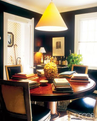
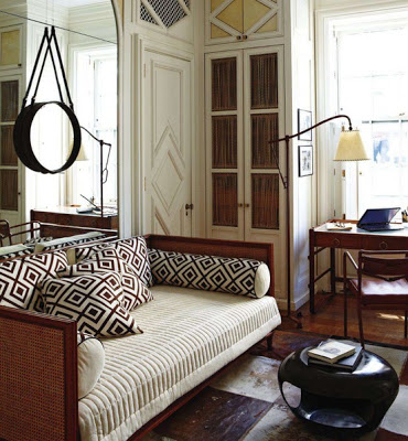
Let’s hear it for the color Black! Albert Hadley loved it and Ralph Laurent home uses it abundantly. Many designers say black is the king-color of style. Think of Coco Chanel! I favor the color black because it is perhaps the most versatile of all colors, it can be plaid-up to make a room sober and elegant or it could be plaid-down to make a room rustically chic

The late Albert Hadley.

The late Albert Hadley was a master at making a room eternal by adding touches
of black here and there.


In this room the neutral of beige and brown gets excited with the touches of black.

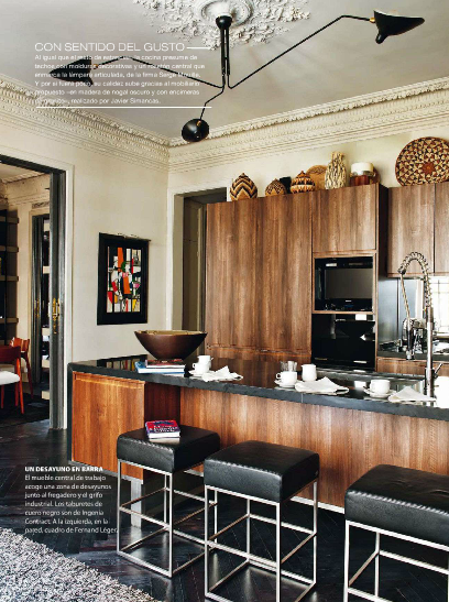
I adore the contrast of the ornate ceiling and Serge Mouille three-arm ceiling lamp.

Can you imagine this dining room with a mahogany or white table?  I don’t!
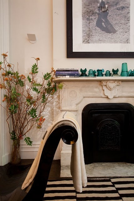

The famous Madeline Weinrib’s Buche rug with its dynamic offset stripes makes this room up to date.
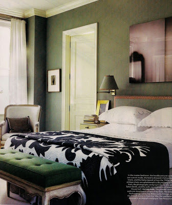

Just a beautiful black throw and art with some black in it would do for the owner who doesn’t want to change things radically.
images via Elle Decor Spain, Nuevo Estilo, Elle Decor US
Read More…
David Kleinberg design in Manhatta via belle vivir blog

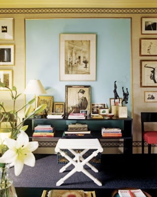
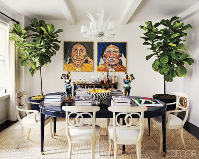
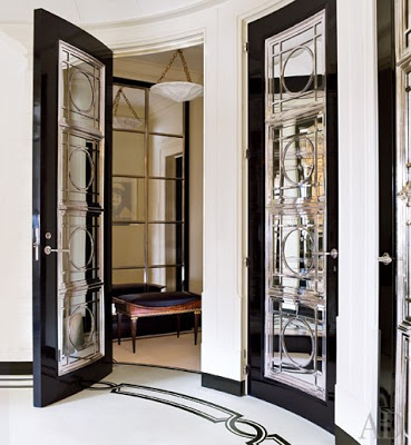
This Manhattan apartment was designed by David Kleinberg and it exemplifies what I interpret as a Chic Home.  A home with a classic architecture furnished with modern art and a mixture of classic and modern furniture.  A chic space for me is a space where things juxtapose with tension and friction,  where according to conventional thought, things are not supposed to work but they do.  This home designed by David Kleinberg is a perfect reference to it.  Enjoy!

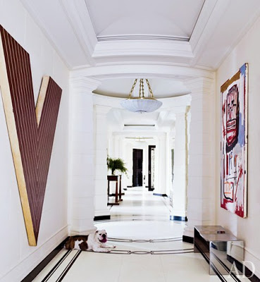
David Kleinberg design in Manhatta entryway

The design in this hallway explains more than anything of my whole idea of a “chic home.”  Classic architecture is juxtaposed with modern art such as the Jean-Michel Basquiat painting (right) and the unexpected texture of the stainless steel bench.   This a perfect interpretation of classic lines in a modern way.

Read More…

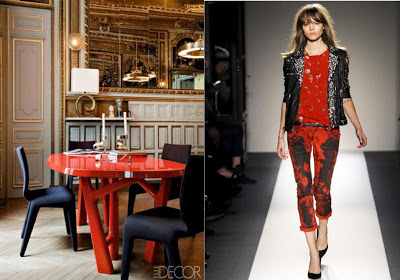
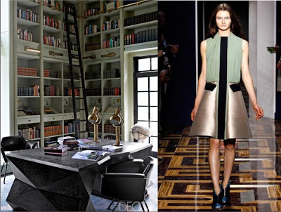
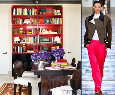
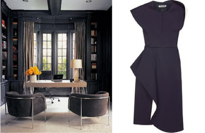
I’ve been having so much fun organizing my home, we just got our furniture after 4 long months of waiting for the shipment, and since I love fashion so much I’ve been baptizing each room with a fashion designer’s name.  Here is a list of one of the coolest-looking home offices I’ve seen lately (and not so lately) and here are the designers who I would pair them with.  Enjoy and have a happy mid-week!

Home office images from Elle Decor.  From top to bottom Balmain, Balenciaga, Stella McCartney and Jil Sander.


Read More…

I’m especially exited today because after four long living-with-rental-furniture-months we are finally getting our stuff tomorrow.  It’s play time! I have a pretty clear idea of where things are going to go, but boy can’t that change? One thing that I’m certain though is the gallery walls I
want to create around the house.  I’m a big fan of picture cluster walls and I’ve realized that when there is a lot of different ways to create them and/or to display them, each produces a different background.  From a complete harmonious and balanced display, to careless and Bohemian one to a more eclectic grouping.  Each and everyone translates the personal
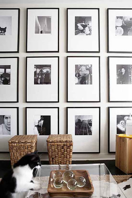
lifestyle of their owners, as it should be.  So I’ve been paying attention about how to create the best gallery walls or wall art composition as some call them.  For creating a harmonious and balanced gallery wall is good to keep things simple and hang each picture at the same distance vertically and horizontally speaking.  One thing to keep in mind is to keep all frames and matting in the same color.

how to create the best gallery walls, black and white gallery wall via belle vivir blog

A display of black and white photography hung with the same identical distance between them creates a more modern aesthetic.
Read More…
A Monochromatic Cabin in Megeve

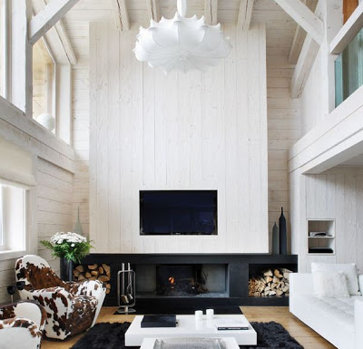
While many rich and famous take the first month of the year vacationing to warmer weather destination, others like myself go back to work and duty.   Unnaturally though I would rather be somewhere else where there is a lot of snow and mountains- at least for a very short time.  A Cabin like this one in Megève to come back to after a long day of skiing (with an aching body from all the falls) is of course part of that wish.  The basic black and white
of this cottage is very soothing and fitting for the million dollar view of the Swiss Alps, however I would rather have seen a bit more shades of brown throughout.  The cowhide chairs for instance are the queen of this house, what do you think? The kitchen with its monochromatic palette is a big focal point of the cabin and the tulip chairs with rabbit pillows are also a great warm detail.  Enjoy!

Read More…

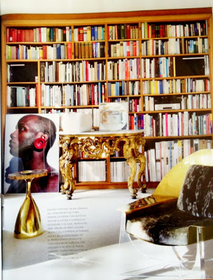
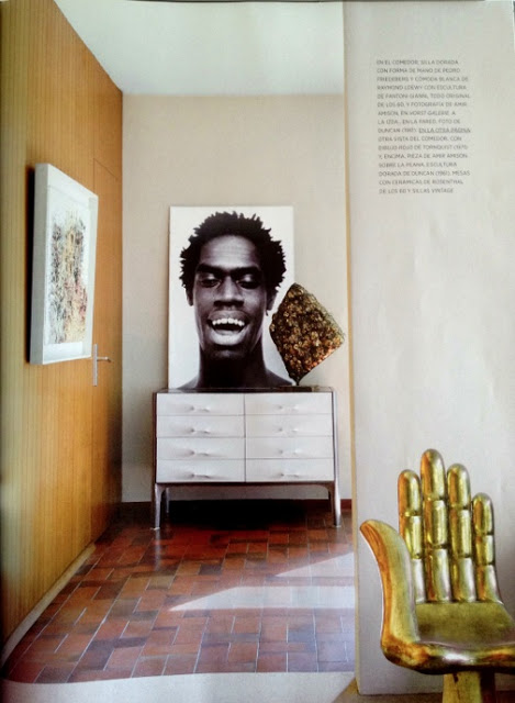
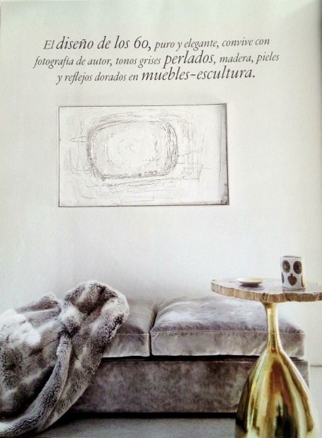
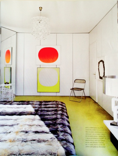
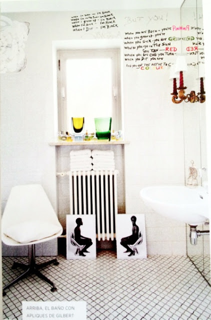
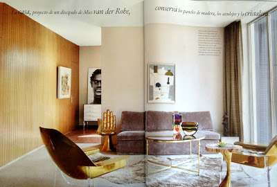
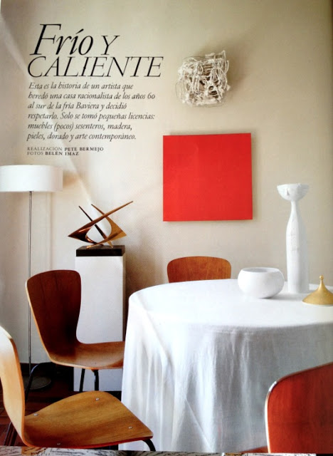
While in Buenos Aires a couple of weeks ago I bought a the November edition of Architectural Digest Spain where they showcase a home of an anonymous artist (yes, some people do so well don’t need the publicity) who inherited a home in Bavaria.  The house was built in the 60’s and he smartly decided to furnish it with nothing less than gorgeous pieces of furniture from the same period.  Most of the furniture is by Philippe Hiquily.  The result is a modern setting of a very spare and sophisticated home with an good amount of gold throughout that assures me this owner’s work should be amazing.  I took photos with my iPhone to share the beauty of this home with you.  Enjoy!

The white sideboard is by Raymond Loewy

The sofa is upholstered in a Manuel Canovas velvet.  The two beautiful gold chairs and side gold table are by Philippe Hiquily.  The painting is by Neruth.

Original photos by Belen Imaz

Read More…