Tag: home decor

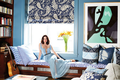
Nothing better than when we get to peak in into the lifestyles of stylish people.  It proves once more than a great sense of fashion doesn’t stand too far from a good sense of living.  Leave it to the Herrera family to show us that.  In the December/January issue of Harper’s Bazaar, you can get a good sneak peek into Patricia Herrera Lansing’s New York apartment.  It’s beautiful and cozy as equally elegant. But that shouldn’t take anyone by surprise, Patricia’s parents are the legendary fashion designer Carolina Herrera and Vanity Fair contributing editor Reinaldo Herrera.

Patricia Herrera Lansing's New York apartment, bedroom

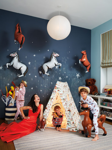
The apartment was Patricia’s husband bachelor pad.  They gutted it and reworked it doing the spaces by color, according to Patricia.  ” I did it by color-a blue room and a green room and so on”  The result is a family friendly home with lots of good art.  “I think you have to have a place where your children can run around freely,” she says, and I agree.

Patricia Herrera Lansing's New York apartment, kids bedroom
A beautiful children’s room with started wall and blue walls.
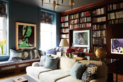
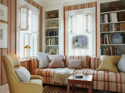
Patricia Herrera Lansing's New York apartment, library
Built-in bookcases in the cozy library.

Read More…

Kevin Isbel house beautiful via belle vivir blog
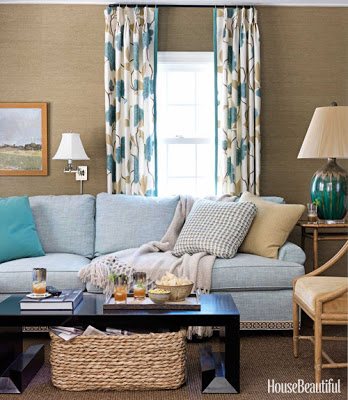
 A beautiful and cozy room designed by Kevin Isbell in the December/January issue


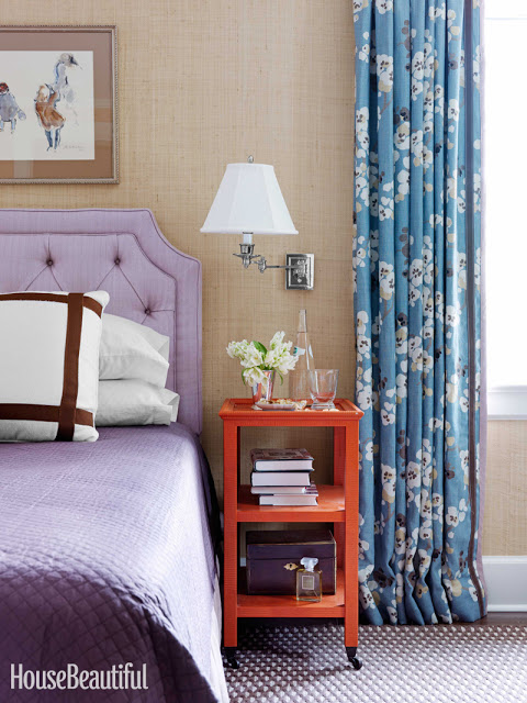
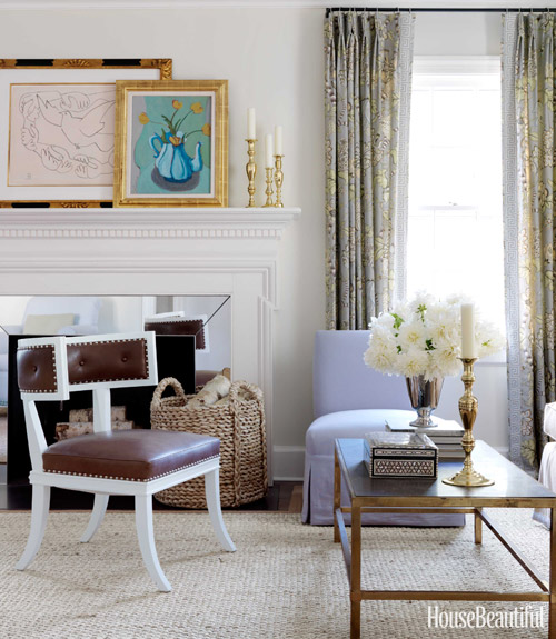
I’m happy to have been contacted by House Beautiful to write a post on Grass Cloth a week ago and very honored for the mention that will appear in the December/January issue.  If you have an iPhone you’ll be able to link to Belle Vivir through the HB Connect app.  It’s amazing how dynamic and personal magazines have become.  House Beautiful was kind enough to send me the article so I can see it and new watermarked images that will appear in the December/January issue.  Kevin Isbell knew how to make this1930’s center-hall colonial home current by injecting warm and intrinsic details such as geometric trims to floral curtains, gross-grain ribbon tape to a plain white sofa and visually connecting two separate rooms by custom painting grass cloth walls the same color as the ceiling.  “Grass cloth has a warmth that paint does not, and darker colors are more cocoon-like” Kevin Isbell.

Kevin Isbel house beautiful via belle vivir blog

I love the contrast between the modern looking cocktail table and the wicker basket in the family room.  Notice the detail of the tape on the sofa.  It’s all in the small details that slowly reveal themselves to you.  In this room the grass cloth used is a bit more textured than the one used in the bedroom above.  A very applicable difference, I think.

Kevin Isbel house beautiful via belle vivir blog

You know how I feel about any klismos and klismos influenced chairs.  It’s forever my favorite chair.  And the contrast here between the lilac slipcovered chair and the leather brown on the klismos chair is the perfect union of masculine and feminine.  I didn’t want to spoil the article so I’m only posting the three images above, the two below are from Isbell’s website.

Kevin Isbel house beautiful via belle vivir blog
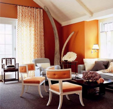
 Top three watermarked images exclusive from House Beautiful, last two from Kevin Isbell website.

Read More…

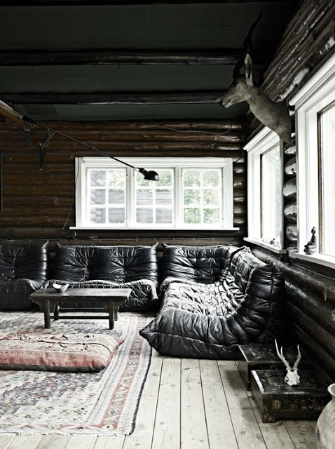
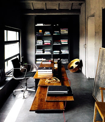
 Above, Jean Louis Denoit’s home.

The days here in Sao Paulo are getting warmer, which I love giving the fact that my favorite season is Summer.  But, that doesn’t save me from missing the beautiful interiors of winter, the laziness of long dark days and the coziness that they conjure.  Enjoy! and keep warm if it’s cold where you are.

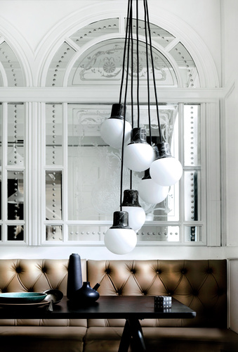
Gorgeous paneled mirror wall and banquette calls for coffee.
 So adorable!
 Someday I’ll have these lounge sofas.
It’s all about that Brutalist desk. So brutal!
pictures from Pinterest and le petit bird told me

Read More…

I feel I’ve been absent from my lovely blog for ages.  Our little one has been under the weather and I’ve been paying attention to nothing else.  Thankfully today he’s feeling much better and I have time to share with you what I have taken with me, not literally, these things
were shipped, to Sao Paulo.  I’m very pleased with the things I got in such a short notice.  The only surprise was that the rug I bought intentionally for the living room came a bit lighter than I anticipated.  Thankfully I know that after some time under the sun, it will turn that lovely wheat color I’m looking for.  One of my favorite things was the overhead light fixture.  I was looking for pieces that would represent a little bit of Sao Paulo architecture which is by most, Brutalist Architecture.   When I opened the box of the Lawrence Flush Mount from Circa
Lighting, I ended up gasping for air.  When I got it I had no idea it was going to be this beautiful.  It is really pretty!

Julie Paulino Design via belle vivir interior design blog

I was lucky finding great pieces at auction for great price.  I found a pair of oversized French 1940’s lounge chair which I got at an auction for a very good price.  They were lucky to come across my fantastic upholsterer in the US who was able to upholster them in just two days and got them delivered just one hour before the guys finished packing our truck.  Talking about luck, ha!  I used the beautiful ikat Schumacher fabric below.

Julie Paulino Design via belle vivir interior design blog

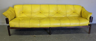
This handsome mid-century Brazilian sofa was sitting in the back of an Auction.  Begging to be returned back home and I did just that.  He’ll soon be back home in its birth country.  This one may go in my office.

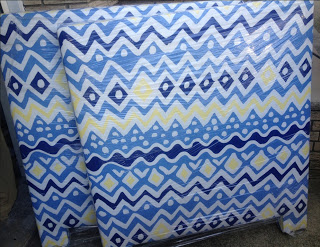
And finally the awesome headboard for our little one’s bedroom.  The fabric is Cap Ferrat by Alan Campbell, Quadrille.  I can’t wait to see his bedroom!

Julie Paulino Design via belle vivir interior design blog

Read More…

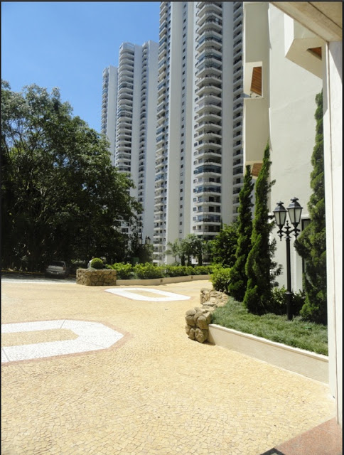
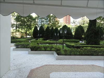
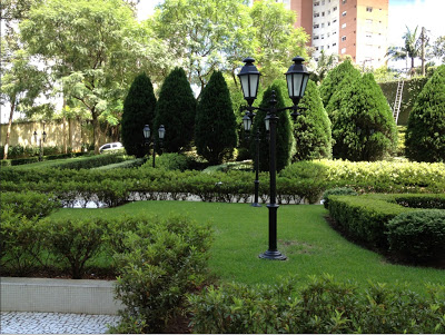
I think I’m going to forget about hygiene and I’m going to walk barefoot on that mosaic floor.  If you’ve been house hunting you know how stressful could be to be looking for a home that offers everything you’re looking for and a little more.  If you add all that to be looking in a foreign country that you don’t know anything about, and which speaks another language, then you have all the scenarios to start biting your nails like a maniac.  We had two real estate agents who took us around, one spoke some English the other didn’t.  Spanish is my first language so I’m able to understand a lot of written Portuguese, but understand it when spoken, that’s another story.  Fortunately the real estate agents were very patient and we were able to find something that pleased us.  From our experience I could tell that Sao Paulo offers three types of homes.  The first option is a ‘casa condominium’, a group of 7 to 10 homes in a gated community.  After seeing three or four of these houses I started picturing myself ending up like the last Buendia character in One Hundred Years of Solitude, dried from depression and carried away by ants.  Ouch!  So sooner than later we decided that we’re not built for gated communities.  Second option is Free Standing Homes.  For all the good reasons you can imagine while living in a foreign country this one was out of the question.  At that point we were left with the third option; high-rise buildings.  I’m not very keen of high-rises, but when we came across this complex with many of the features I love from mosaic walls, cobble stone narrow hilly streets surrounding the buildings and beautiful pine tree courtyards, we were sold.  Brazil is known for its beautiful vegetation and nature so I shouldn’t have been surprised when I found out that in the middle of the entire complex there is a mini forest packed with monkeys that you can feed.  Lucas, our son, will be amazed by it. The apartment is higher than I would’ve liked it, but the view compensates for it.  It seems to be a very common thing in Brazil for the building have one apartment per floor so we also loved the privacy of the elevator coming directly to our apartment.

I’m not sure if this was a sign from God or if it’s freaky.  The building’s name has me and my husband’s initials and the funny thing is that neither one of us noticed it until just recently when we were showing the pictures to our family.

 This made me so happy the first time I saw it.

I’ll be having espresso here soon.  Yes you read that right, espresso under the sun if I need to.

This is part the mini Forrest.  I couldn’t take more pictures because they don’t allow outsiders to take pictures.

The view that I”m sure will inspire us in many many moments when we feel like strangers far from home.

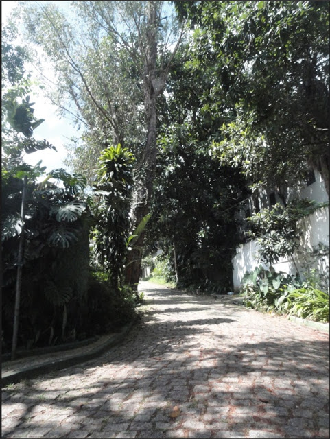
This is one of the many cobblestone walkways around the complex.  I’m planning to take Lucas for night walks around here.

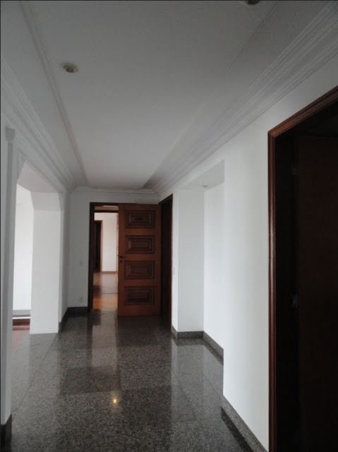
I finally have a foyer.  I suspect that ceiling is calling for some patterns!  Uhm…

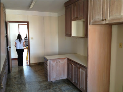
Since we’re not going to do any type of remodeling, I’m happy that the kitchen is in great condition because the bathrooms…ah… that’s another post.

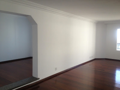
I love the open and not exactly open layout of the apartment.  You are able to peek into the dining room and TV room from both sides of the living room.

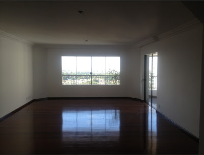
The living room.  It’s a new beginning and I couldn’t be more happy and excited!

Read More…

The first picture below is not the best picture of the folding screen I’m referring to, but you get the idea.  How to make a folding screen:  I believe, correct me if I’m wrong, there is no standard size for the width of the panels of a folding screen,  but there is a need for the thickness to be at least 1-1/2″ in order for the screen not to tilt over.  I had the frame custom made (cut-assemble-paint) by my carpenter and then I wallpapered it myself.  Now, here is the trick of how I did it.  To make the entire process a lot easier for me I asked my carpenter to make each panel the same width as the wallpaper.  That helped me to avoid cutting the wallpaper along the sides, which is very complicated and time consuming.  The size of the screen is 7′ tall with four panels of 20″ wide.  I liked the Block Wallpaper by Erika Wakerly in brown, gold and beige.
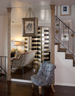
how to make a folding screen via belle vivir interior design blogI can’t believe that exactly four years ago we moved into this house and started remodeling it slowly.  And just when it’s finished it’s time to pack up and move to another country.  I look forward to moving to Sao Paulo and start designing our new home.  Nothing like having complete autonomy when decorating a home.  Below are two more shots of vignettes in our home.  On a separate note, the genuine and sweet Ada from Classiq invited me to be part in her beautiful Chic Files series and I’m more than flattered.  If you want to see me pretending to be an important person and answering a few fashion-related questions and wearing my loving stripes then head over there.  Enjoy!

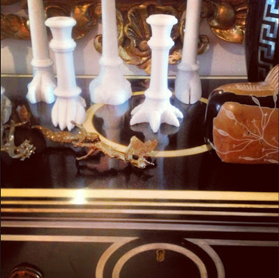
In case you’re interested.  Above, an ebonized inlaid commode from Italy and it’s from Lerebours Antiques at E 60th St.  The alabaster candle sticks are by Jardins en Fleur, the Greek key base is a Home Goods find, the brass sculpture, the marble lion sculpture and mirror are from a local vintage store.

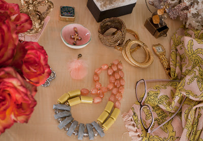
A vignette of my vanity.  The necklace and scarf are from Anthropologie, the cross is custom made (my mom’s), the coral and the pill case are from Turkey,  two of the bangles are from C. Wonder and the one next to the watch is from the Antique Garage Flee Market.

Read More…