Tag: home decor

Taking a break from the Christmas decor, I wanted to post today about these chic small spaces and how much easier it is to make small compact spaces comfortable and chic, compared to big open spaces. Contrary to popular belief, over sized furniture in small spaces make them look bigger as long as you opt for rounded edges.  Covering the walls in fabric or natural texture wallpaper like sea grass or grass cloth makes the room feel swaddled.  Big art work or mirrors bring excitement and reflection to small spaces.  Sconces, sconces sconces, I love sconces small, big, shiny or matte, they bring functionality but also interest and add an extra layer of fun. 

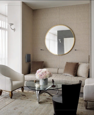
chic small and cozy living room via belle vivir blog

The banquette enclosed between these two columns gives a cacoonish feeling to this space.  I love how they kept the furniture low.

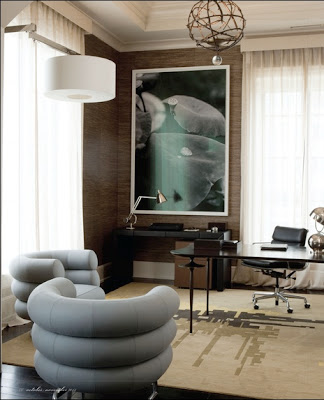
chic small office via belle vivir blog

Again in this room, the walls are covered in seagrass wallpaper.  The desk that is kept light and skinny and the Bibendum chairs by Eileen Gray keep the space open.

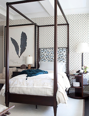
chic small bedroom with canopy bed via belle vivir blog

The Guest room designed by Thomas O’Brien for Hearts Designer Visions this year was a very suitable small space with great scaled furniture.  Thin but tall canopy bed bring your eyes up letting you appreciate the beautiful fabric on the walls.

2nd by Antoine Bootz last via High End Weekly.

Julie Paulino Design

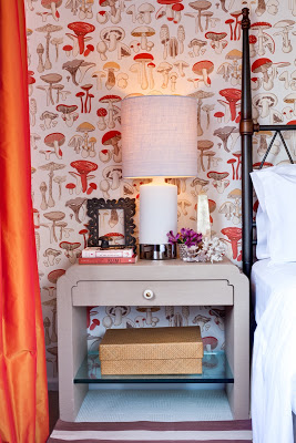
There was a little bit of misunderstanding with yesterday’s post.  Apparently some lovely people thought that the first image was part of my home, it’s not.  I found the image at New York Social Diary.  The post was intended to inspire a different way to approach Christmas Decoration.  I apologize for the confusion.  For that reason I decided to post a few images of our home, which I don’t do much because we all know that magazines would not be interested in featuring somehing that’s been already published.  This past Saturday the photographer Marco Ricca was here and took many lovely pictures of two of our bathrooms, the guestroom and Lucas’ room.  For the guestroom above I wanted to create a magical space that was cozy, inviting and dreamy.  So my first thought was the movie Amelie.  Since I love French movies for their lightness and happiness underlined I designed our guestroom inspired on Amelie, hence the whimsical and unique wallpaper and the color scheme.  The wallpaper is Champignons by Brunschwig and Fils, the side tables are designed by a Karl Springer apprentice.  I don’t remember his name.  The handle is one sculptural gorgeous thing but you can’t appreciate it much unless you click on the picture an zoom in.

Read More…

interiors in black and white

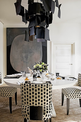
To many people the thought of decorating a home entirely in black and white may sound a little bit too formal or too sober.  Colors are too comforting and too welcoming, even if the interior is done in pastel colors.  But there are rooms that seem to pull it off surprisingly well, and the common factor seems to be one or two whimsical touches.  This dining room above designed by Alberto Pinto, for instance, has a very playful chandelier and chairs upholstered in polka dots.  The table setting is also very whimsical.

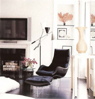
interiors in black and white modern living room in black and white furniture, lucite chairs and fireplace via belle vivir blog

This living area above is also very light in ambiance with lucite based curvy modern chairs and a shag rug.

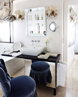
vanity in black and white via belle vivir blog

Whims everywhere in this bathroom, from the shade to the skirted chair/stool.  The sconces have their own touch too.

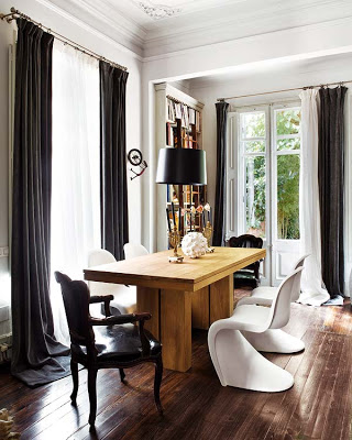
Interiors in black and white via belle vivir blog

Mix and match chairs in this room include casual Panton chairs and Louis XV style chairs.

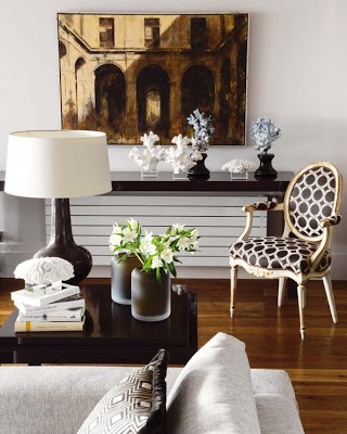
Interiors in black and white via belle vivir blog
 Sort of polka dot again covering a chair.
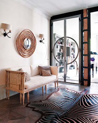
modern entryway in black and white with zebra rug and round mirror via belle vivir blog

The space above has like a very nice light reflection that gives it a hint of pink.  The zebra rug, the round mirror and the sconces pull everything off.

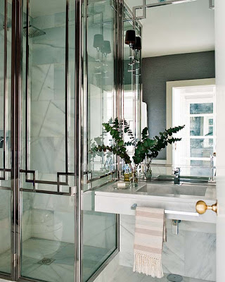
bathroom in black and white with marble sink and chrome shower doors via belle vivir blog

This bathroom is quite spectacular.  What doors!  Love the size of the sconces and the brass door handle.

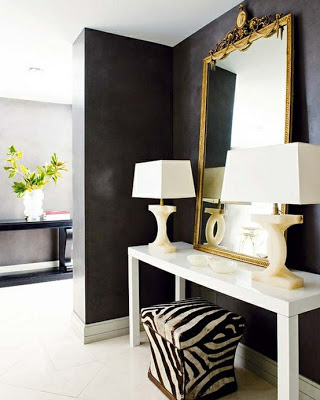
entry way in black walls and white table and zebra stool via belle vivir blog

Here again, the zebra stool and the shape of the lamps brake the space from being too sober.

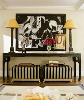
Interiors in black and white striped stool via belle vivir blog
So beautiful!
images via Nuevo Estilo and Elle Decor
 

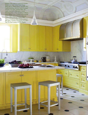
Waking up to a Kitchen with bright yellow cabinets is like being greeted with a “good morning sunshine” every single day.  With such an impressive antique ornate coffered ceiling, a simple and delicate pendant is the smartest thing to do.   If all the previous failed, for sure a black and white polka dotted floor will do.  Enjoy! 

Have you had your sunshine today…
image from Veranda Magazine via Splendid Sass and Pinterest
Thomas Urquijo design and interior design via belle vivir blog

Thomas Urquijo, a Spanish Interior Designer or Interior Architect I should say, is one of those masters who knows how to mix periods and style in one of the most effortless ways I’ve seen.  His Interior Architecture is completely classic and elegant but it feels totally livable.  It doesn’t make me feel stiff at the thought of living in it.

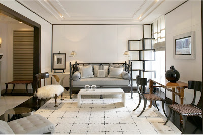
Thomas Urquijo living room design with klismos chairs via belle vivir blog

Love this area for a small apartment living room.  The architectural screen and the treatment on the walls brings personality to the room while the daybed and the kind of modern or transitional carpet makes the whole atmosphere feel friendly.  The Klismos chairs make a direct reference to classic in a very light and chic way.

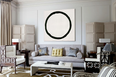
Thomas Urquijo living room interior design via belle vivir blog
Thomas Urquijo bedroom design via belle vivir blog
This bedroom feels so soothing and cozy yet it feels sophisticated.  The touch of light colored wood has a lot to do with this feeling.
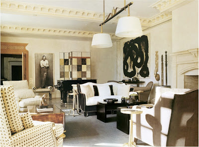
Thomas Urquijo living room design via belle vivir blog

Thomas Urquijo seems to love regency and art deco style furniture, which I would say helps his rooms look transitional.  I feel I can never get tired in these rooms.

Thomas Urquijo dining room design via belle vivir blog

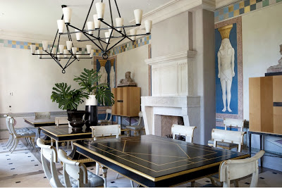
Here, in this amazing dining room, Thomas went completely regency.  He painted Egyptian figures on the walls and used a more modern version of the Klismos chair.  I adore the checkered border on the upper part of the walls.  It’s amazing how a simple little detail can bring so much character into a room.

Thomas Urquijo library design via belle vivir blog

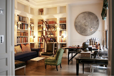
This room has me drooling…. I mean seriously drooling.  I can not tell you how much I adore that ladder, does it look a bit Art Nouveauish to you?  I have to have a Louis XVI chair upholstered in black leather one day.  I know, I know…  Check out the circle sculpture on the wall! Can you picture a square one…? nah… The gingham checkered fabric on the wing chair brings a touch of youth to the classic library.

Thomas Urquijo garden design via belle vivir blog
kitchen with ice green cabinets decor via belle vivir blog

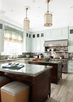
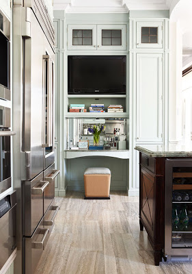
No white or natural wood cabinetry for a change in this weeks’ kitchen of the week.  The decor in this kitchen that I found at Erin’s blog House of Turquoise caught my attention for its clever use of color in the cabinetry.  It’s there but not in your face, the effect is almost as neutral as white or beige.  I also love the height of the cabinetry.  It’s smart to use all the wall space you have and make the entire area more functional and grander.  You may be wondering why all appliances that one can imagine are together in one kitchen…and that’s because the owner is an apprentice chef who has incredibly good looking brass pendants hanging in her kitchen.  I mean…let’s take a moment here…don’t these pendants lend a life changing factor to this kitchen?

kitchen with ice green design cabinets via belle vivir blog

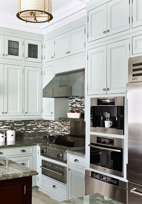
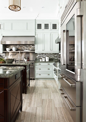
I kind of like how the backsplash looks from this angle where it adds uniqueness to the design elements.  The designer Dee Dee Taylor Hannah probably thought that there’s been enough white subway tiles (something I still love regardless)  in the history of design and opted for something a little bit more modern for a traditional kitchen.  I’m not a big fan of this type of glass tile, but one of the things I love more about blogging is when I come across something that perhaps makes me think twice.  I never get tired of things that wake up all my senses and possibilities and in this kitchen those glass tiles really make all the sense.  I think that using white subway tiles in this kitchen would have probably made it one more typical kitchen. 

An integrated coffee maker, warmer drawer and whatever that thing under the microwave/oven is, are on my list for my next kitchen.
kitchen with ice green design cabinets via belle vivir blog
kitchen with ice green cabinets decor via belle vivir blog

I usually do my computer work out of our kitchen table so one of the things I would love to have in my future kitchen is a work space in it to open letters, write notes and put together to-do lists… I would need a chair with back support though.  Can my list get any longer?  Enjoy!