Tag: home decor

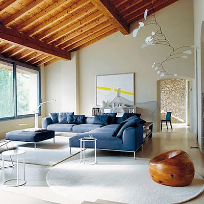
Homes with mobiles and voulted ceiling via belle vivir blog
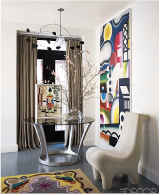
Alexander Calder mobile

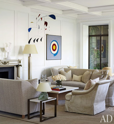
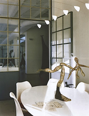
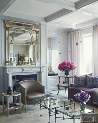
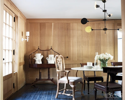
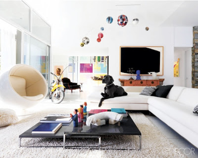
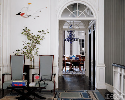
Very often we think of layers as something that can be hung on walls or overlaid but layers could also be something sculptural, like mobiles. They seem to live better in homes where not much pattern and color is used, I suppose that is so they don’t get swallowed up by the distraction.  Mobiles sculpture are delicate so they need a clean environment to frame them and let them reign by themselves.   Mobiles by Alexander Calder are very much used by Interior Designers in all types of decor from modern to more traditional ones. 

Homes with alexander calder mobiles via belle vivir blog
Homes with mobiles via belle vivir blog
 Alexander Calder mobile via The World of Interiors
Homes with mobiles via belle vivir blog
 Via Elle Decor
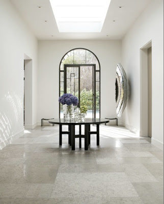
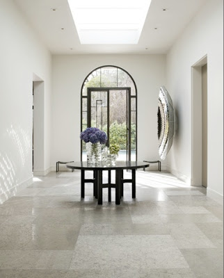
entry way with calder mobiles via belle vivir blog
Kazumi Yoshida via Elle Decor
dining room with mobile over dining table via belle vivir blog
Bories and Shearron
modern mod home with mobile via belle vivir blog
I think it would be such a fun idea to replicate this, above, as a Christmas decoration.  Via Elle Decor
traditional Home with Alexander Calder mobile via belle vivir blog
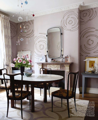
dining room with fireplace and with glass mobile hanging above dining table via belle vivir blog
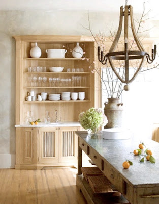
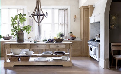
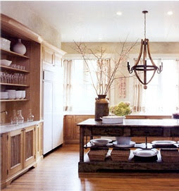
I have decided that all my “future kitchens” will not have overhead cabinets, at least on one wall.  I also have decided that I want a row of windows, the taller the better, above the kitchen sink row of cabinets.  This kitchen is designed by Smith Hanes and would I change something?  Well, yes I would: the chandelier! Give me some sparkle or some shine; a little brass perhaps?  The color of the island to bring contrast and probably I would need a little bit more space on both sides of the range; but now that I think twice; why would I, that’s a pretty big stove.  But that is just me, everything else is too awesome! 

The living room done by Carrier and Company had a very subtle and delicate linen technique.
 

Up until a couple of years ago the word “paint technique” would make many, including myself, freak out!.  The first thought coming to mind would’ve been that weary sponge paint technique of the 90’s that was just eekie-cheapi-looking… Now wall paint technique have refined itself to the limit.  Most of the designer showhouses I’ve visited lately have had many walls covered in these new and exquisite techniques.  The latest was Designer Visions Showhouse 2011 where basically all three apartments had two or more rooms covered with Ralph Lauren’s paint techniques which offer a range of finishes from Natural Linen to Antiqued Leather.  My favorite finishes so far are Natural Linen and Venetian Plaster.  Now this last one may not appeal to everyone but I think that in modern apartments where architectural details are lacking, this would add interest and character.

 The living room done by Carrier and Company had a very subtle and delicate linen technique. 

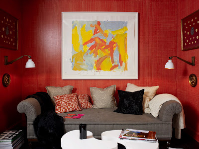
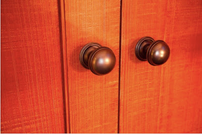
In the den, Carrier and Company applied another linen technique in an orange tone where you can appreciate the effect better.  Below, a closer look.

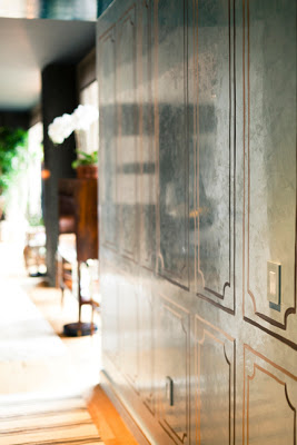
This decorative paint done on the entryway of this year’s Designer Visions Showhouse is Venetian Plaster and was done by Ricardo Brizola.  The same technique, below, was done on the hallway walls of Elle Decor Modern Concept home this year. 

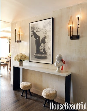
images via House Beautiful, Casa Diseno,

William Hogarth 1697-1764 England, was a painter satirist and social critic during the 18th ct. His satiric paintings and engravings mostly covered and criticized social and political situations by ridiculing conventional and social standards of his times. One of my favorite work of his is Marriage à-la-mode, a series of six paintings which were later engraved and published, ridiculing arranged marriages where of course the unhappiness of the entire family ends with the tragedy that covers everything from murder to suicide. Go figure! “Moral: don’t listen to evil silver-tongued counselors; don’t marry a man for his rank, or a woman for her money; don’t frequent foolish auctions and masquerade balls unknown to your husband; don’t have wicked companions abroad and neglect your wife, otherwise you will be run through the body, and ruin will ensue, and disgrace, and Tyburn” And you may be wondering why am I reading all this and you’re right! but William is entirely responsible for what’s called Serpentine Line or Line of Beauty which is the S-shaped curved elongated line that frames an object. He thought that curves, not Sophia Vergara’s in this case, were more dynamic, more interesting to see, more lively and not as dead and static as straight lines. And I so much agree. When my professor said these things in class last year I thought “Clever man!” He probably had no idea that his theory would transcend to furniture, hence the Serpentine sideboard and many more wonderful good looking furniture and sculpture that we enjoy today. Below, a few images that show gracious and beautiful curves.
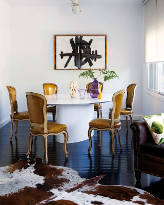
William Hogarth , Serpentine line

William Hogarth Serpentine Line

daniel romualdez dining room decor via belle vivir

francois halard home via belle vivir blog

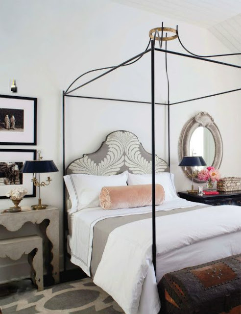
iron canopy bed with gold crown top


Read More…
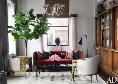
 a transitional entry way designed by Steven Volpe Interior Design via Belle vivir blog

When I received my Architectural Digest this month and saw that one of Steven Volpe‘s creations was featured I got extremely at just the thought of what my eyes were going to see.  If there is an Interior designer who has perfected the art of mixing with elements of surprise that result in pure Avant-garde and sophisticated spaces that’s Steven Volpe.  Volpe composes rooms that seamlessly combine exquisite designer furniture of different styles with top-notch art in a way that nothing clashes, instead the result is perfect harmony.  His transitional style seems to never get outdated and its always exiting to look at and get inspired from it.  Ever since I posted about the home he designed for Bita Daryabari I was hooked, do I need to say why?  About this home in AD that he designed for a tech-sector titan Steven says  “I was trying to create something that makes an impact, something that people haven’t seen before”.  I was particularly impressed in the big size of the house but yet, how livable and personal it looks.  The dinning room is nothing like you have seen before so I guess Steven Volpe knows how to deliver exactly what he intends!  Enjoy!

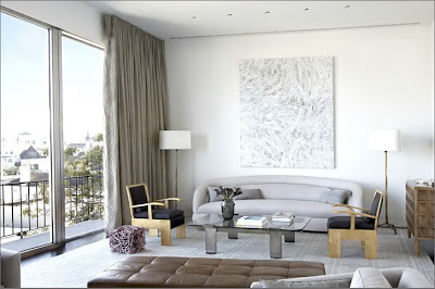
living room with curved sofa and two cubisc chairs by Steven Volpe Interior Design via Belle vivir blog
Steven Volpe Interior Design via Belle vivir blog

Steven Volpe Interior Design via Belle vivir blog

Steven Volpe Interior Design via Belle vivir blog

Steven Volpe Interior Design via Belle vivir blog
photos from Steven Volpe’s website.

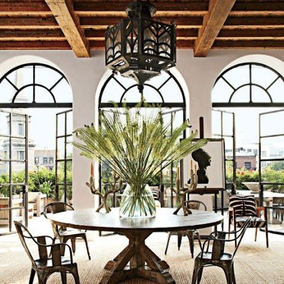
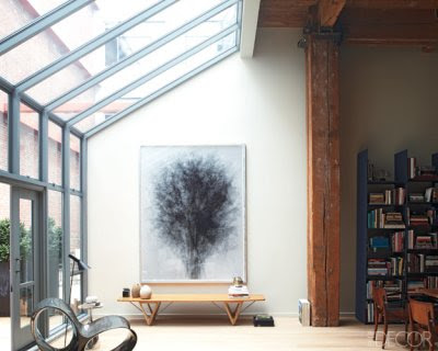
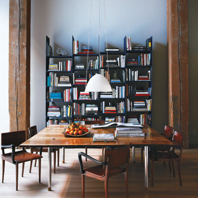
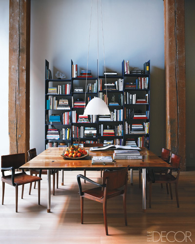
Lately I’ve been loving the Industrial Decor, mostly thanks to Steven Volpe’s home featured recently in Elle Decor (picture above).  There is something downtown-chic in Industrial Decor that makes me feel young and adventurous every time I see a room with industrial touches.  Unlike more feminine decor it’s a style that can appeal to women as much as men.   It’s also budget friendly due to the vast availability of vintage industrial furniture at flee markets.  Some of the staples of Industrial decor are muted colors like browns, black, white, grays; too much pattern and color is not its thing, while finishes such as metal, unfinished or whitewashed wood, leather and hides are more used.  As much as I love build-ins, I think there is a lot of flexibility in bookcase on casters.  Below, a shopping suggestion of really cool bookcases! Enjoy!

1, 2, 3, 4, 5, 6, 7, 8